Tailwind v4 alpha brings CSS configuration, here's a quick intro to using it.
Basic setup #
I got most my information from the announcement post on Tailwindcss.com, it has good pointers for getting started.
I chose to set up a
Remix app with Vite. Once that's
running, the new Tailwind default looks like this, a new magical @theme rule:
@import "tailwindcss";

@theme {

}
BYO props #
At this point, you'll need your props in a CSS format. Open Props has always offered both JS and CSS versions of the variables, so getting them into this new config was swift.
This isn't an Open Props pitch I promise! It's much more about CSS focused
prop supported as configuration values.
npm i open-props
Vite supports the alias imports, so the props import into the config looks short n sweet like this:
@import "tailwindcss";
@import "open-props/style";

@theme {

}
We're ready to start mapping.
Font Sizes #
Tailwind v4 alpha has proposed a simple way to opt out of their defaults with a swift entry into the CSS config:
@theme {
  --font-size-*: initial;
}
Now we can add our own --font-size mappings and Tailwind will generate utility
classes for it.
The rules look like naming hooks, where if the custom property name on the left
has --font-size in it, then it will generate
font size utilities.
The trick is to hook into the naming while also supplying your own design tokens as values.
@theme {
  --font-size-*: initial;
  --font-size-00: var(--font-size-00);
  --font-size-0: var(--font-size-0);
  --font-size-1: var(--font-size-1);
  --font-size-2: var(--font-size-2);
  --font-size-3: var(--font-size-3);
  --font-size-4: var(--font-size-4);
  --font-size-5: var(--font-size-5);
  --font-size-6: var(--font-size-6);
  --font-size-7: var(--font-size-7);
  --font-size-8: var(--font-size-8);
}
Usage:
<h1 class="text-5">…</h1>
This same process was easily repeatable for colors, shadows, and more.
Gradients #
Going off the beaten path a bit, I followed the naming hook pattern idea and cross referenced it with the theme.css published in the v4 repo; I found I could bring all of the Open Props gradients in and Tailwind makes them available via the background-image utilities.
@theme {
  --background-image-gradient-1: var(--gradient-1);
  --background-image-gradient-2: var(--gradient-2);
  --background-image-gradient-3: var(--gradient-3);
  …
  --background-image-gradient-30: var(--gradient-30);
}
<div class="bg-gradient-30 dark:bg-gradient-8">
  …
</div>
Glad I went off the path. There's more to explore.
Adaptive utilities #
On to my favorite part, creating adaptive utililities.
I really like adaptive custom properties, and I wanted Tailwind to generate adaptive utility classes for me.
Instead of:
<div class="bg-gray-2 dark:bg-gray-12">
  …
</div>
I'd write:
<div class="bg-surface">
  …
</div>
It's possible, and easy to setup.
I was happy to see I could configure Tailwind v4 to enable the
workflow.
Utility classes are just backed by props now right? And with colors, there's a
clear naming hook. So what if instead of using Open Props values inside
@theme, I make up some new ones, then I provide values for in light and dark
media queries?
So here's the light and dark theme:
- 2 text "ink" colors
- 2 surfaces
- a link color
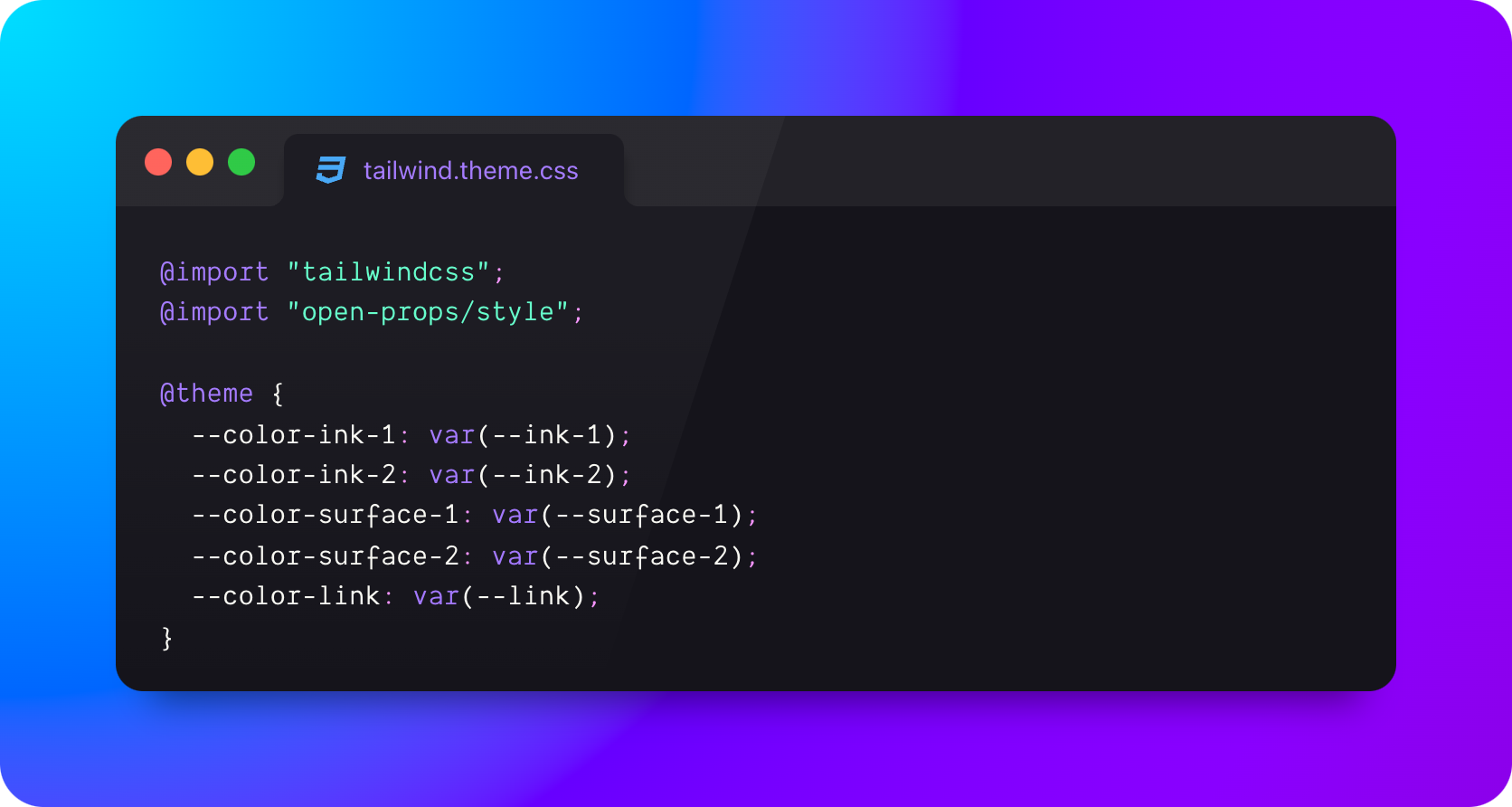
Tailwind sees the --color prefix hook and builds utilities.
@theme {
  --color-ink-1: var(--ink-1);
  --color-ink-2: var(--ink-2);
  --color-surface-1: var(--surface-1);
  --color-surface-2: var(--surface-2);
  --color-link: var(--link);
}
But, --ink-1 and friends havn't been defined anywhere.
So let's do that, with our design tokens.
:root {
  --ink-1: var(--gray-9);
  --ink-2: var(--gray-7);
  --surface-1: var(--gray-2);
  --surface-2: var(--gray-1);
  --link: var(--indigo-6);
}

@media (prefers-color-scheme: dark) {
  :root {
    --ink-1: var(--gray-1);
    --ink-2: var(--gray-5);
    --surface-1: var(--gray-11);
    --surface-2: var(--gray-10);
    --link: var(--indigo-4);
  }
}
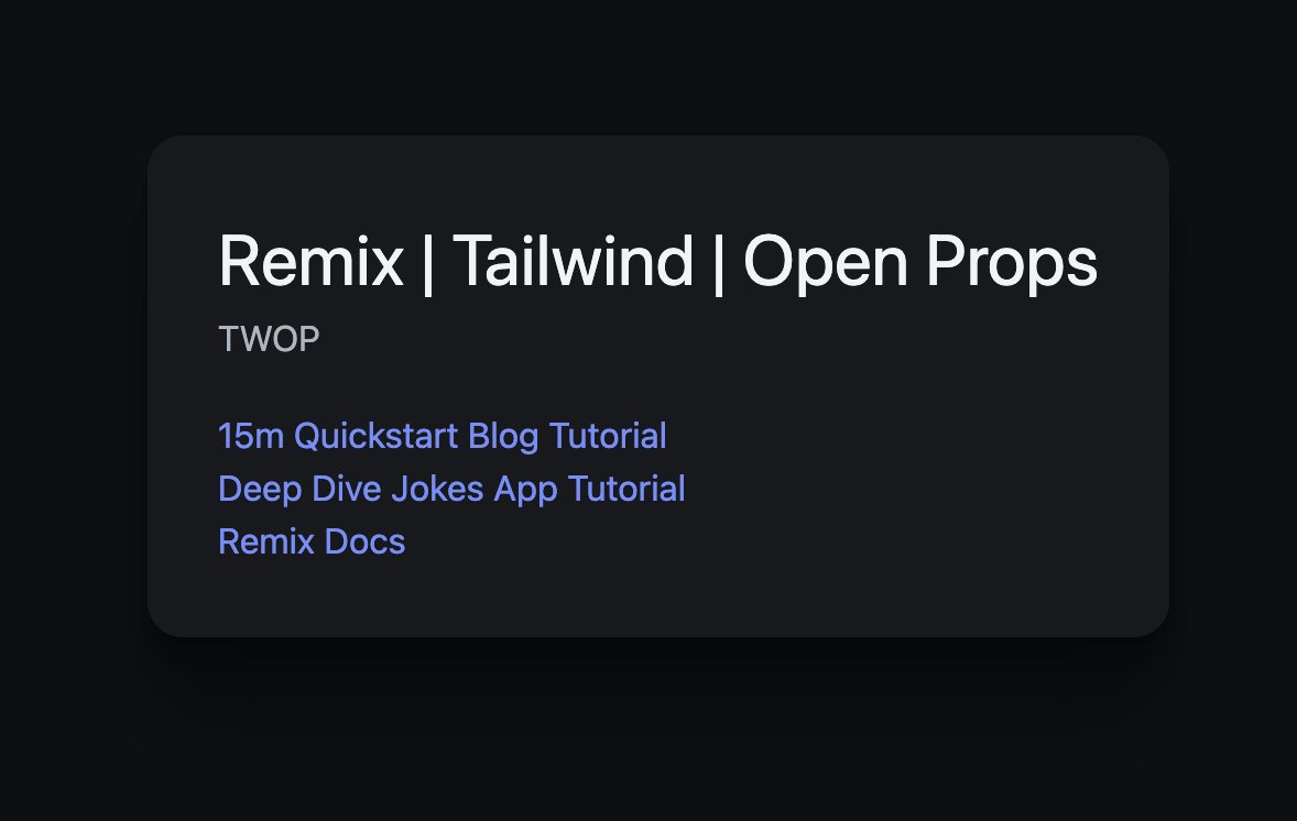
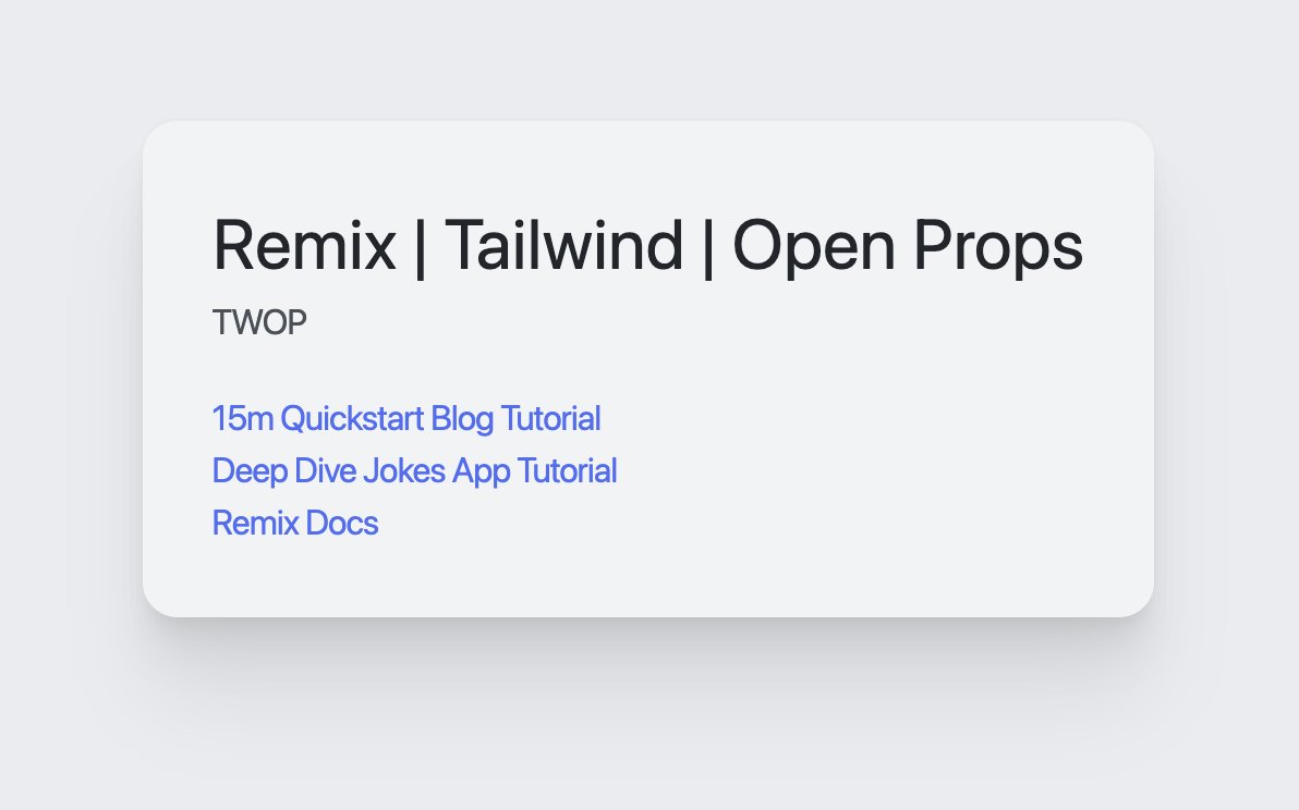
That's it, now I have a workflow like this, no noise about light or dark, that's configured higher up in the stack and templates don't need to deal with it.
<div class="bg-surface-2">
  <header>
    <h1 cssName="text-ink-1">…</h1>
    <p className="text-ink-2">…</p>
  </header>
</div>

Outro #
I stashed this work in a repo called TWOP (TailWind OpenProps). Definitely checkout the theme.css file.
Let me know what else you discover you can configure!


