
I love cozy games. I want more cozy software.
It's such a great UI/UX goal: chill, empowerment, and joy.

I love cozy games. I want more cozy software.
It's such a great UI/UX goal: chill, empowerment, and joy.
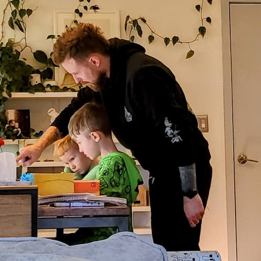
So stinkin' cute!

Ep #240
AI Cowgorithm Disrupts The Herd
(presented by Warp)
🕹️ Token spending
🧐 Autoresearch
🌗 Day Shift / Night Shift
🐄 Cowgorithms
💻 Terminal tools
🥃 Whiskey & whatnot
⤷ whiskey.fm · youtube · spotify · apple


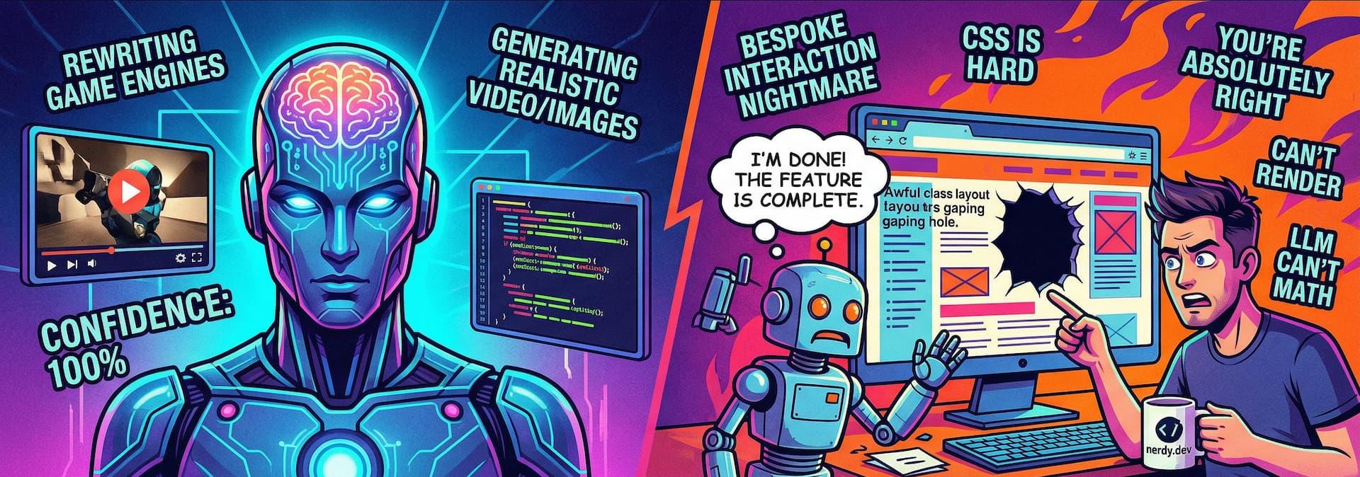
How can it generate 3D worlds, videos, images and entire web pages, but still suck at front-end?

Ep #239
Flogging Margins With The Dropcap Murphys
featuring Dave Rupert and Chris Coyier
™️ Brand Truth vs Brand Slop
🔫 One-Shot Apps
🧑🎨 CSS in the Age of AI
Context Rot
🧛🏻♂️ Energy Vampires & AI Brain Fry
🥃 Whiskey & whatnot
⤷ whiskey.fm · youtube · spotify · apple


dash.deno.com → console.deno.com
Fresh → Fresh 2
This was a large chunk of work 😅
Please report any regressions.

Ep #238
NextJS is Dead, Long Live NextJS (presented by Warp)
🏭 Dark Factories
🤖 YOLO mode
❌ T shape vs X shape
🦞 OpenClaw
💀 Death of SaaS
🥃 Redwood Empire & whatnot
⤷ whiskey.fm · youtube · spotify · apple


Ep #237
The Transactional Trap:
How 97% of Developers Are Using AI Wrong
- with Leon Noel & Danny Thompson
🤖 agentic dev
💬 prompt engineering
🦞 OpenClaw
🎼 orchestration, harnesses, and models
💀 leet code interviews
🕹️ Pokemon Go
🥃 whiskey & whatnot
⤷ whiskey.fm · youtube · spotify · apple


Try the latest <color-input> concept
(I think it's hella rad)
⚓️ anchor() progressive enhancement
🤖 workers for color compute
🙈 new animations & interactions
🎨 gamut boundaries, mapping, stretching
☯️ contrast scores
& much more
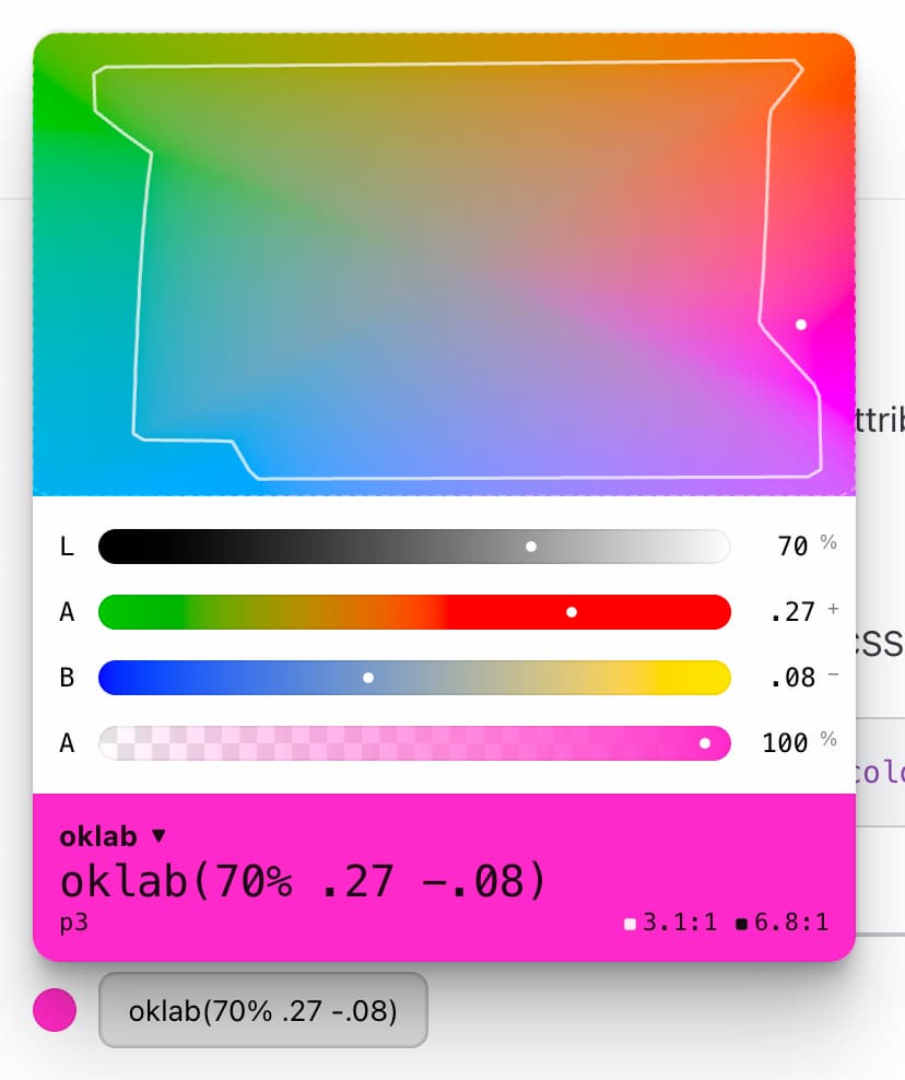
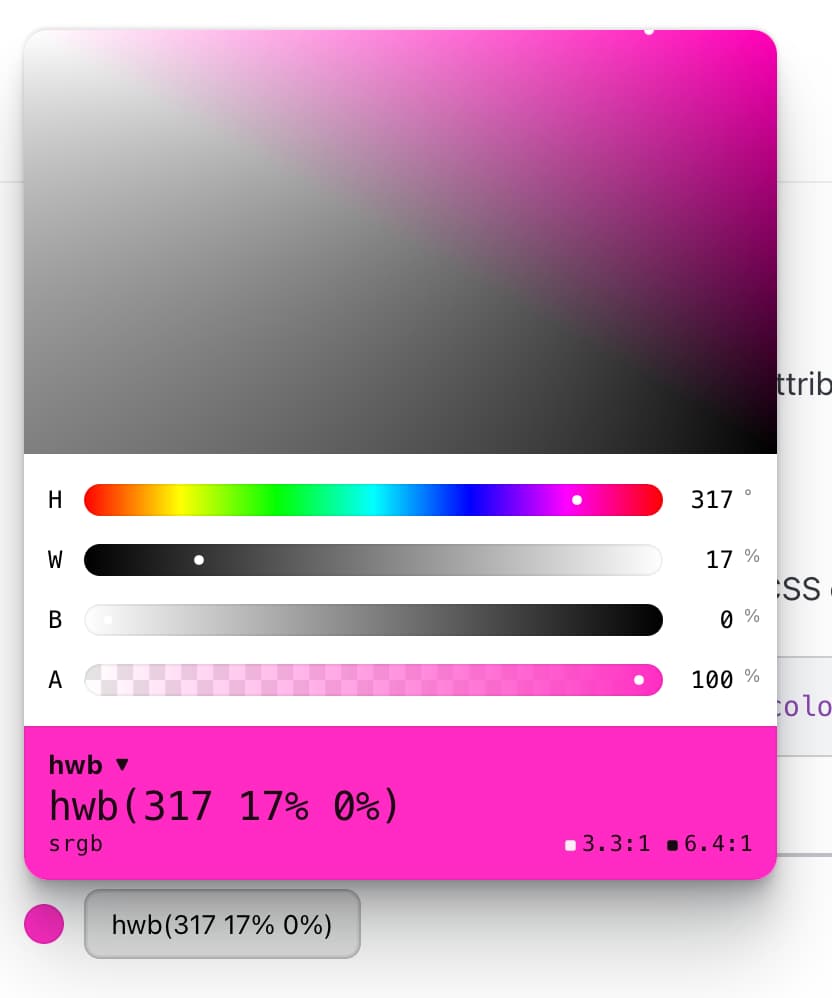
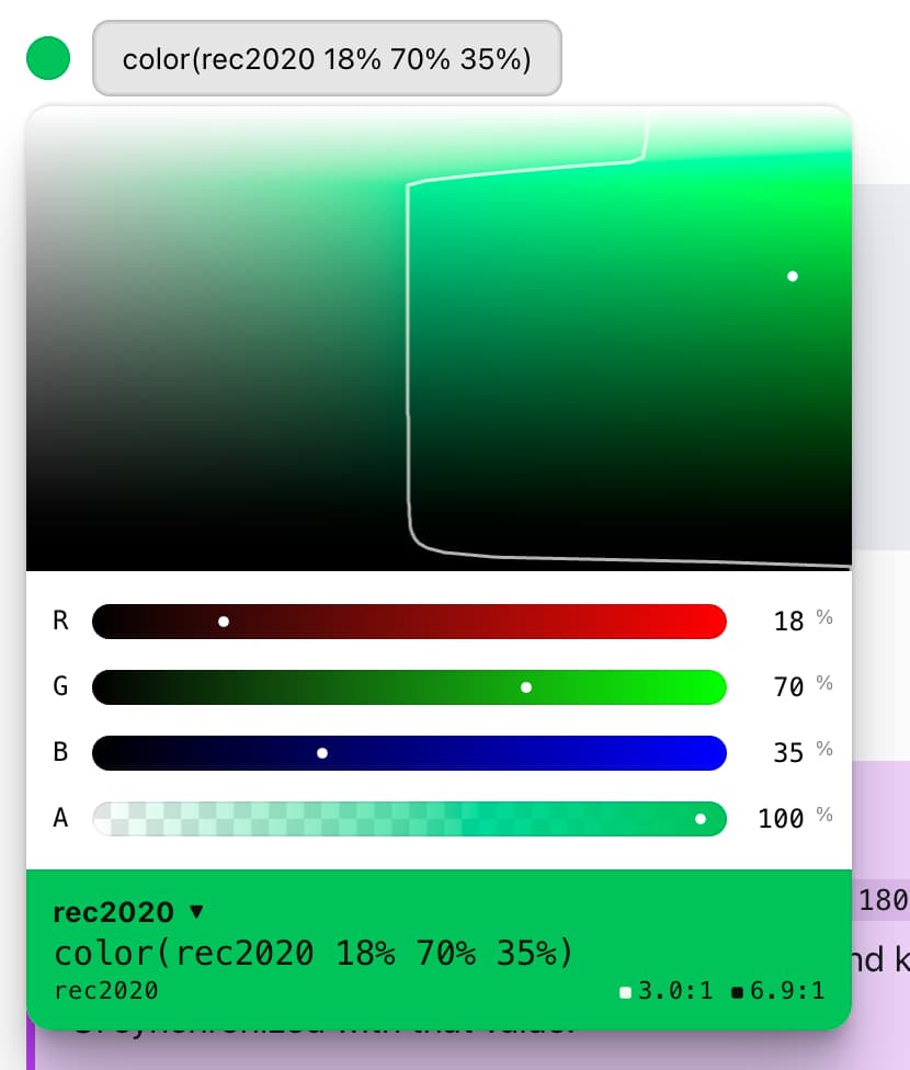
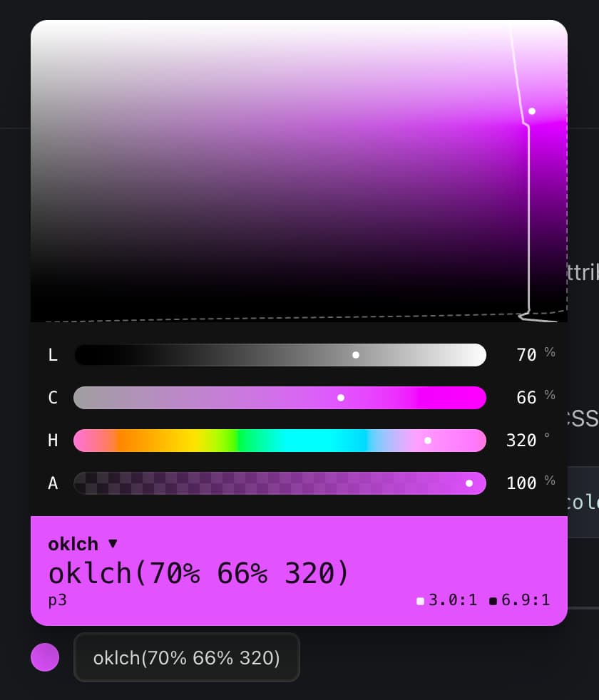

Page load improvements deployed.

Ep #236
The Manager Has Become The Managed
(Presented by Warp)
Robbie and I chat with guest Amelia Wattenberger about:
📄 Why specs still aren't taking off
🤖 Being managed by your own bots
🛠️ Amelia's rad project Intent
🦆 Rubber duck debugging with Claude
🥃 A little whiskey & whatnot
⤷ whiskey.fm · youtube · spotify · apple


My CSS Day 2025 talk is out!
📼 youtube.com/watch?v=vPb7d28RFNE
Slides, demo links, & more here.


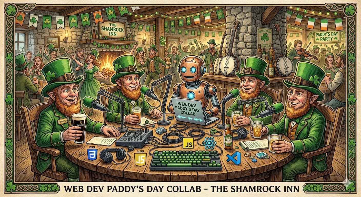
Join us tonight at 5pmPT for a 🍀 St. Patrick's Day 🍀 live collab with the ShopTalk Show folks!

Ep #235
Hot Pockets Pro Max (presented by Warp)
Robbie and I chat OpenClaw, token optimizations, liberating data from walled gardens, burn windows, and of course some whiskey and some whatnot.
⤷ whiskey.fm · youtube · spotify · apple

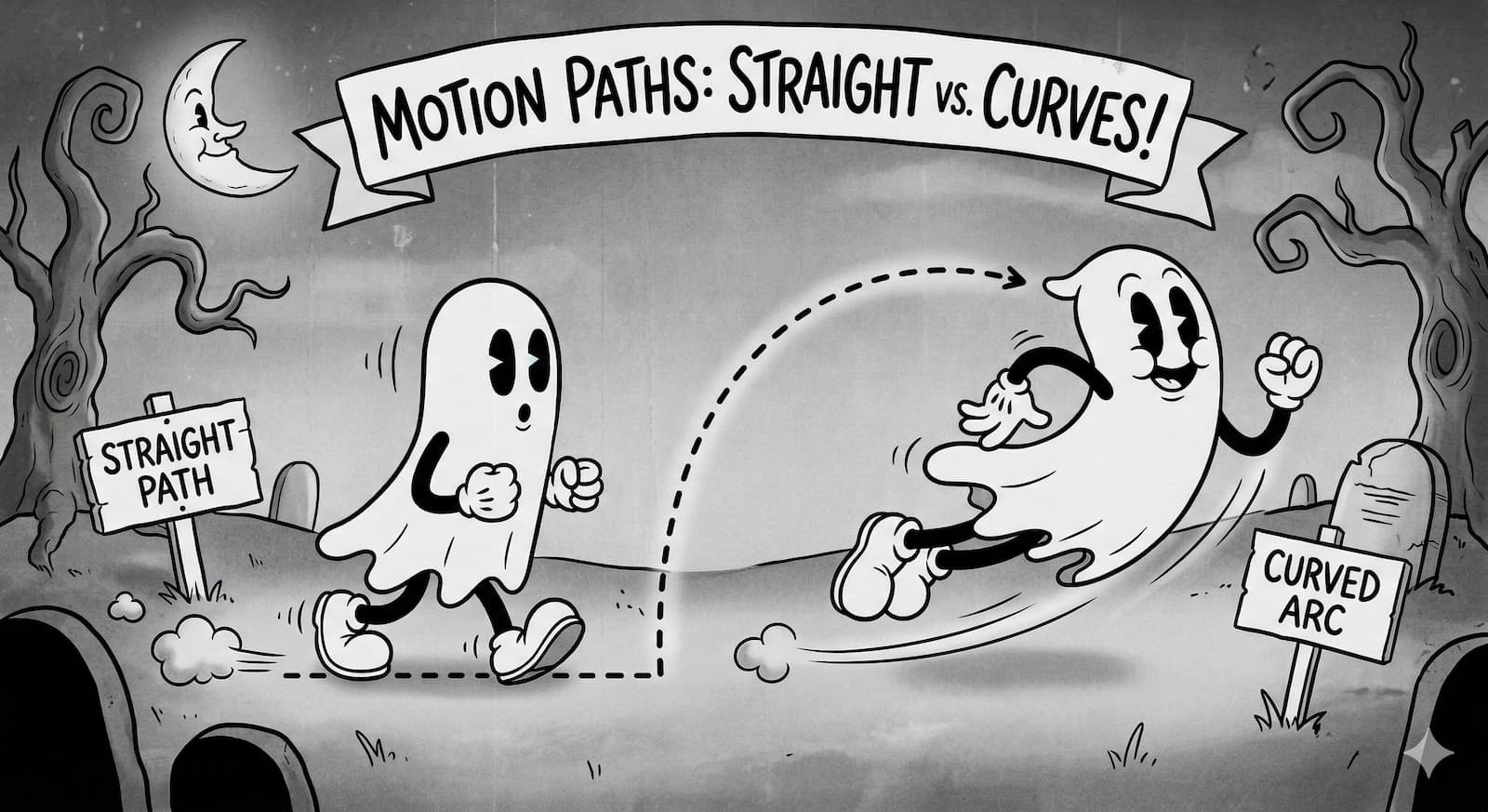
How to make View Transitions not always a straight line

Ep #234
Pay No Attention to the LLM Behind the Terminal with Zach Lloyd of Warp
Robbie and I chat latest agentic workflows with the CEO of Warp, digging into our favorite features, cloud agents with Oz, some delicious smokey whiskey and some whatnot.
⤷ whiskey.fm · youtube · spotify · apple


Hello personal software:


Tracking where my tokens go.

scroll-driven geometric orbit experiments
Featuring billboarding, center of mass pivoting, and CSS trig functions.

Ep #233
Humans Are Now Legacy Dependencies
Robbie and I chat agentic workflows, OpenClaw, Pi, malleable software, some whiskey and some whatnot.
⤷ whiskey.fm · youtube · spotify · apple


Ep #232
No Ralph Wiggum. No Training Wheels. Just Agents.
⤷ whiskey.fm · youtube · spotify · apple


Ep #231
We stopped coding by hand because agentic AI is too good
Robbie and Chuck dig into agentic AI loops, the rise of prompt-driven development, whether coding by hand is officially dead, and what happens when tools like OpenCode and Claude become the new normal.
⤷ whiskey.fm · youtube · spotify · apple


Site Updates

img:hover {
  scale: 1.2;
  clip-path: inset(10% round 20px);
}
nice, n' simple (codepen)

Ep #230
We accidentally deleted programming
Robbie and I dig into the shift from code-first to spec-first development, whether TypeScript still matters in an AI-driven world, the rise of agency over specialization, and why the future might belong to prompt-driven tinkerers instead of traditional developers.
⤷ whiskey.fm · youtube · spotify · apple


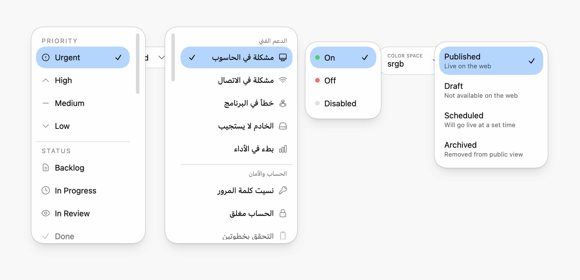
Building a modern custom select with base-select.

This week I compete in Syntax's March madCSS; me against 16 other badass devs in CSS & UI challenges 😅
Wish me luck 🤞


Ep #229
Is AI just stealing with extra steps?
Robbie and I talk about the ethics and economics of AI, and why “stealing with extra steps” feels like the right metaphor for where things are headed.
We also dig into open source burnout, whether AI replaces developers or just reshapes the job, and some whatnot over whiskey.
⤷ whiskey.fm · youtube · spotify · apple


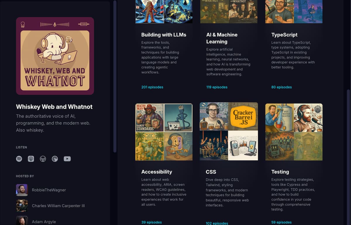
Need to catch up on a tech topic? Try one of the 🆕 WhiskeyFM Collections!

I prompt LLMs with logical properties.


Morphing overlay elements from dynamic places

@custom-media working behind a flag in Firefox Nightly!
@custom-media --motionOK (prefers-reduced-motion: no-preference);

@media (--motionOK) {
  transition: transform .3s ease;
}
Lovely syntax. Open Props has ~45 ready to go, peep the spec, or visit MDN for more info.

Ep #228
Santa.exe 🎄💻🥃
Robbie, Chuck and I bring you the holiday edition of Whiskey Web and Whatnot: random whiskeys, Christmas hot takes, and dev debates.
⤷ whiskey.fm · youtube · spotify · apple


Finally… Chrome 145 joins WebKit and Firefox in supporting overscroll effects on nested scrollers. No more bonk UX, get the same soft edge bounce as the main page has always had!
❤️ Ty Robert!

Ep #227
AI and Oath with Will Johnson
Robbie and I talk with Will Johnson, senior developer advocate at Auth0, about web dev, parenting, and internet culture.
⤷ whiskey.fm · youtube · spotify · apple


Ep #226
A very merry descent into holiday madness
Robbie and I talk about holiday travel chaos, parenting stress, and health scares before diving into AI-assisted coding, Linux quirks, IDE trends, burnout in open source, and more.
⤷ whiskey.fm · youtube · spotify · apple

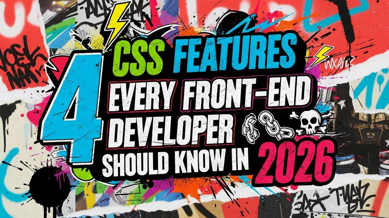
Toolbelt worthy, powerful, and game-changing CSS you need for 2026.

Ep #225
SOC 2 in the Streets, Spaghetti in the Sheets
Robbie and Chuck sip Jack Daniel’s Single Barrel Rye, and discuss why SOC 2 compliance is a painful but necessary sign of company maturity.
⤷ whiskey.fm · youtube · spotify · apple

What me and the kids are playin

iOS vs Android in 2025:

Ep #224
Spooky Scary CSS
This week, Robbie and Adam talk about Halloween vibes, excellent scotch, and the strange state of modern web development. After rating an Orphan Barrel single malt, they dig into AI coding workflows, agent tools, why one-shot prompts so often fail, and more.
⤷ whiskey.fm · youtube · spotify · apple


Ep #223
The Piano Man of State Machines w/ David K. Piano
This week, Robbie and Adam talk with David K. Piano about state machines, the chaos of overusing React hooks, Tailwind controversies, AI agents, security risks in emerging AI tooling, and why determinism still matters.
⤷ whiskey.fm · youtube · spotify · apple


Bring the color in at gradient.style

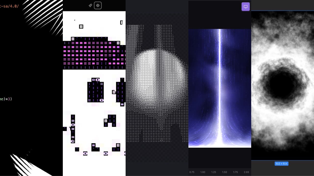
5 awesome projects


Use true or false queries

Fit width text in 1 line of CSS:
h1 {
  text-grow: per-line scale;
}
Prototype available in Canary 145+

Was on The UX Show with Yash Raj and Victor Sanchez 🤓


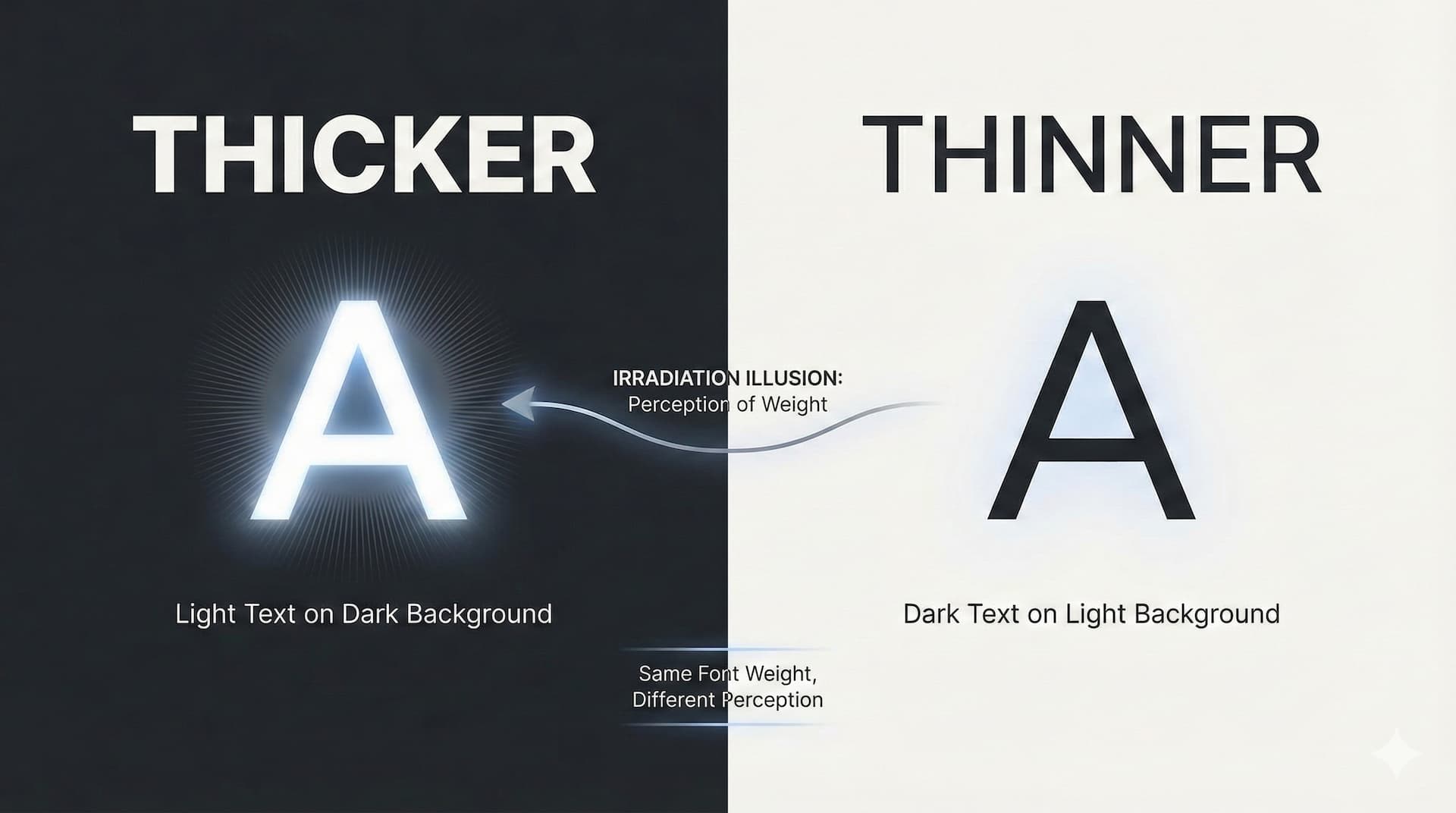
How to adjust perceived font weight in dark mode without layout shift

MIDI Meets CSS; out now on YouTube!


Streamlined visual forking

Is it just me or are superellipsed pill shapes cool?
Check it out on Codepen and I know your next question is caniuse


Refocusing and reducing

My talk Midi Meets CSS is done! Had a blast bein a high energy nerd on stage blastin banjo and beats from a K.O. II.
Marc, BTconf; you rock. Day 1 of the talks have been so inspiring. Stoked for day 2.


I was on the General Musings show with Kevin Powell 🤘🏻💀
We chat front-end job hunting in 2025, the misalignments between the technical interviews and the roles they were looking to fill, the overall state of the industry and hiring processes and how to distinguish yourself from the crowd.

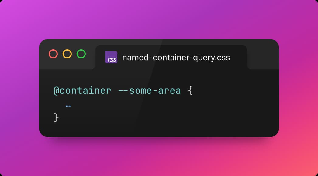
As Miriam Suzanne says "containers know stuff," but like, how much stuff?

Ep #216
Live at All Things Open w/ Shruti Kapoor
Robbie and guest co-host Jason Lengstorf chat with Shruti Kapoor about her leap from Slack and PayPal to YouTube, the joys and pitfalls of open source, and eternal web dev debates.
⤷ whiskey.fm · youtube · spotify · apple

Stoked for my upcoming talk at Beyond Tellerrand in Berlin next month:
🎶 Midi Meets CSS 🎶
Most folks use WebGL to visualize their audio (and it's awesome) but that's not me, CSS is. I've taken a different approach…
Be there or be aspect-ratio: 1

Ep #215
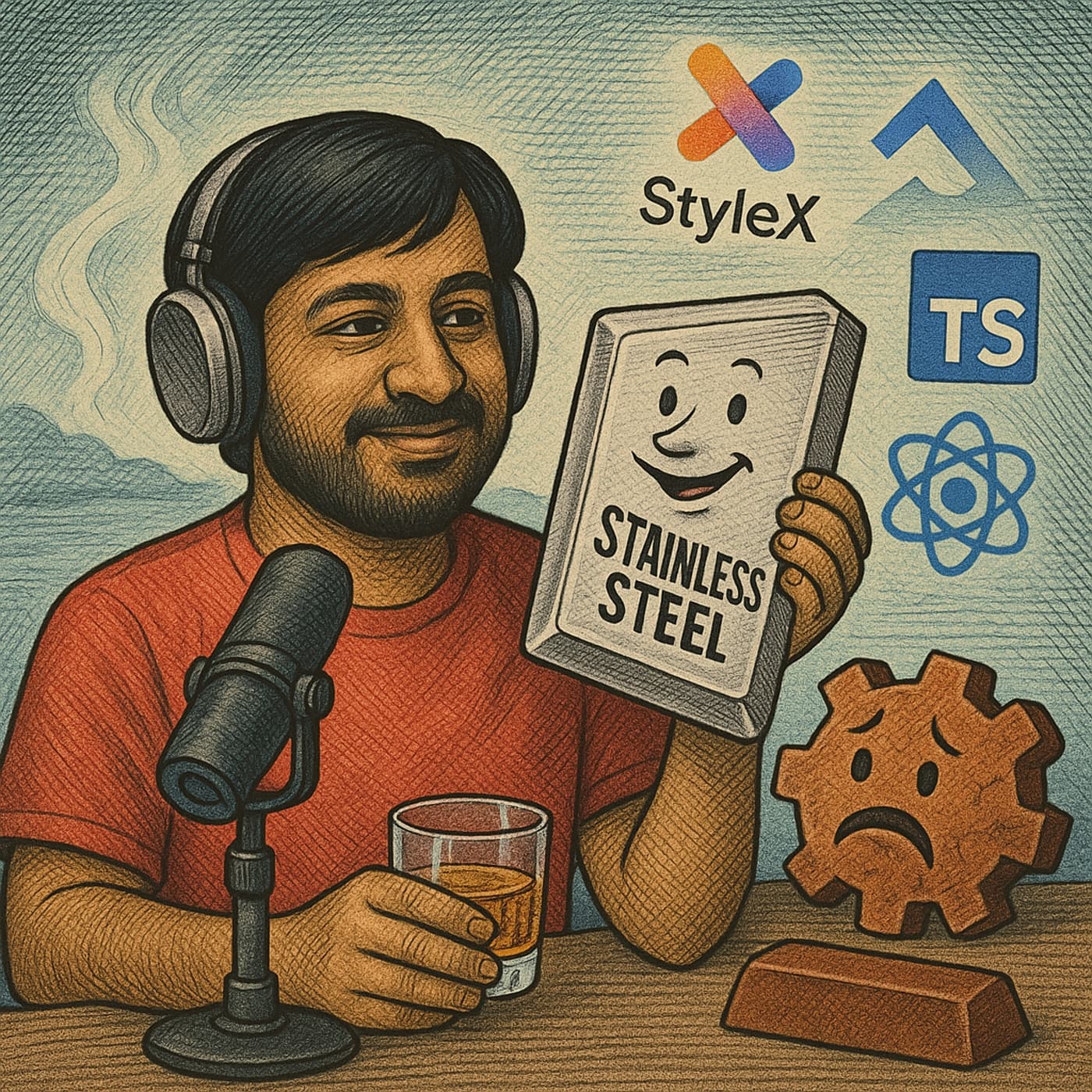
Rust Is Overrated w/ guest Naman Goel
Robbie and I talk with Naman Goel about the origins and evolution of StyleX, how it integrates with React and other frameworks, the pros and cons of different programming languages like Rust, TypeScript, and Swift, and whatnot.
⤷ whiskey.fm · youtube · spotify · apple

Ep #214
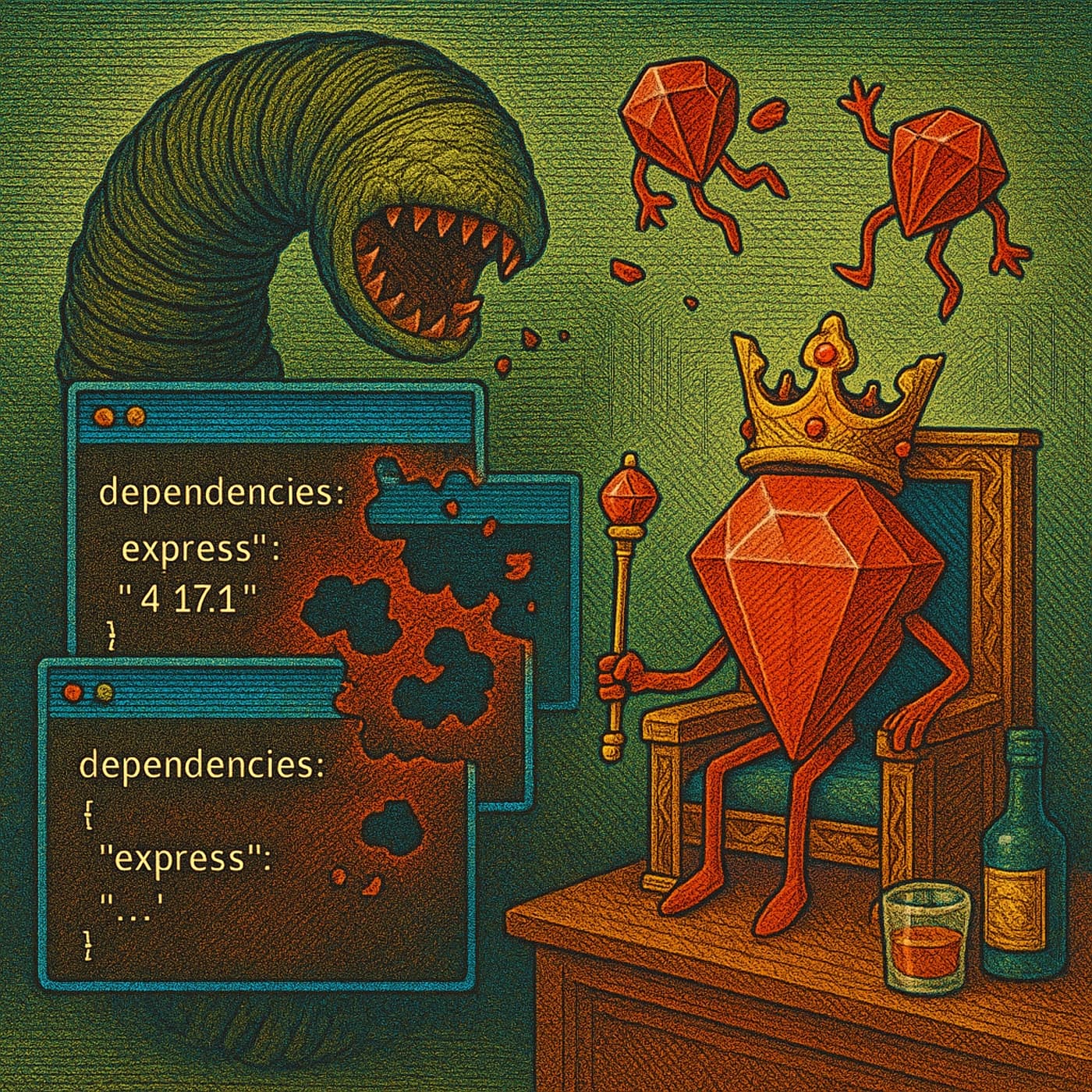
NPM Worms & RubyGems Coups: Trust Issues in Open Source
Robbie, Chuck, and I talk about the worst whiskey, Tailwind as a “state management library,” recent security scares in open source, NPM dependency hygiene, developer visa drama, and tech salaries.
⤷ whiskey.fm · youtube · spotify · apple


Declarative dialog light dismiss

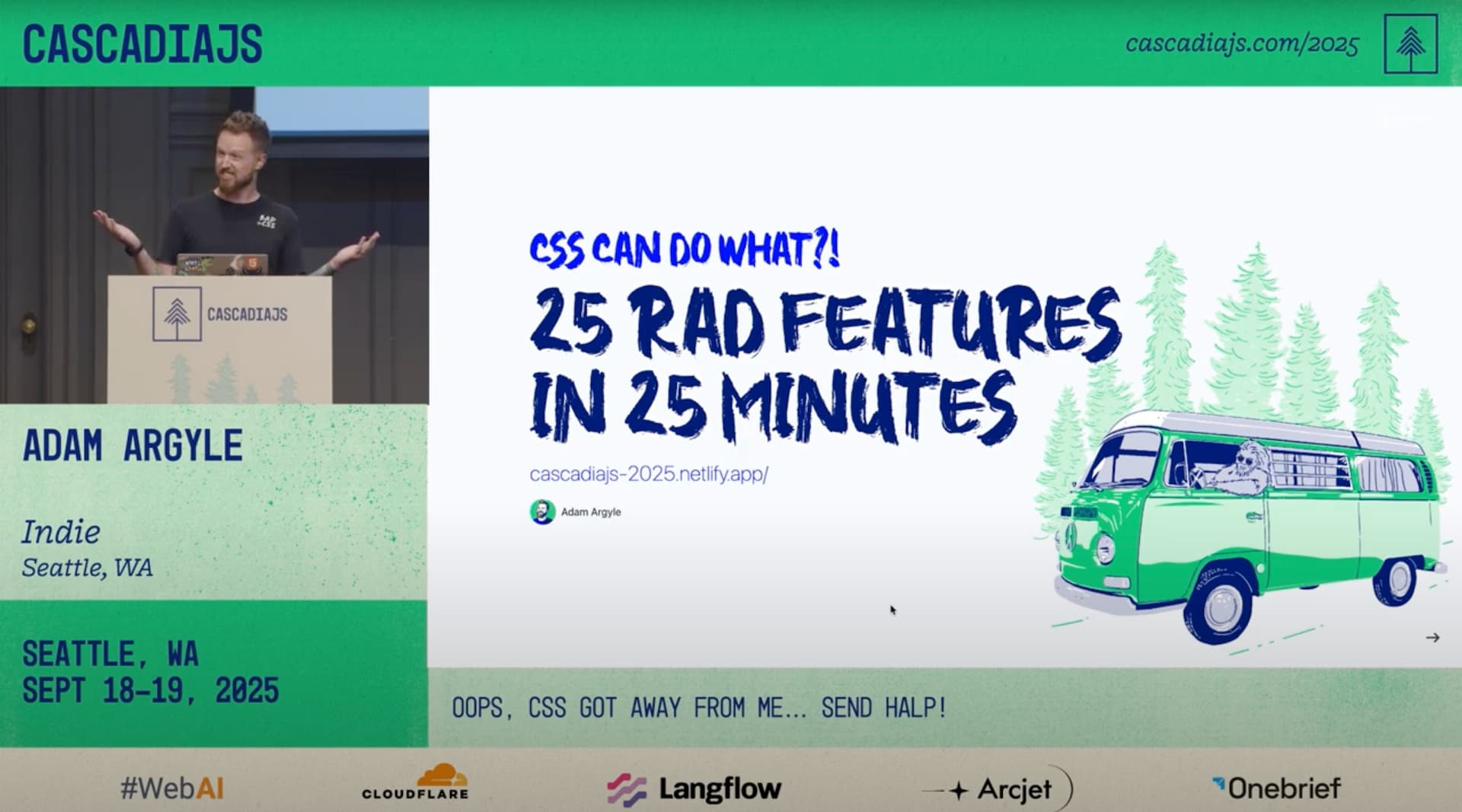
You can now watch my talk from CascadiaJS 2025 3 weeks ago 🤘🏻💀

Ep #213
Is CSS A programming language?
Robbie and I chat with Kevin Powell about the quirks and complexities of CSS, Tailwind and Flexbox, AI’s failure to write decent styles, anchor dingles, trim styles, and more.
⤷ whiskey.fm · youtube · spotify · apple

On Bluesky? Here's a CSS Feed I made 🤓

Still a fan of Warp, it's good stuff y'all.

Checkout this episode of PodRocket with Kevin Powell, Paige and I; we chat about… you guessed it, CSS!
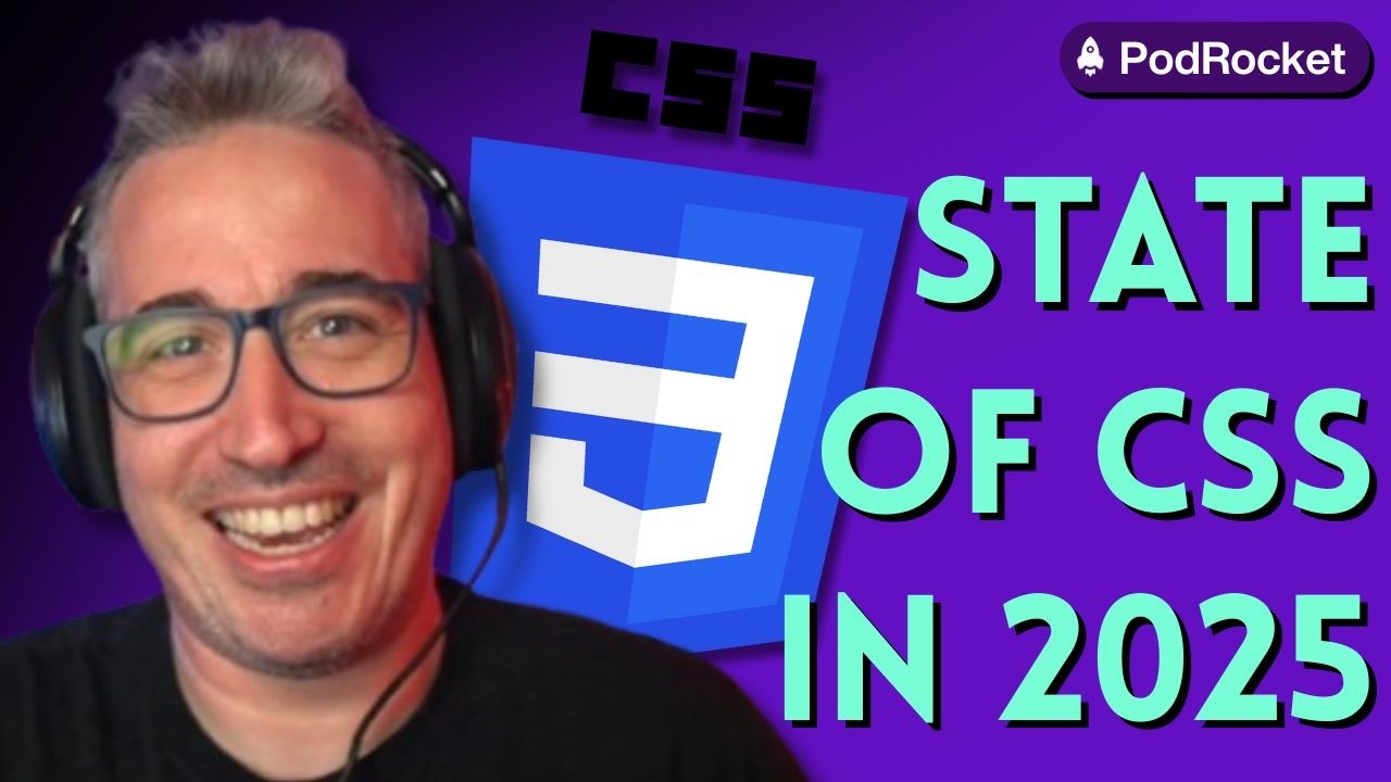

Ep #212
TalkShop Show w/ Macho Man Randy Standards
Robbie and I chat with Dave Rupert about whiskey, web culture, the quirks of building side projects, the shifting landscape of the web, AI-driven development, spec-driven workflows, RSS’s decline, and more.
⤷ whiskey.fm · youtube · spotify · apple


Bramus with a rad snippet:
@function --light-dark(--l, --d) {
  result: if (color-scheme(dark): var(--d); else: var(--l));
}
In 3 lines, a --light-dark() CSS function that works anywhere 🤩

I joined the good folks on Front-End Fire to share how front-end interviewing is like in 2025, in the age of AI and short attention spans.


Sticky staggered offsets + gradients = neat transition

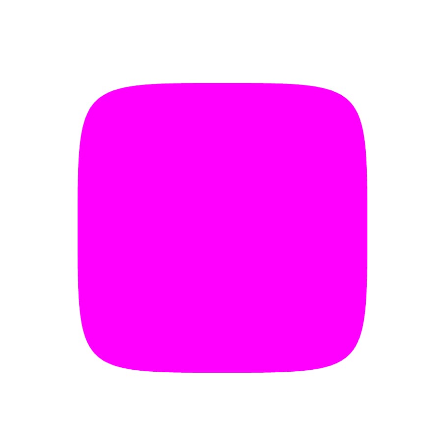
Squircles with clip-path: shape(), while we wait for corner-shape: squircle.
Vote for corner-shape in Interop 2026 or give this little GUI a peep from Zoran.

Ep #211
Agents of Chaos: Whiskey Experiments and the Future of IDEs
Chuck and I talk about offbeat experiments, and the chaos of tech culture. They discuss AI workflows, Warp vs. IDE debates, and the realities of coding culture, from bleeding-edge hype to WordPress drudgery.
⤷ whiskey.fm · youtube · spotify · apple

Nobody wants to see your ugly config,
Just Vite It.


SO fun.

Wow Lerosh, these are rad pics from CascadiaJS 🤩

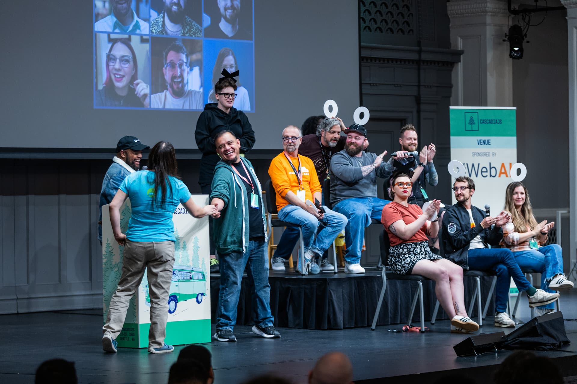
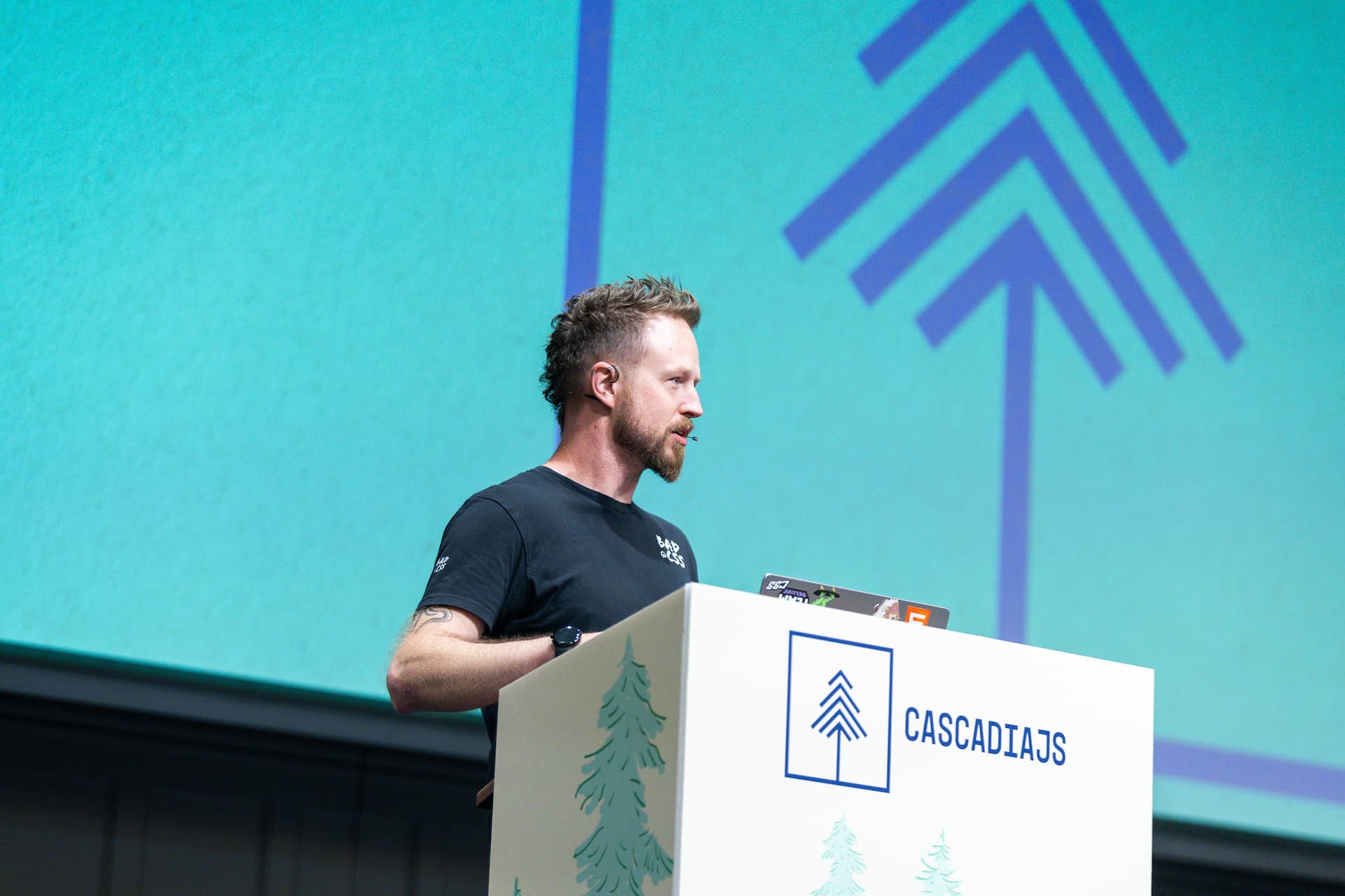


My talk is in just a couple hours here in Seattle at CascadiaJS 🤘🏻💀
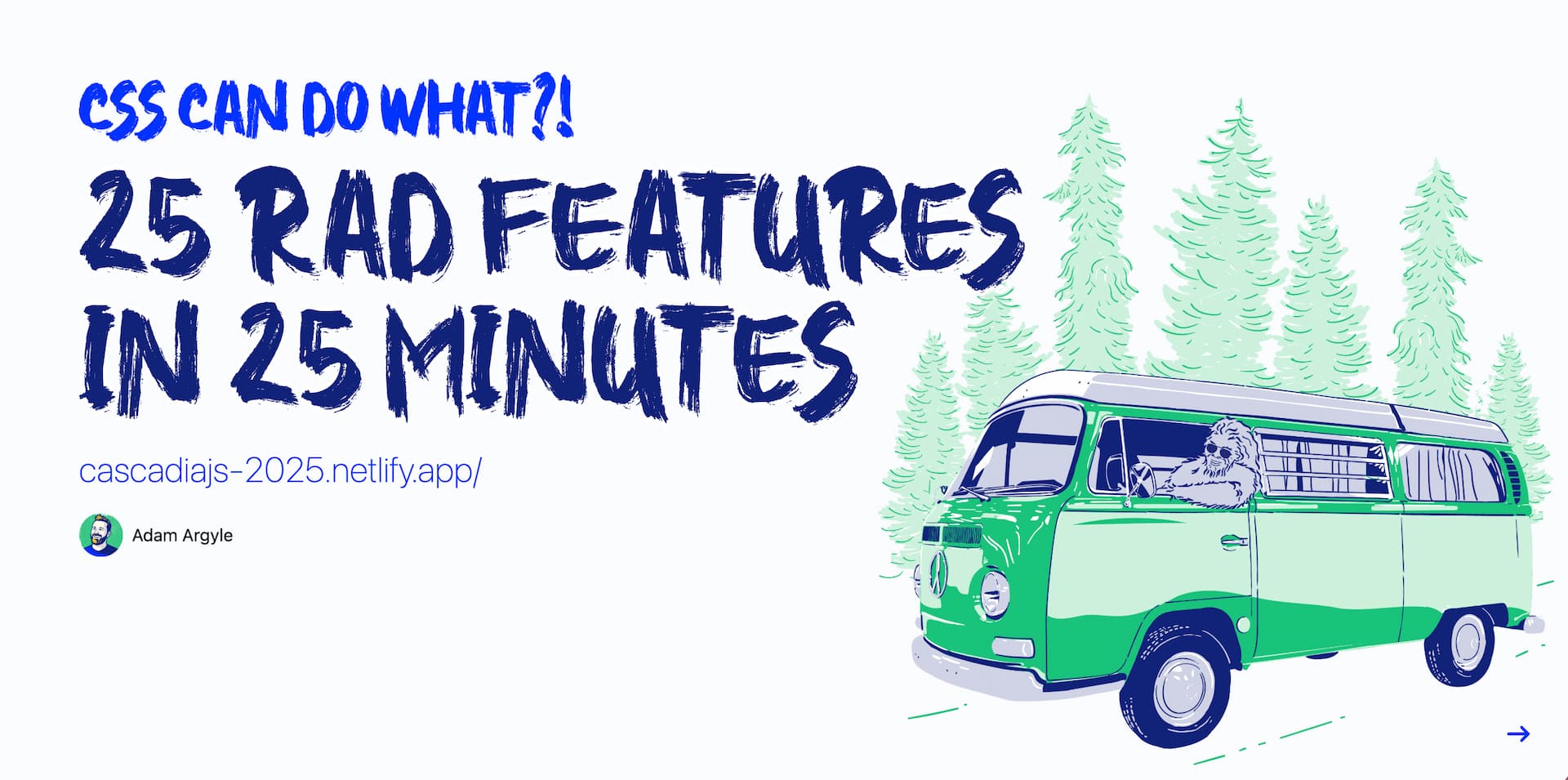

Ep #210
DevRel, Linux, and the Shrinking Path for Junior Developers w/ Ali Diamond
Robbie and Chuck talk with Ali Diamond about her journey through tech, cybersecurity, and community building. They sip tequila, swap hot takes on programming languages and developer culture, and dig into the realities of junior engineering paths.
⤷ whiskey.fm · youtube · spotify · apple

I'm stoked to share my next role:
Design Engineer at Shopify;
alongside Jason Miller to hack on next-gen admin UI/UX and a new Polaris.
I'm also workin to rejoin the CSSWG via Shopify too 🙂
Thanks for all y'all's support! 💀🤘🏻

Twitter comments, likes and reposts are now integrated.

Ep #209
Is Cracker Barrel a JS Framework?
Robbie and I talk about JavaScript trends, from the overuse of hooks to frameworks chasing sameness, and why Cracker Barrel’s rebrand feels like a frontend metaphor.
⤷ whiskey.fm · youtube · spotify · apple

In the darkness may it bind us


The percentages you can pass to CSS and JS for keyframe timing.

Ep #208
I've joined Whiskey Web and Whatnot as a permanent show host 🎉
In this episode, Robbie and I talk about CascadiaJS, my new role at Shopify 👀, and why tech interviews are so broken.
⤷ whiskey.fm · youtube · spotify · apple

I'm happy to share that gradient.style is out of beta and:
Open to feedback and comments 🙂
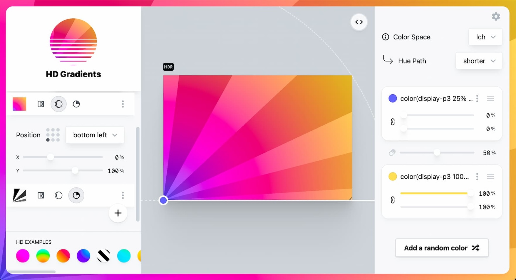
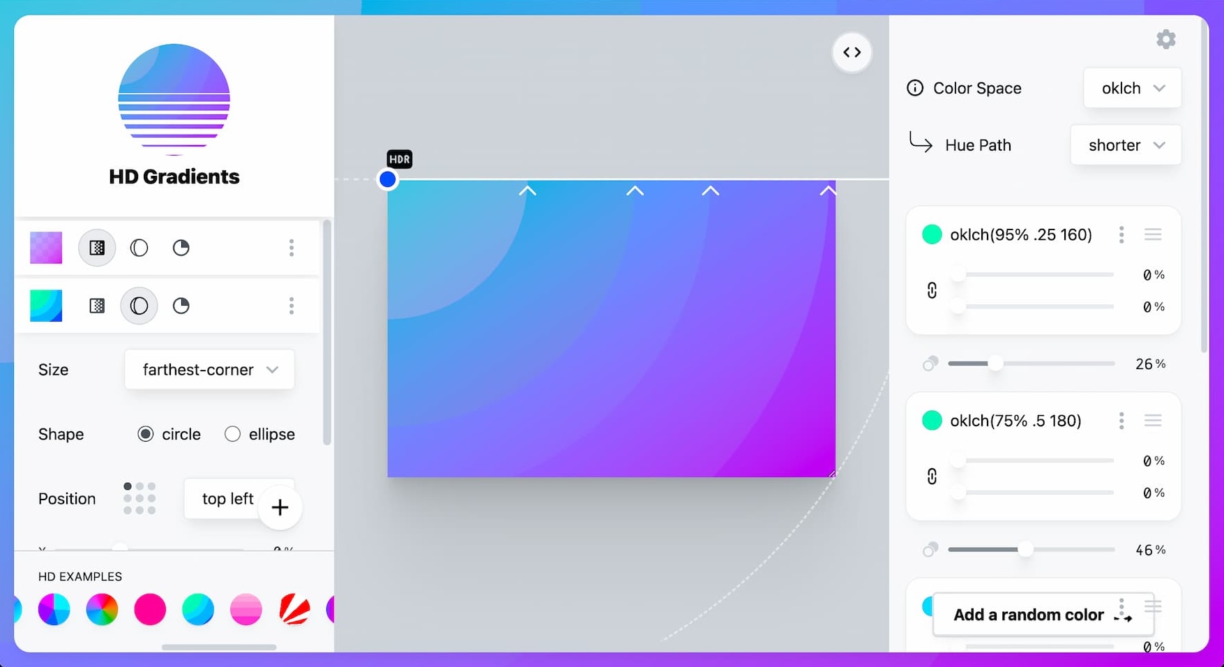
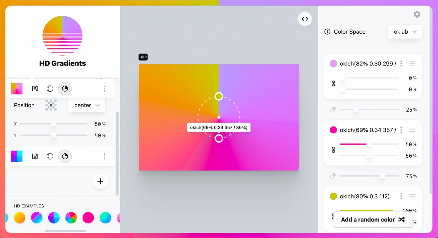

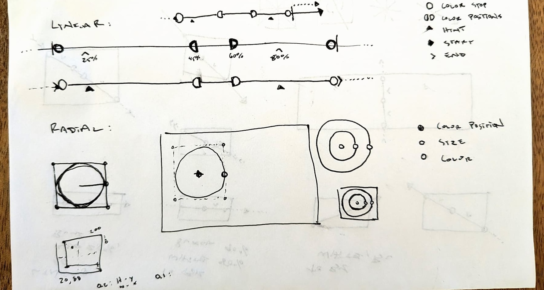
A fun sneak peek into the sketching that led to the UI.

Ep #151
DevTools FM
Join Andrew, Justin and I for a chat about some of the developer tools I've worked on.

CSS at a JavaScript event‽

In a world where agents can reason, generate, evaluate, and deploy, you no longer need a large team to build something remarkable. You need two people: one who understands systems and one who understands the user. Better if they’re the same person. Suff Syed - Why I'm Leaving Design
I'll be your huckleberry.

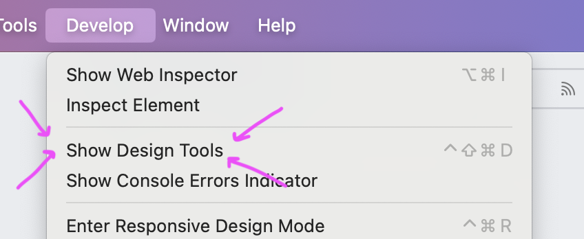
A browser with "Design Tools" 🤘🏻


ReadableStreams, view transitions, throttling, and much more.

Ep #672
The Working Draft
With Schepp, Vanessa and me 🙂 Join us for a tour of of what’s new and what’s next in CSS.

A small sample of UI, code, tools, and design from my 20 professional years of webdev.

Happy Father's Day to other parentNodes


Scroll snap, scroll-state, scroll-driven animation, and more; adding up to the smooth and tangible scroll experience we all have come to love from the Switch.

It's an honor to speak at CSS Day, the biggest CSS conference every year.
Hope y'all enjoyed nerding out about making beautiful scroll experiences.

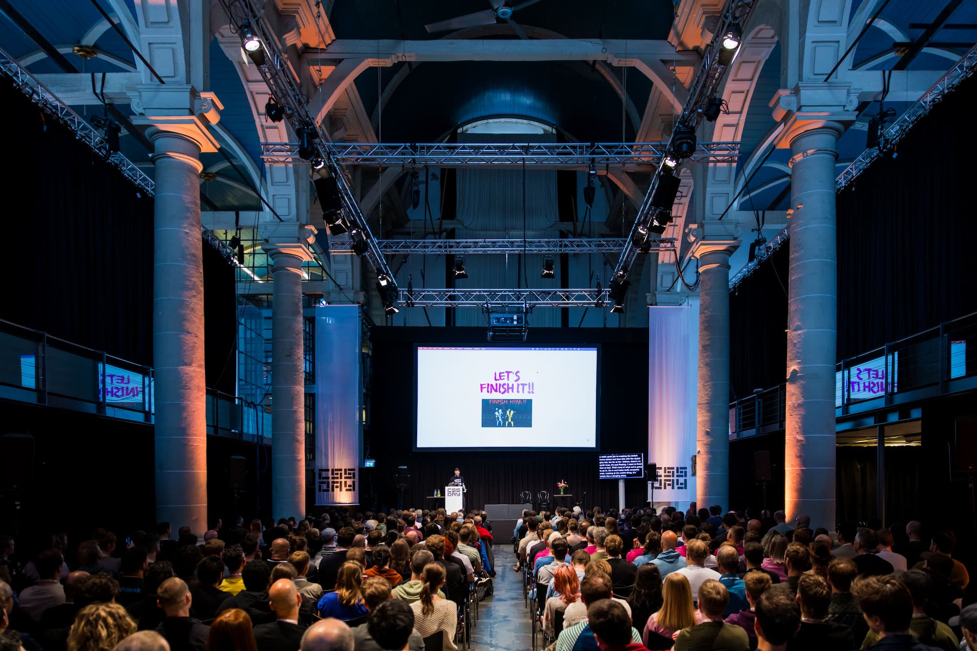
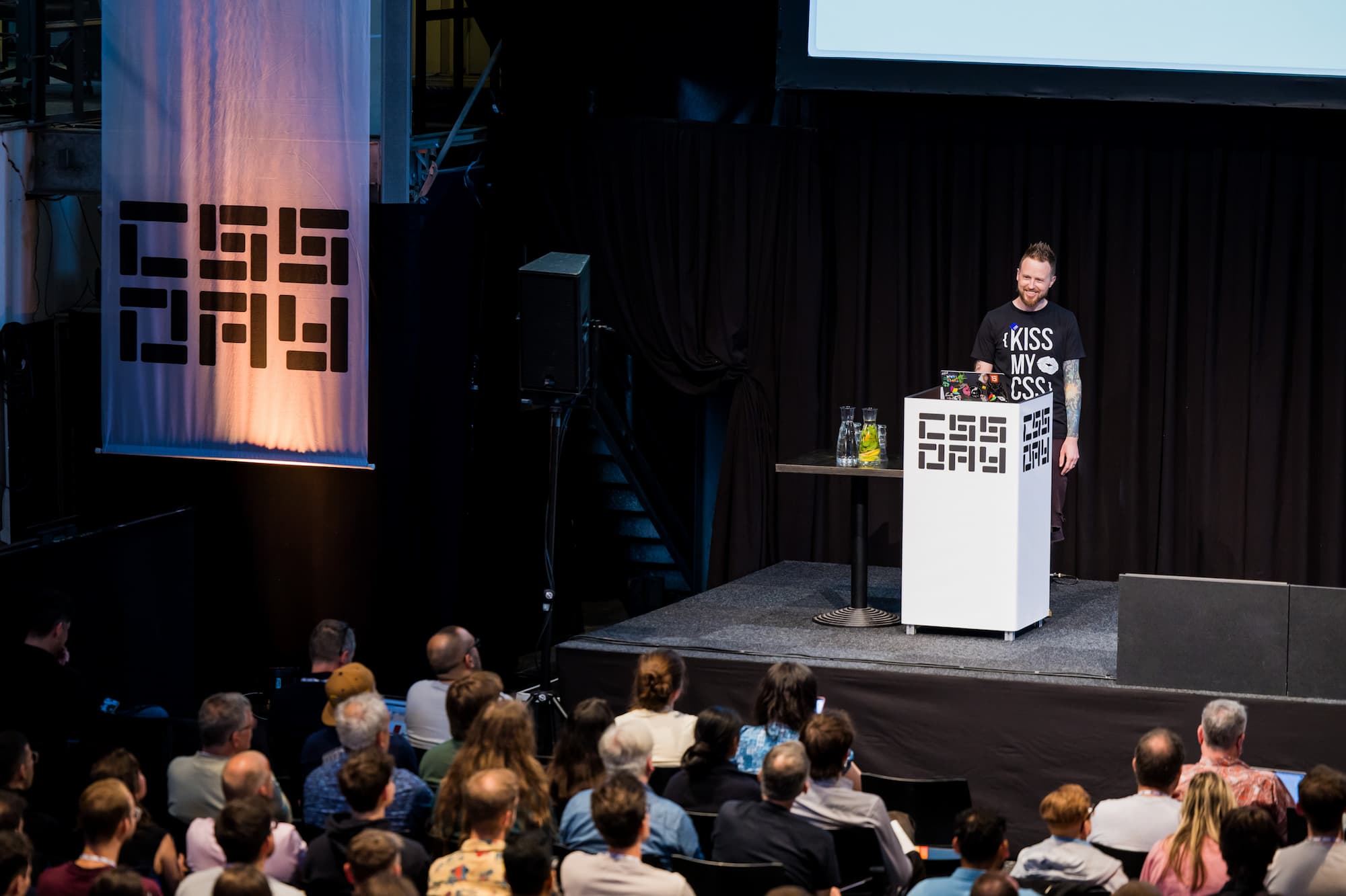
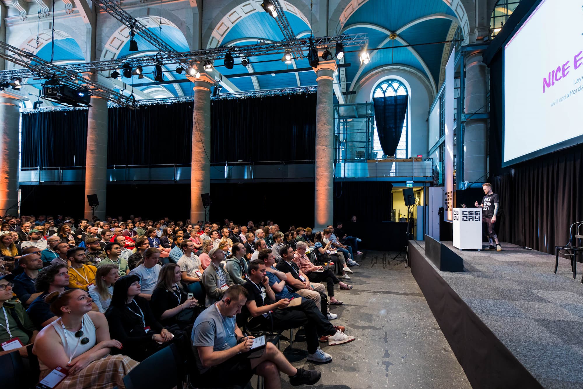

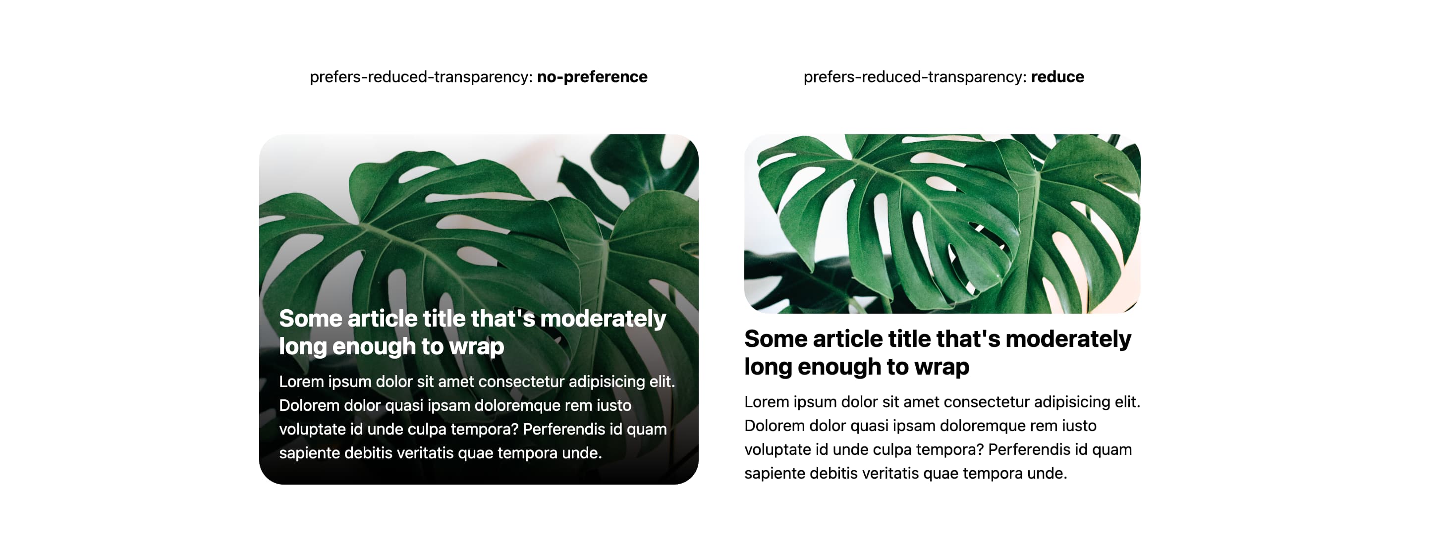
It's not a challenge to design for reduced transparency, it's an opportunity.

Speaking in just a couple hours 🤘🏻💀


Off to CSS Day; see ya there‽


Mt. Rainier in the bg, on a friend's little personal website boat, playin banjo tunes in double C:
Vibe check? This is the way.


min-height: 0, flex-shrink: 0, and repeat(auto-fill, minmax(min(10rem, 100%), 1fr))

Blogging about blogging.

Lane Wagner and I take on 2 other teams in a 4 hour challenge to make a 2+ player game using Temporal.

Beautiful
<details>
are possible.
Try this one! Lots of fun micro interactions.

CSS Zen Garden Leave…
Taking time, breathing slow, clearing my head, tending to a brutalist garden on Codepen.
Seems appropriate.

Cloudinary removed sitewide.
All processing now done at build time with custom scripts.

My role at Google was eliminated.

CSS
::scroll-button(),
::scroll-marker,
Carousel Configurator, and
Carousel Gallery with
Chris and Dave on
ShopTalk Show.

Recording is live!
Watch CSS Can We Do That on YouTube via Smashing Meets CSS online event.

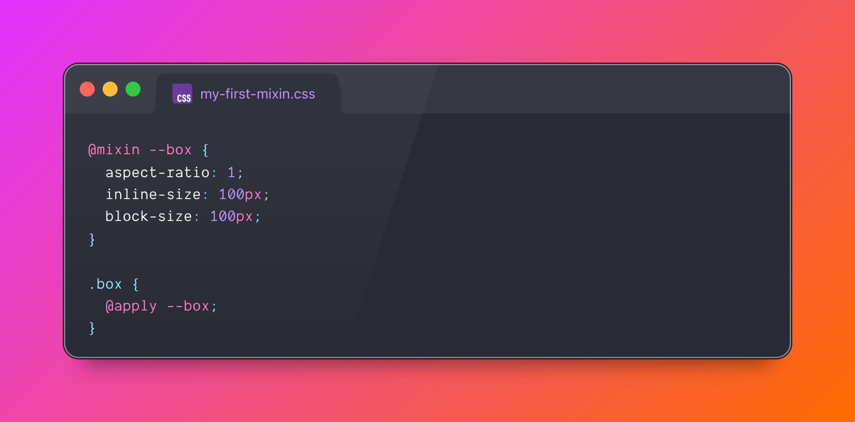
Here's how to get started with CSS @mixin in Chrome Canary.

Get ready!
The <select> element can now be customized with CSS,
check out the post on the Chrome Blog!
<option>
We just announced how CSS can make carousels on the Chrome Blog!
CSS Carousel Configurator:
I made this so you can directly see the relationship of a feature you want and
the related CSS.
CSS Carousel Gallery:
Showcases
meaningful use cases and exemplifies how to orchestrate many capabilities
together.

Add a rainbow shadow effect with
hue longer
interpolation and a little bit of
blur().
Try it in this Codepen


Gettin' rrready for Google IO!


Join me, Julia, Miriam and Geoff April 1st for the virtual event Smashing Meets CSS.

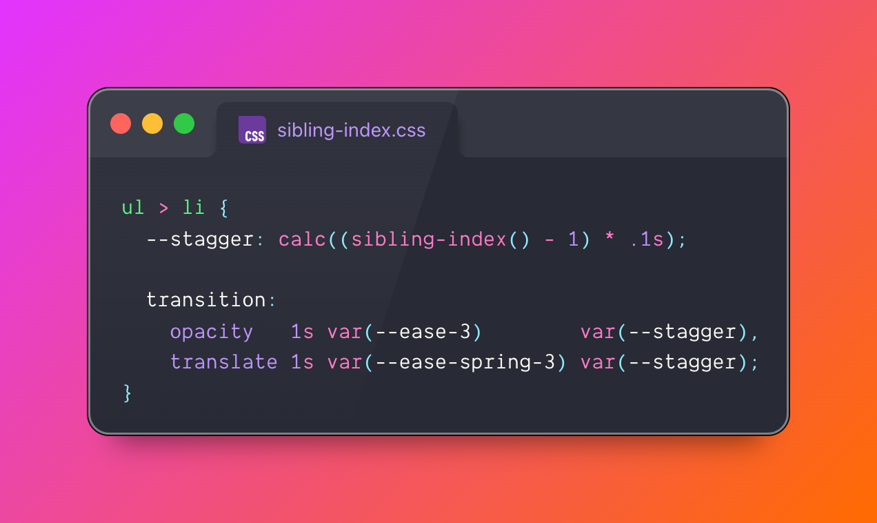
Elements can now know which position they are in the DOM tree (index) and how many other elements there are in total (count).

To give View Transitions a perspective, either:
::view-transition-image-pair(--foo) {
  perspective: 500px;
}
/* or */
::view-transition-new(--foo) {
  transform: perspective(500px);
}
Hope this finds someone well.


Animating gradients in 2025.

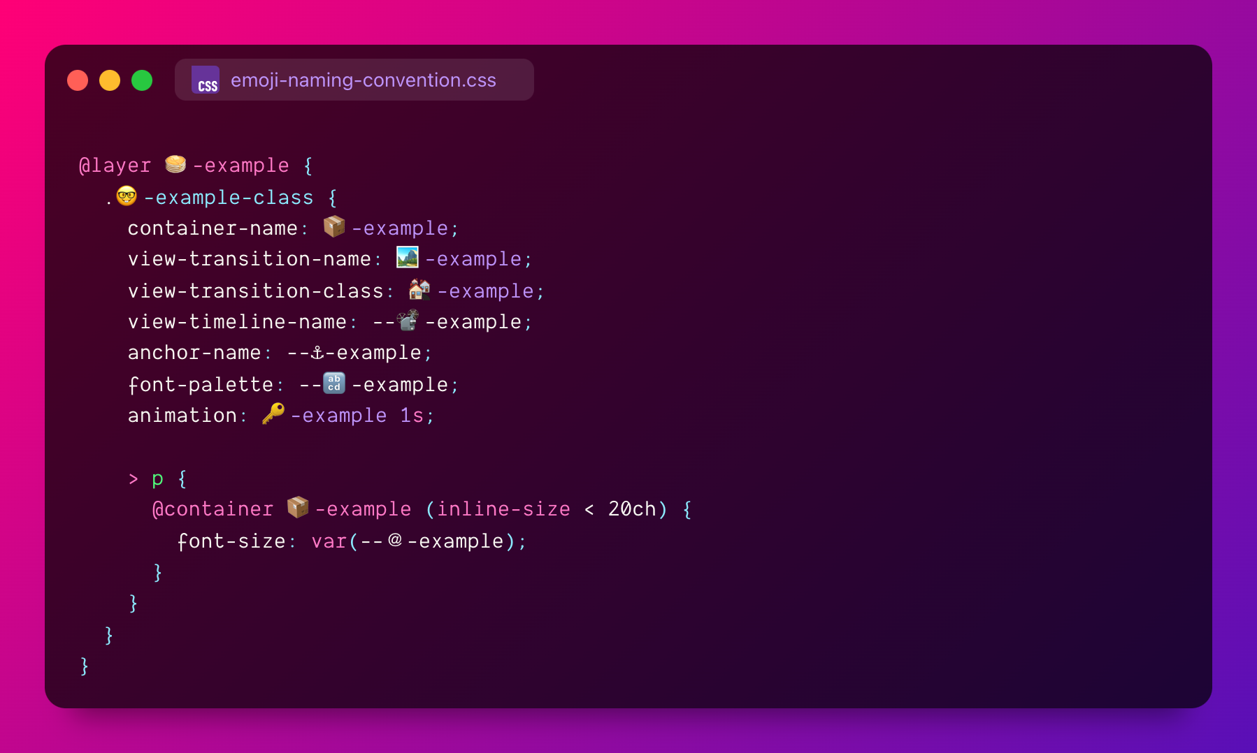
Prevent collisions and make it clear.

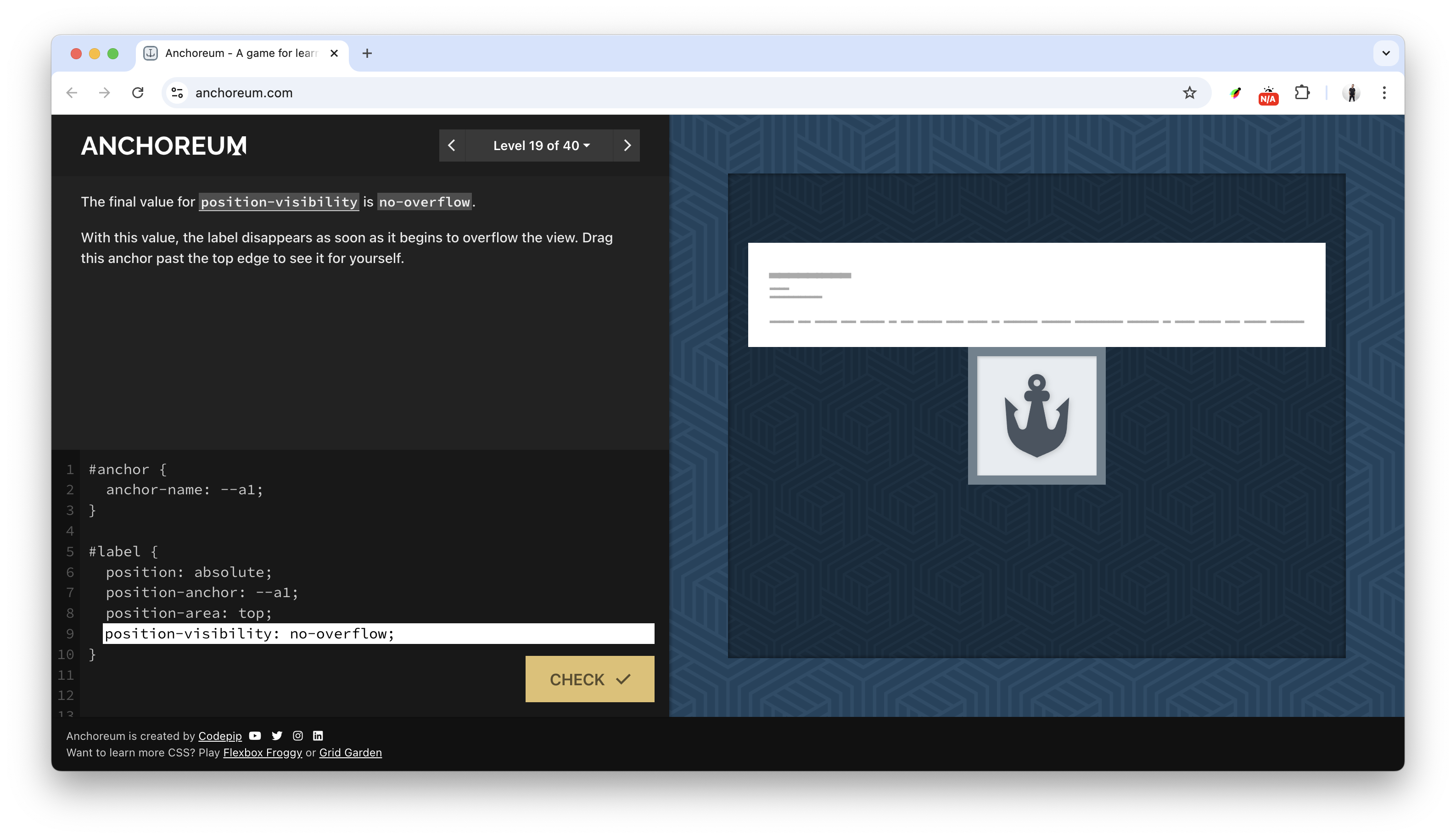
Need a rad way to learn CSS anchor?
Look no further than anchoreum.com!

39 today, wheeee…

For chill time I'm adding to this scroll driven animations notebook.
Some pretty wild stuff in there already, gettin wierder each bedtime routine.

New <footer>,
Went big.

New 404 page:

Ep #14
🎙️ Bad At CSS Podcast
Backend dev Lane Wagner, of boot.dev and host of Backend Banter FM, guests this week sharing what do backend dev think of CSS.
⤷ badatcss.com · youtube · spotify


Toolbelt worthy, powerful, and meaningful CSS you'll need for 2025.

Advanced attr() in
Chrome 133. Opening new
ways to integrate with CSS from your HTML:
<li scroll-snap="start"></li>
<li scroll-snap="center"></li>
[scroll-snap] {
  scroll-snap-align: attr(scroll-snap type(start | center | end));
}
Try it & learn more from Bramus @ Chrome Developers

My @container scroll-state() article is live!
developer.chrome.com/blog/css-scroll-state-queries
Stuck state:
Triggered when an element is stuck.
Snapped state:
Triggered when an element is snapped.
Scrollable state:
Triggered when an element is overflowing.

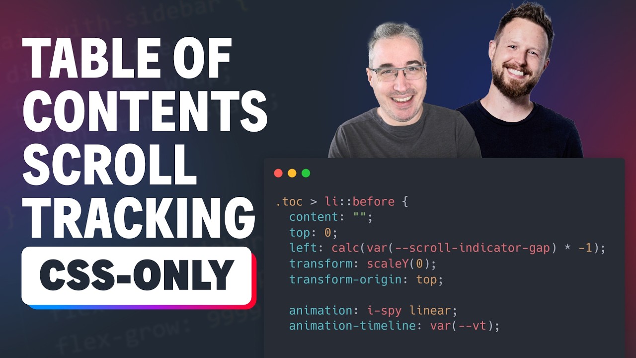
Pure CSS Scroll Spy Table of Contents
Kevin Pow()ell and I go over the CSS Wrapped 2024 site and break down the <details> scroll spy component to uncover the CSS scroll driven animation powering it.

A component library built on Open Props with the goal of using the newest HTML and CSS features.

My text-box article is live!
https://developer.chrome.com/blog/css-text-box-trim
Did you miss my text-box prediction?
Don't miss this interactive notebook, helpful for feeling out the effects and edge cases.


A collection of self hosted ObservableHQ CSS Notebooks

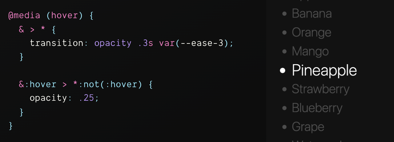
Focus by demotion.


Saw this on a skateboard, had to make it in CSS.
background: repeating-linear-gradient(
  to bottom,
  #000 0px var(--_stripe-size),
  #fff var(--_stripe-size) var(--_stripe-gap)
);
Ended up not just being gradient text, but a repeating gradient text effect 🤓
Fun: CSS can repeat a repeating gradient


Animated gradient text is like the poster child of AI right now. Gotta have that animated gradient text sparkle button thingy to be cool.
So here! Steal the recipe.

Earlier this year, I wrote 5 CSS snippets every front-end developer should know in 2024 on web.dev. I think it holds up!
Checkout the 6 snippet 2023 edition

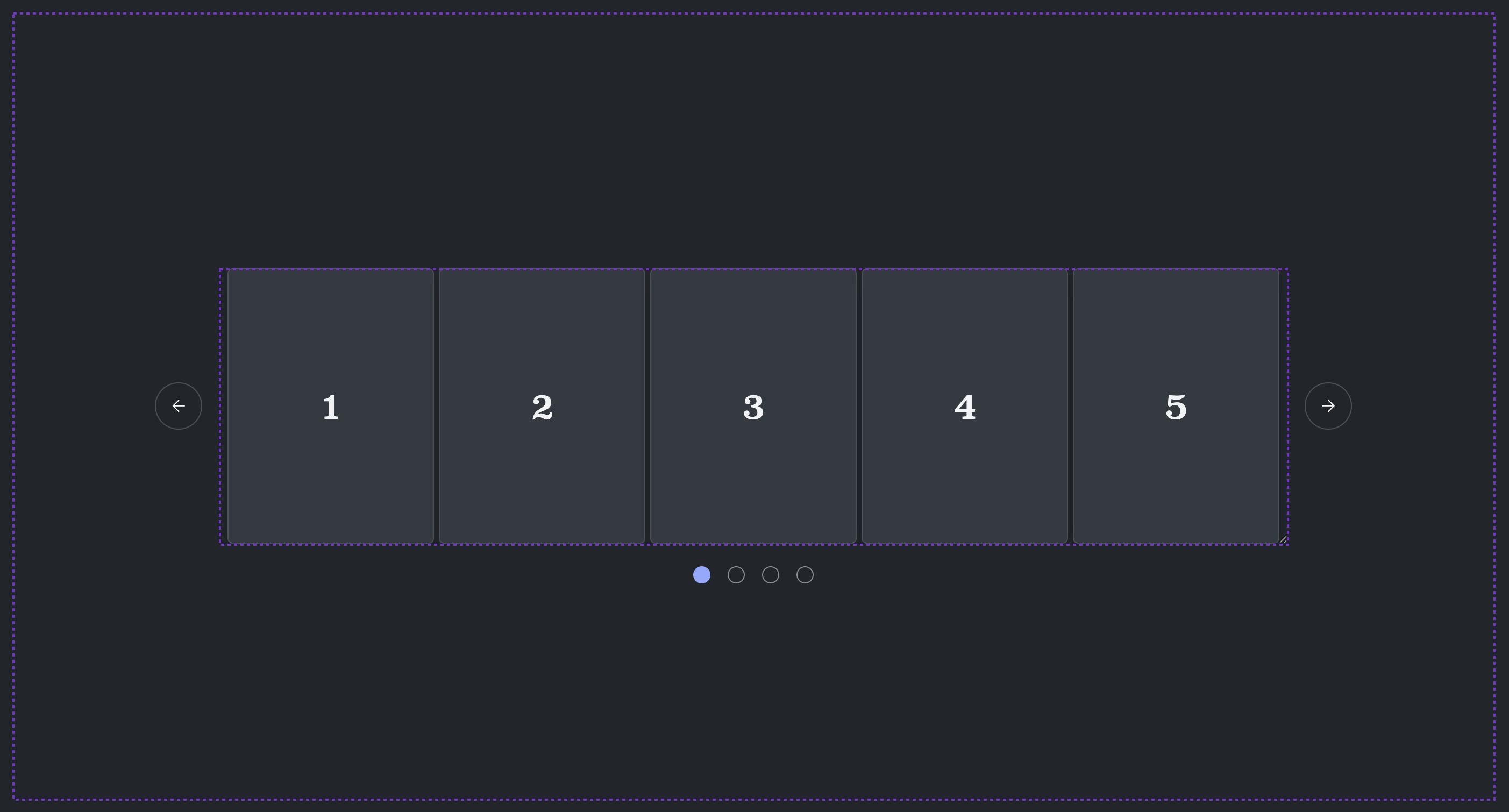
How to automatically adapt scroll buttons to the inside or outside based on available space.

Today marks 28 years of CSS!
"CSS1" created in 1996.


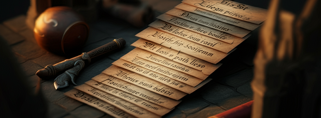
Holy crap I guess I want 15 more things!

It's cookie party day with our friends, but both kids are sick (and my spouse isn't 100% either), and we call in sick…
So, I bundled everyone on the couch, and we giggled (wrong family, too many hands, etc) our way through making cookies with AI.


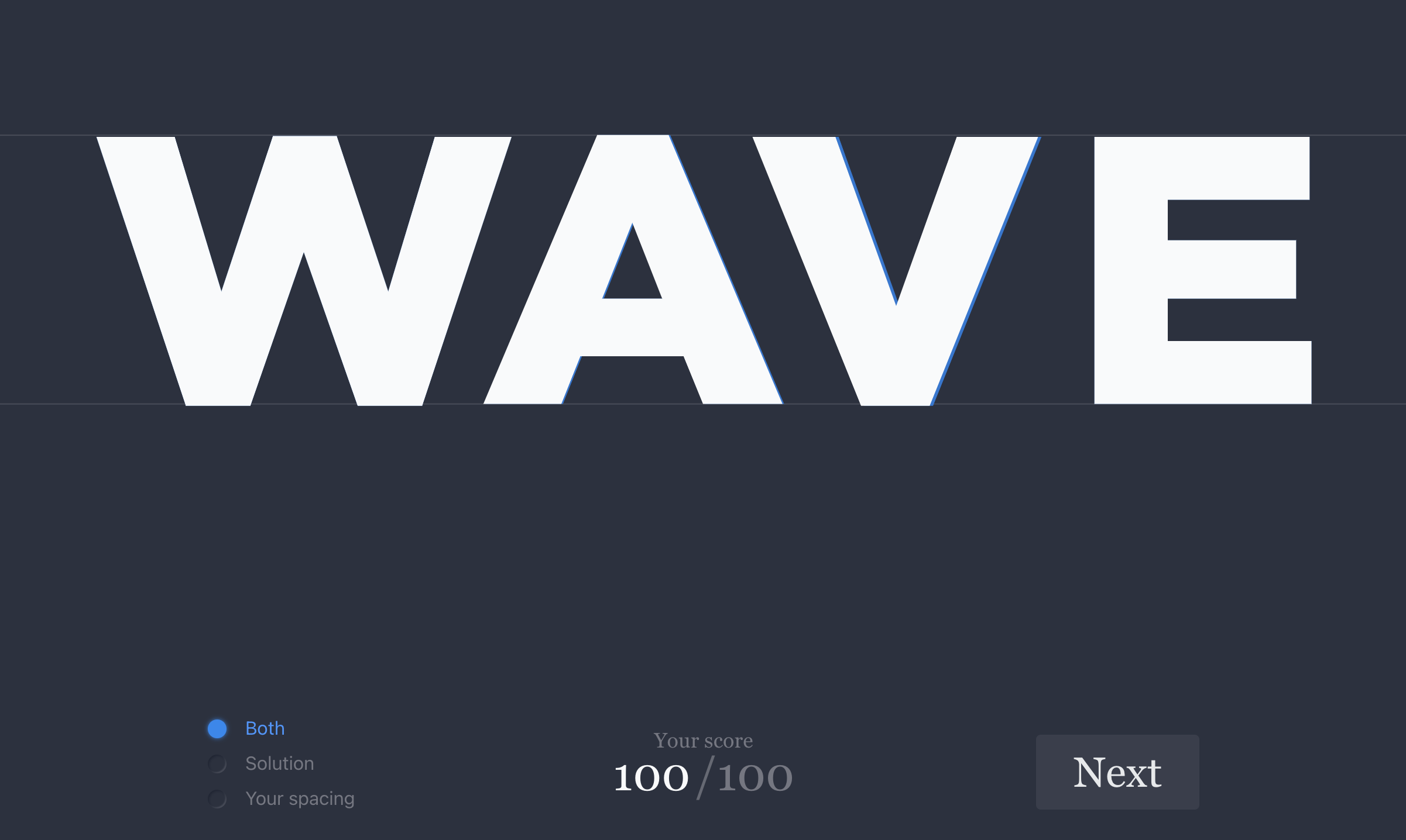
Test your eye, trust yer guts; be compared.
kerntype, a letter spacing game - by Mark MacKay
Can you kern?

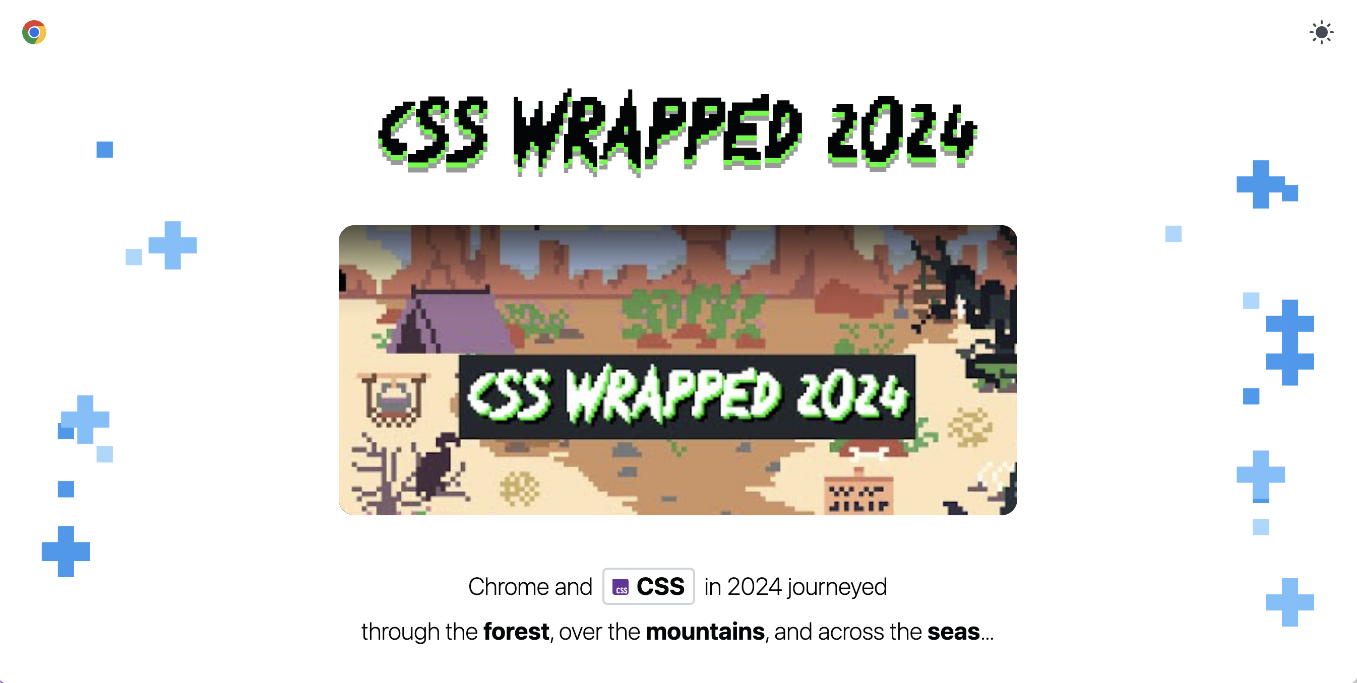
5 new CSS features for components, 4 for user interactions, and 8 for developer experience!

7 years at Google 🙂

Small update for gradient.style, the provided CSS for your creation is now custom properties and not classes.
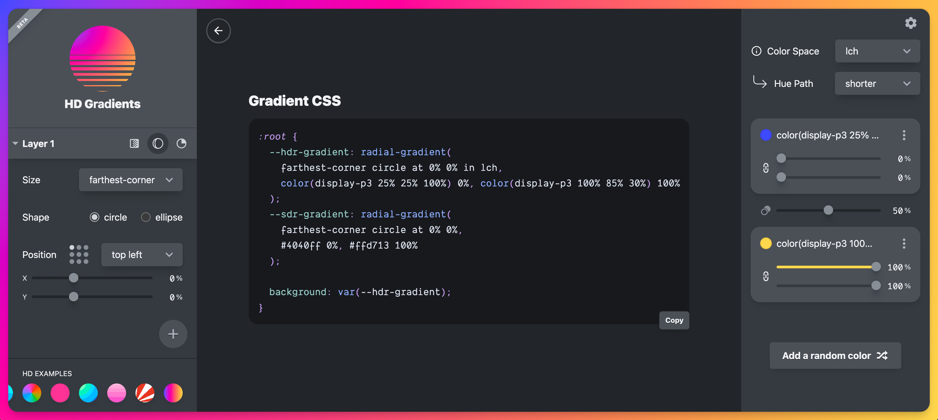

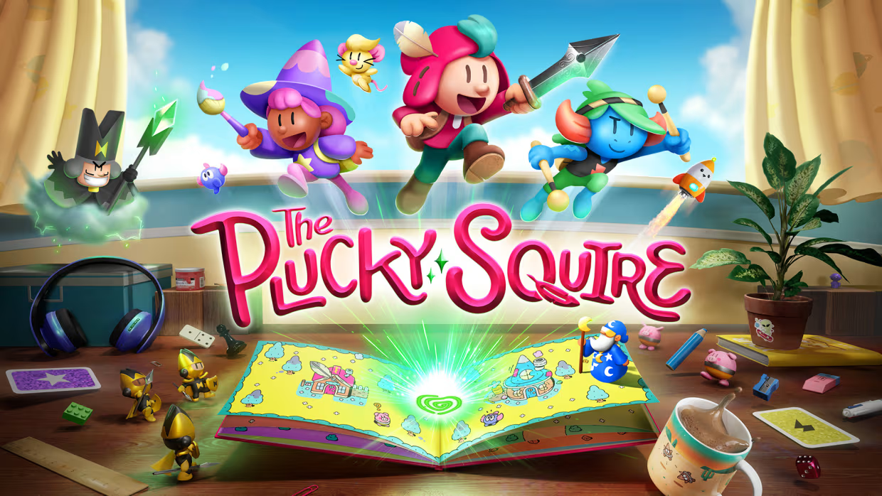
Oddada, Plucky Squire, Windblown, Tiny Glade, Driftwood, and an oldie but goodie Hidden In Plain Sight.


A few fancyish dialogs for you to steal.

UI Workshop
Sprinkle scroll driven animations, view transitions, popovers and container queries onto an ecommerce home page with me!


After many iterations, submissions and cycles of feedback, we're excited to share the communities logo result.

I've got an author page over on developer.chrome.com!

New Feature just dropped!

.card {
  aspect-ratio: 4/3;

  @media (orientation: portrait) {
    aspect-ratio: 3/4;
  }
}


How to combine page load keyframe animation that blends seamlessly with a scroll driven animation.

Just as @scope brought selector donut scoping to CSS (thanks Nicole!), so does interactivity: inert; bring donut inertness.
Try it on Codepen 🤘🏻💀
use Canary with web experiments enabled
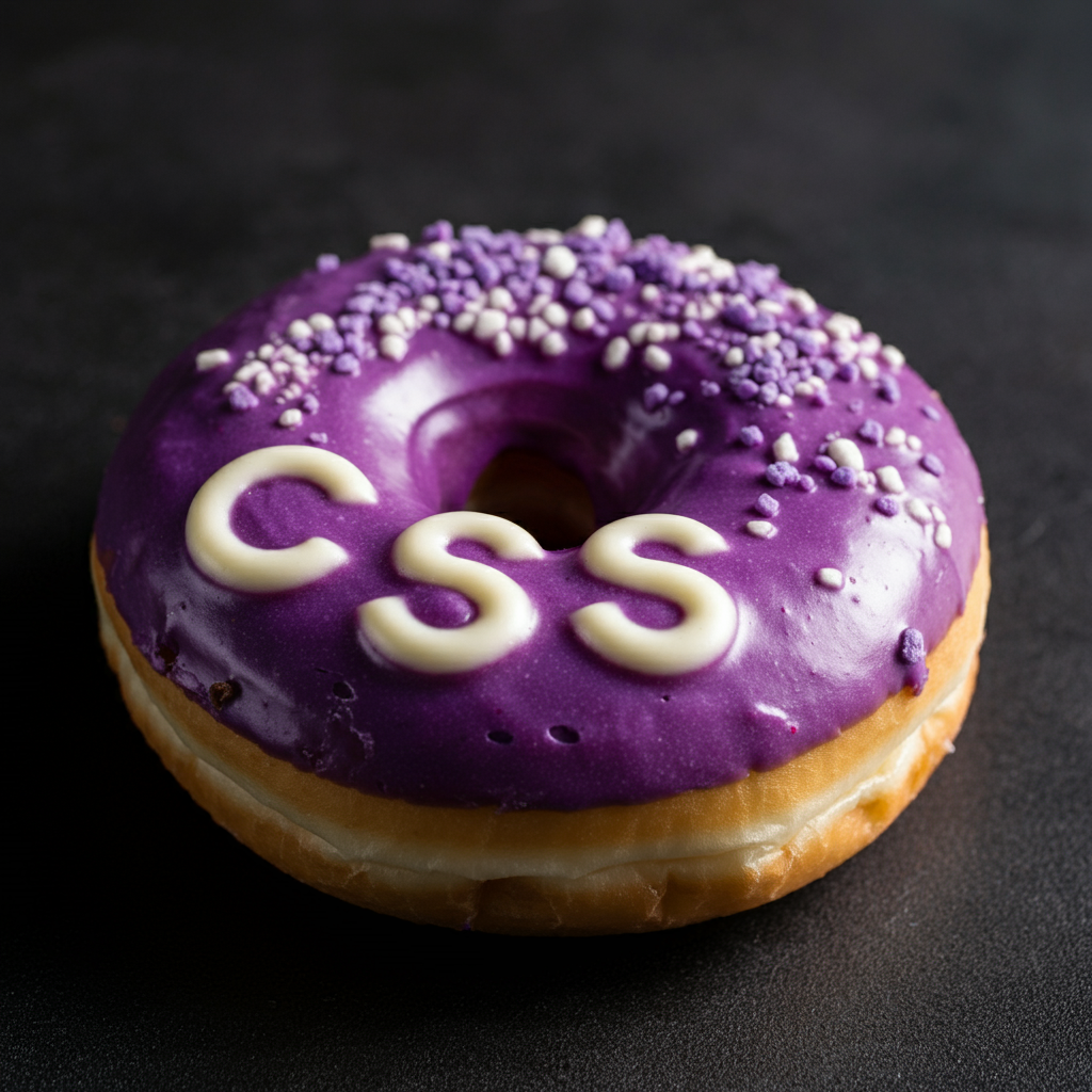

David and I join Robbie and Chuck on Whiskey.fm!


Muahahahahahaha!
Today is a great day.
🎃💀🦇

Watch the recording, peep the slides, steal code.

Species in Pieces
30 endangered animals, 30 pieces
2015 CSS throw back to the super rad clip-path project from Bryan James, which includes a making of post on Smashing Magazine!

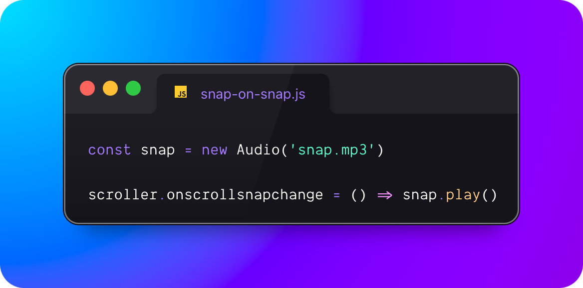
Play a 🫰(snap) when CSS snaps!
const snap = new Audio('snap.mp3')

scroller.onscrollsnapchange = () =>
  snap.play()
Note: you may need to click/tap before scrolling, for the browser to deem playing the audio as user activated.


It's Halloween month, let's talk about UI abstractions.

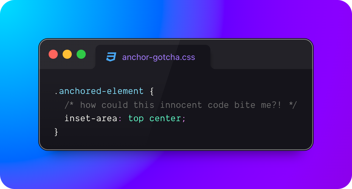
Learn from my anchor() and position-area mistakes.

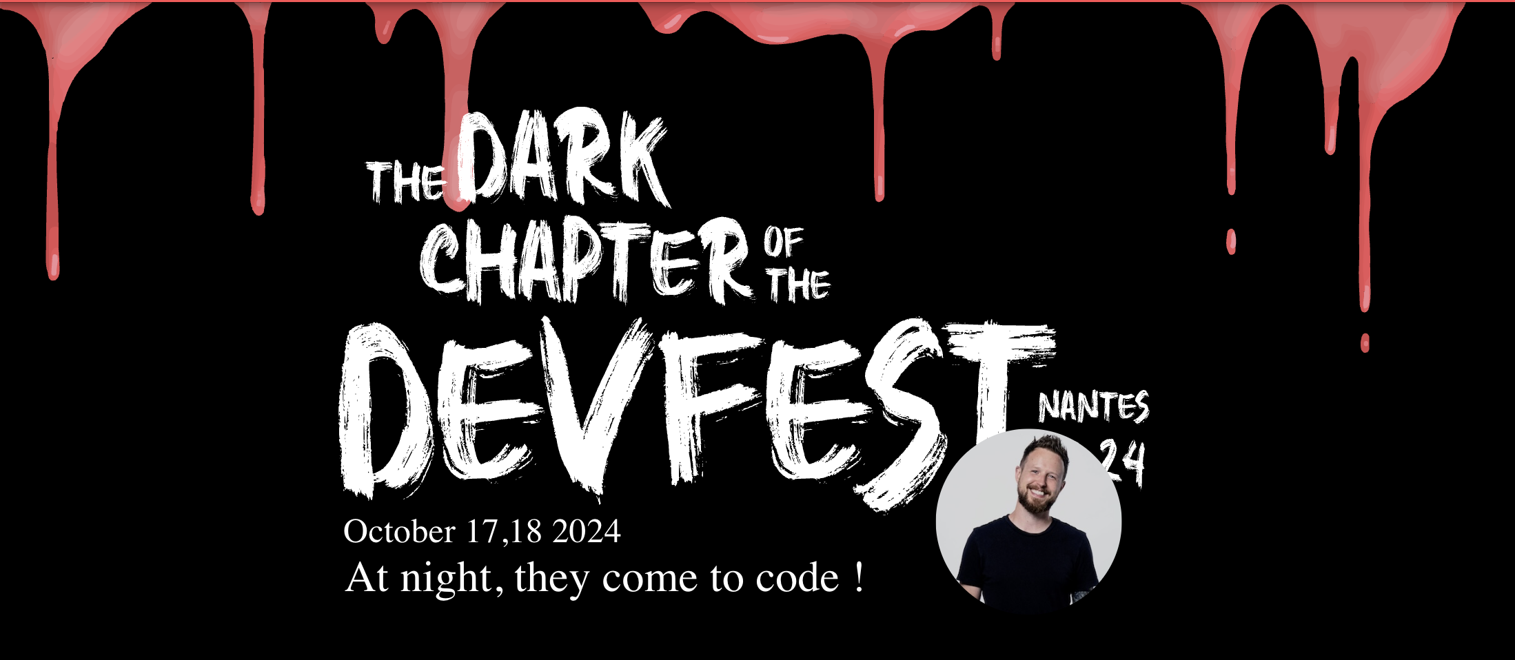
See ya in Nantes, France for DevFest! Watch out for my talk on Amazing CSS in 2024.
Ep #91
Season 5 Wrap
Una and I recap our favorite moments from the season: popovers, dialogs, top layers, trig functions, color functions, :has() tricks, balanced text wrapping, linear() easing, nesting, anchoring, state queries, view transitions, and scroll driven animation.
What a year for CSS!

Bramus investigates and reports on CSS custom property performances. What are the performance inpacts of registered and unregistered custom properties?


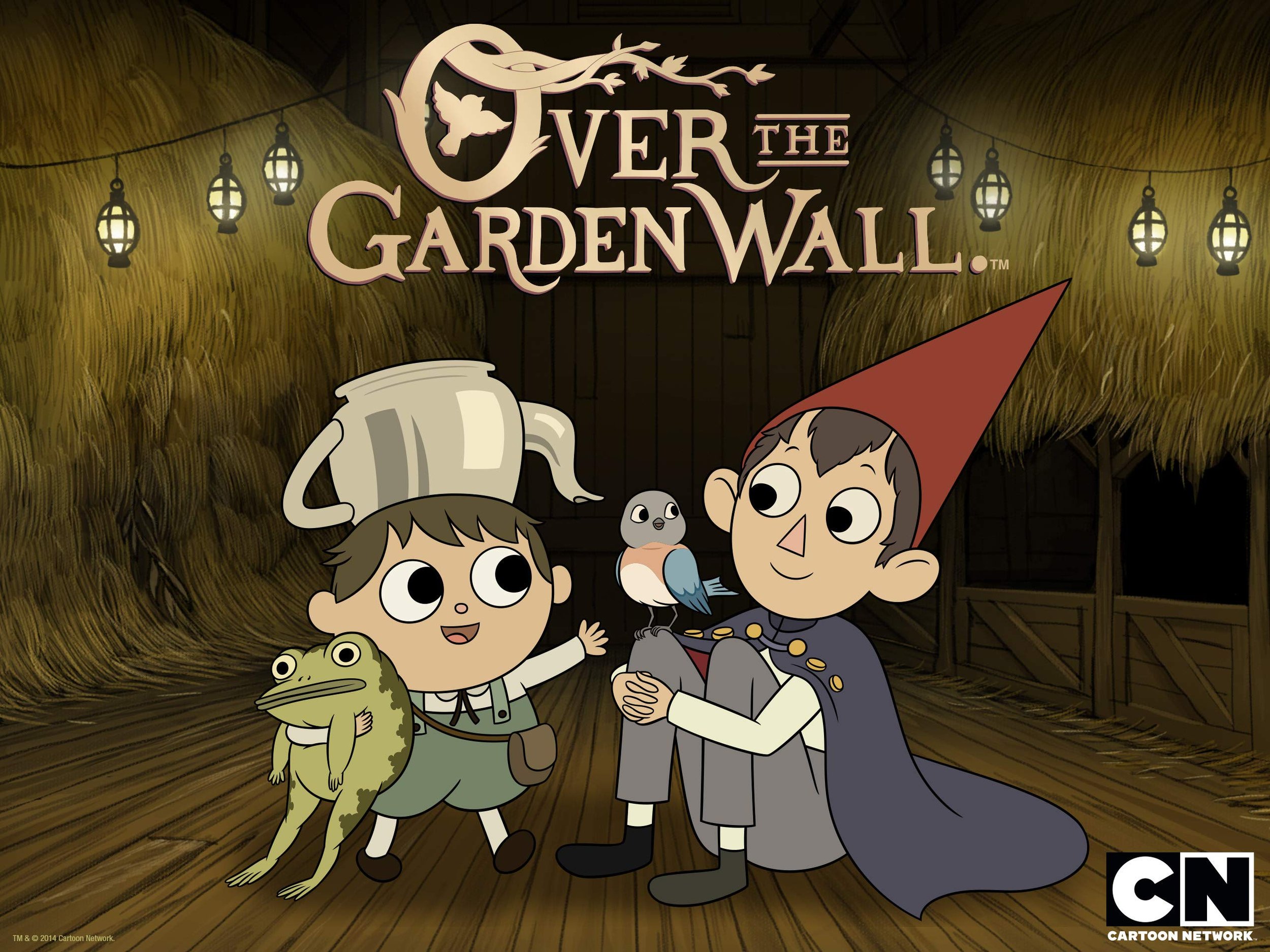
That time of year to watch Over The Garden Wall (trailer)

Ep #90
Scroll-Driven Animation
Una, rad special guest Bramus, and I break down scroll-driven animation!
For more learning and information, checkout Bramus' YouTube Series and his awesome tool scroll-driven-animations.style.


![details { inline-size: 50ch; interpolate-size: allow-keywords;
&::details-content {s opacity: 0; block-size: 0; overflow-y: clip; transition: content-visibility 1s allow-discrete, opacity 1s, block-size 1s; }
&[open]::details-content { opacity: 1; block-size: auto; } }](/media/transition-details.png?__frsh_c=j9g9rst1q0qa)
Your boilerplate starting place for <details> transitions

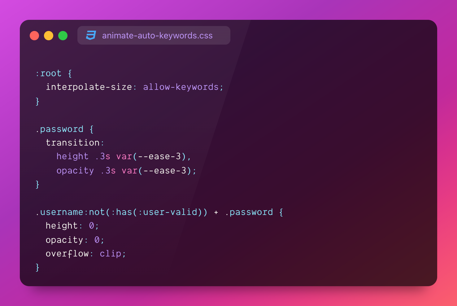
Animate to height or width auto with 1 CSS snippet

Bring some color and intrigue to a <dialog> or [popover] with an animated radial gradient box shadow.
Def jump in and try customizing the colors 🤘🏻💀

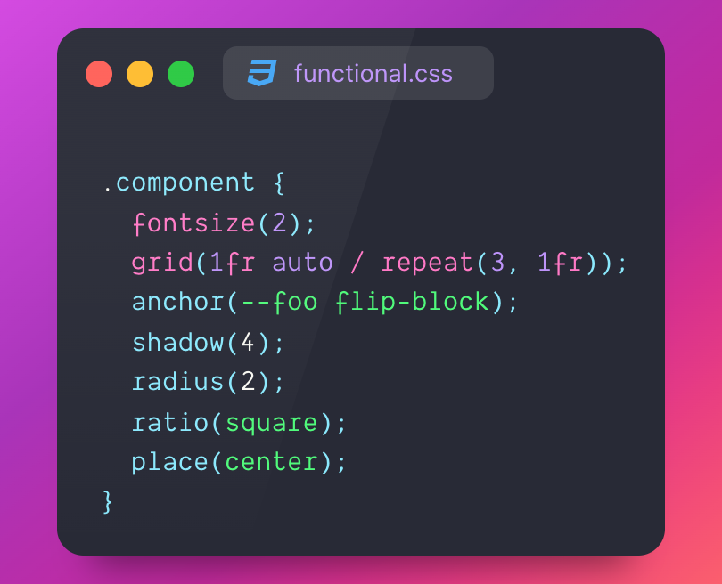
Love it or hate it?

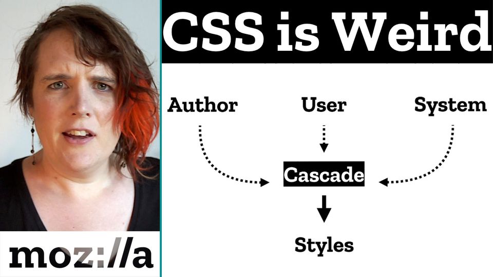
A memorable video from 2019:
Video: "Why Is CSS So Weird?".
Miriam Suzanne explains how CSS is solving a weird problem, yet is guided by meaningful principles; shaping it into the powerful and complex tool it has become.
There's also a blog post.

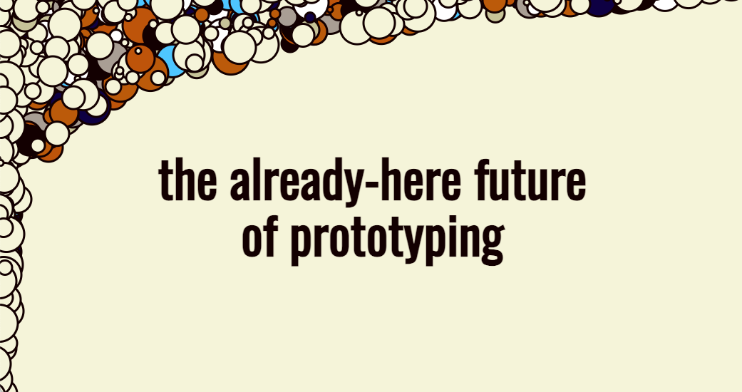
Brad Frost shows on YouTube and a blog how LLMs (Cursor and Claude in this case) are helping him create, iterate and ideate over web design. He poses a question at the end; maybe you don't need static comps.
He asks for a funky design; it got funky.
He asks for a form; got a form.
My favorite moment was when he had Cursor rewrite the styles to use Open Props; really nice that it can unite values into tokens with reasonable logic.

Ep #89
View Transitions
Una, rad special guest Bramus, and I explain view transitions!

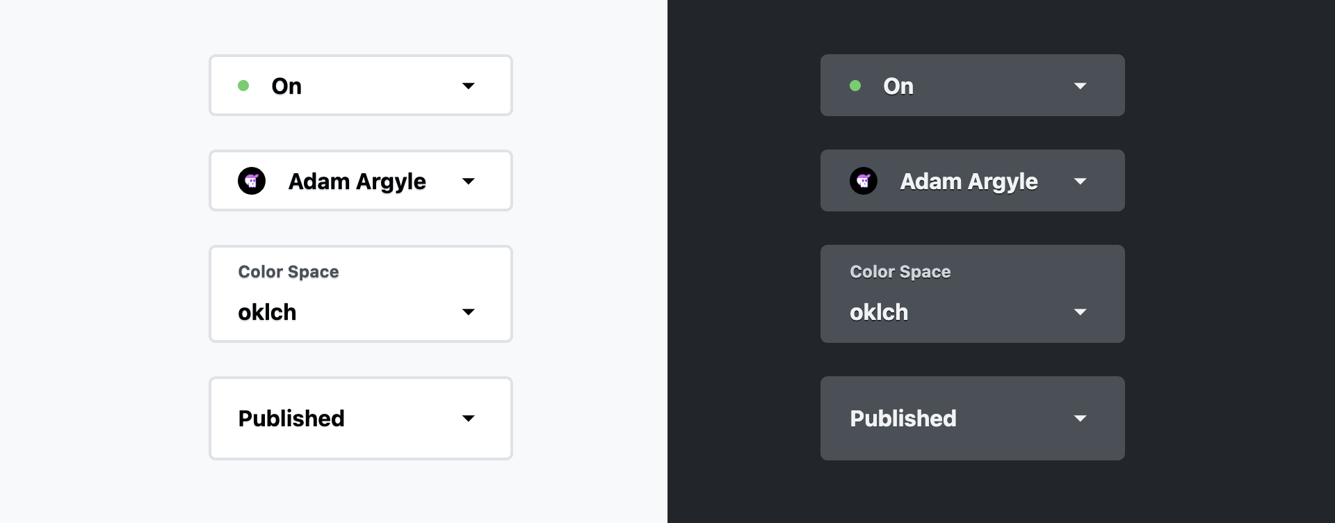
You're going to want this code when you go to kickoff customizing select elements.

Bring a rad clip-path transition to your light/dark toggle switch with a progressively enhanced view transition.

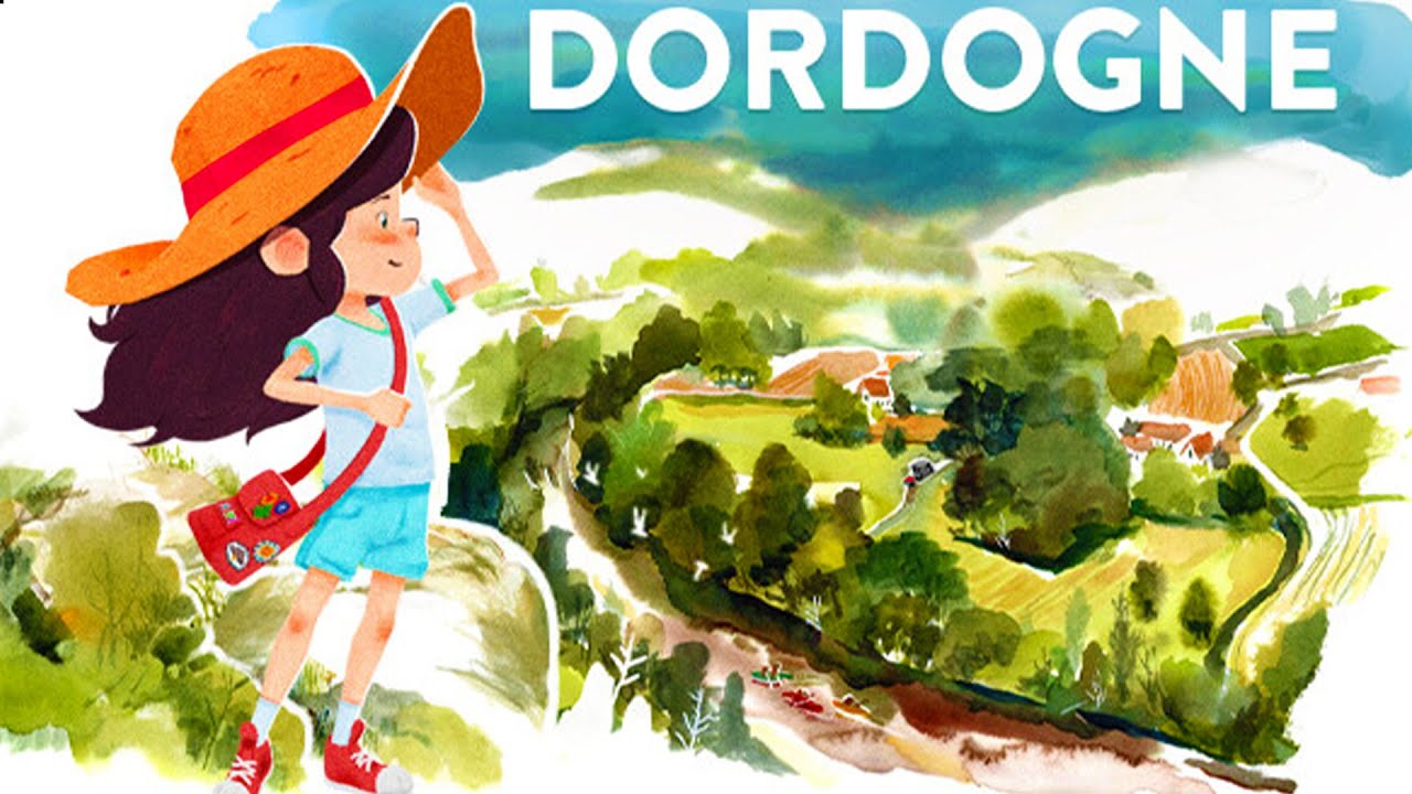
A fragile egg puzzle platformer and a beautiful, hand painted, storydriven water color art experience.

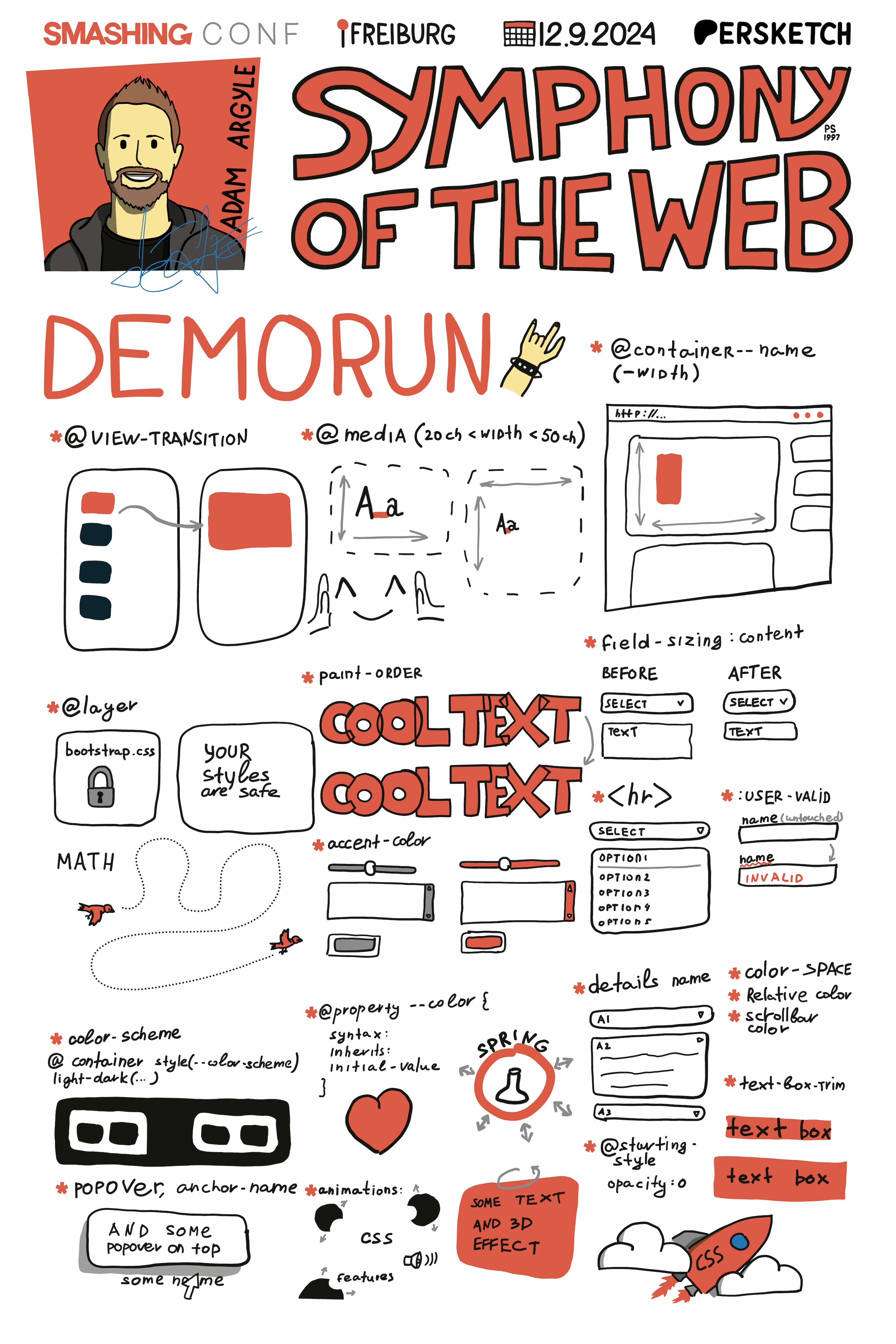
Artem Pendiurin, aka ErSketch, took SmashingConf visual notes in Freiburg.
They turned out rad, here's the one from my talk!

Ep #88
State Queries
Una and I explain State Queries, specifically the scroll queries using @container scroll-state().
Share any state queries you'd like to see with the CSSWG here or here!
Watch · Listen · Show Notes

Ep #13
🎙️ Bad At CSS Podcast
Matthias Ott is the guest this week! Their keynote talk Web Design Engineering With the New CSS was so rad at CSS Day 2024, we had to chat.
⤷ badatcss.com · youtube · spotify


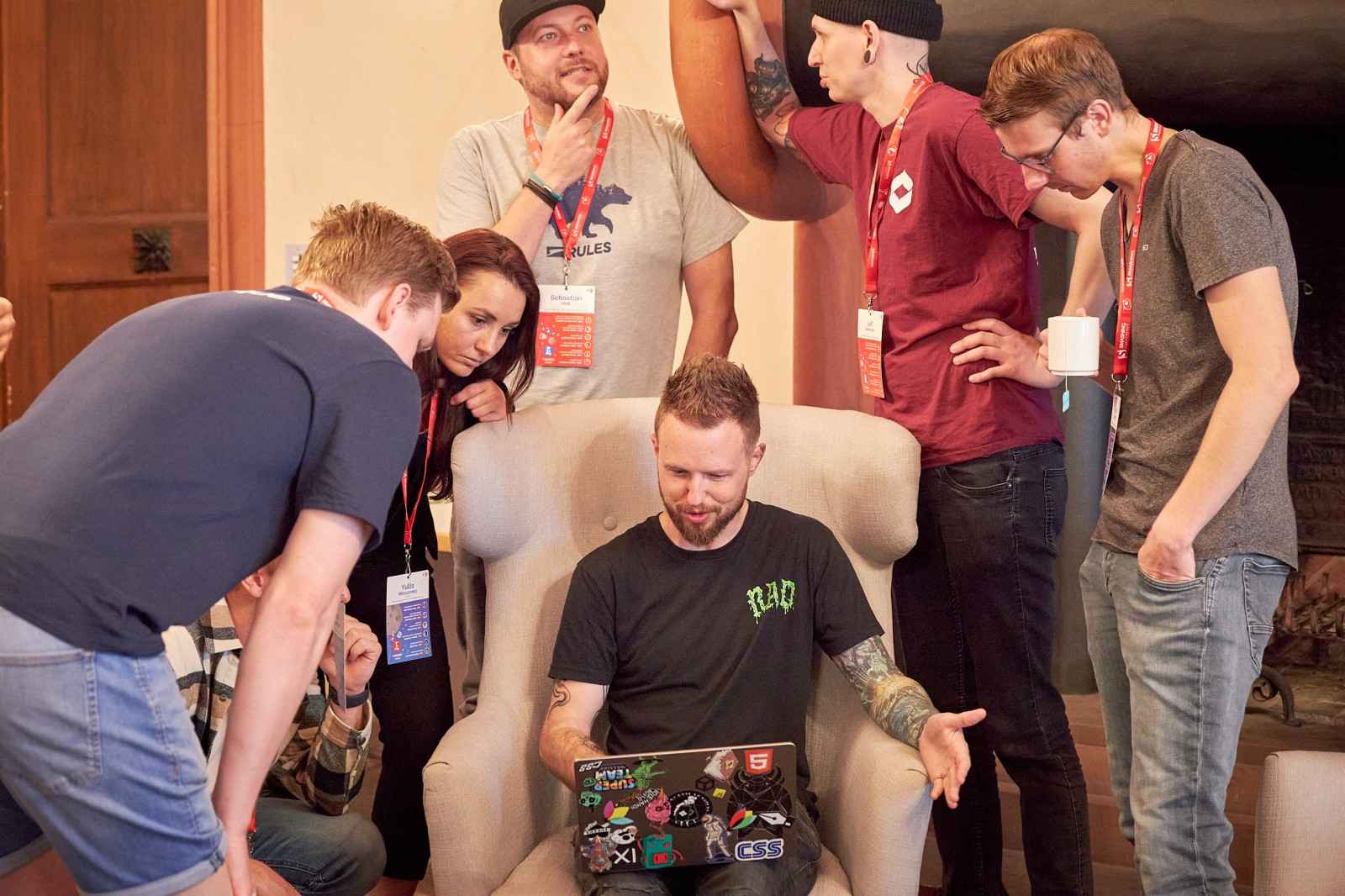
My "Tik Talk" at Smashing Conf went great! Will share the video when it's available.
Until then, here's everyone's favorite picture from the event. They're calling it The CSS Renaissance 🤣

Arrived in the beautiful, green, city of Freiburg for Smashing Conf.
It's a mystery why I'm here 🕵️


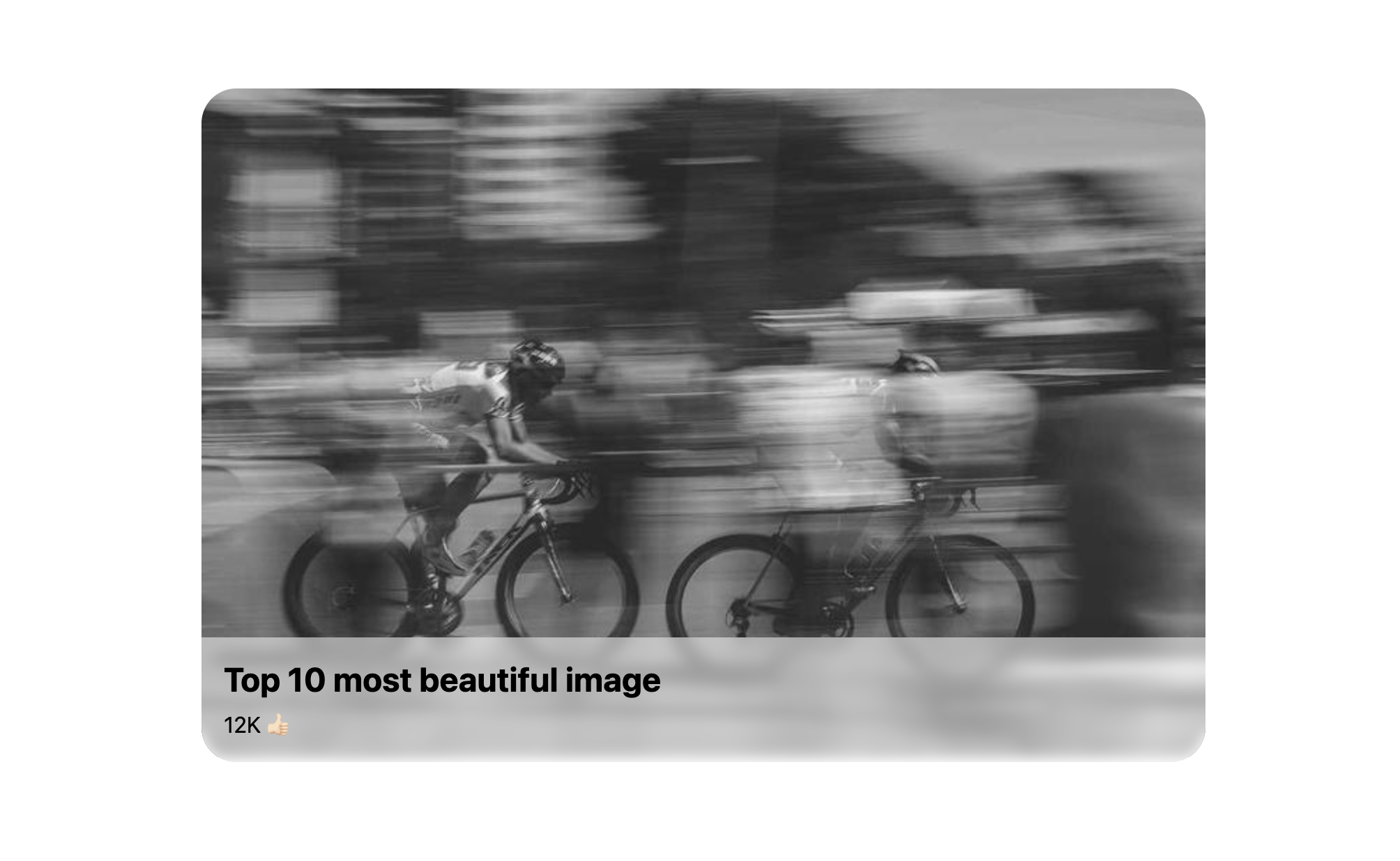
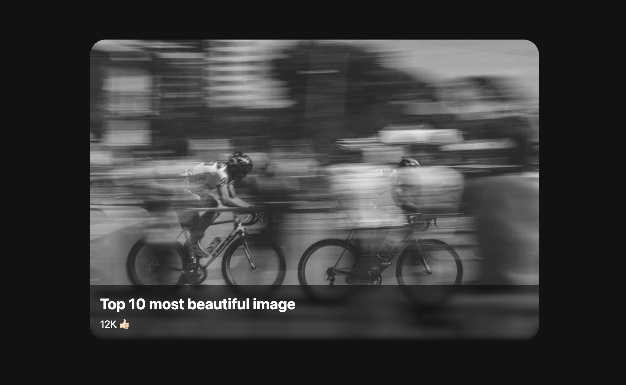
Combo light-dark() with Temani's great border-image techniques.
.card > figcaption {
  color: light-dark(#000, #fff);
  border-image: fill 0 conic-gradient(light-dark(#fff8, #0008) 0 0);
}

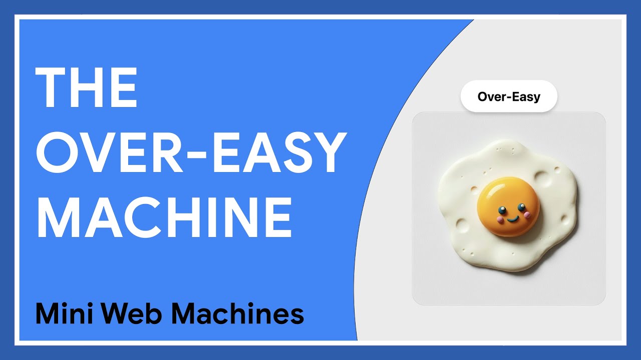
anchor()position: absolutepopover elementsTry the machine:
Basic · Author Cards · Animated Popover
The latest Mini Web Machine on Chrome Developers
Tiny bits of code that power great UX.

Ep #12
🎙️ Bad At CSS Podcast
Estelle Weyl and Eric Meyer join to discuss their book CSS The Definitive Guide 5th Edition, and of course chat about what CSS they're bad at.
⤷ badatcss.com · youtube · spotify


This line of code is about to be in every single stylesheet.
h1, p, button {
  text-box: trim-both cap alphabetic;
}
Centering in CSS is about to get even finer grained.


Some of these functions look hot!

Una and I chat with Wes Bos and Scott Tolinkski of SyntaxFM about the CSS4 and CSS5 RFC plus we dig in to some experiments in Chrome Canary (text-box-trim and scroll-state() queries).
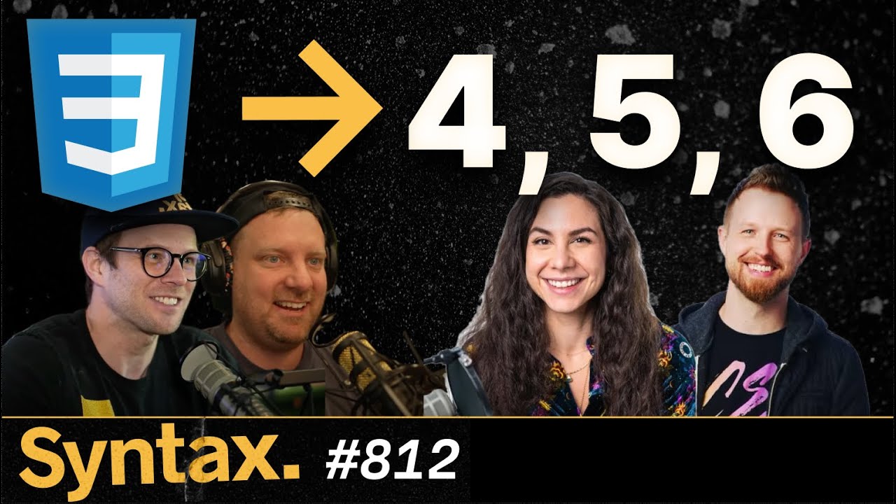

Ep #87
Anchor Positioning

Excellent post on the CloseWatcher API by Abdelrahman Awad.

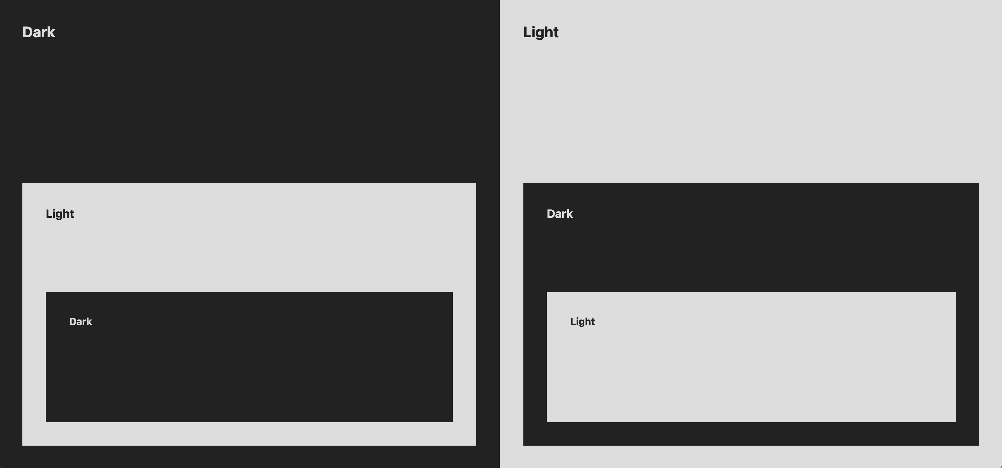
Three solutions, one for today and two for tomorrow


Frostapalooza rocked! So many musicians, all coming together JIT, and… takin. down. the. house!!
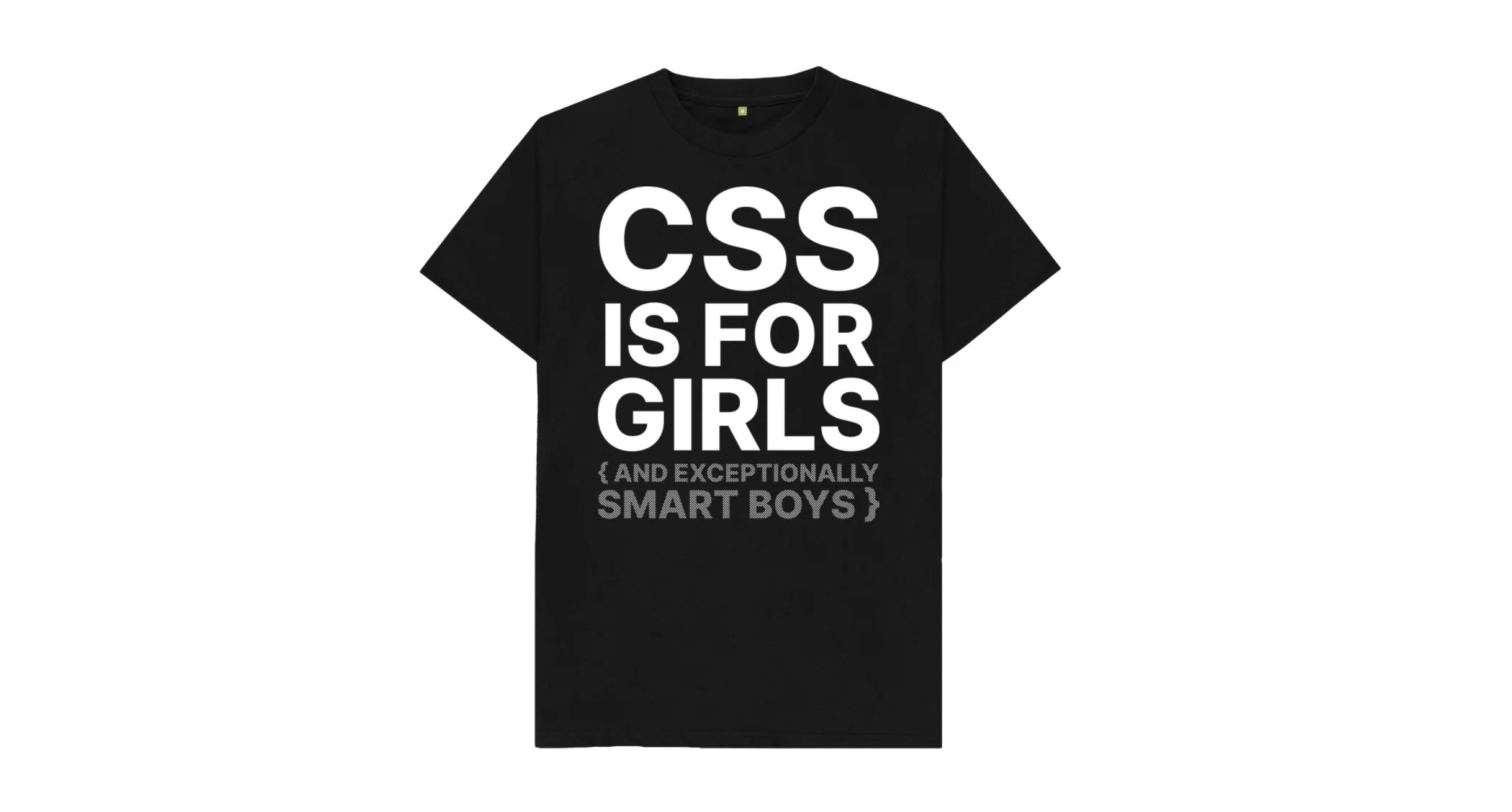
Get yer own "Kiss My CSS" shirt here 🤘🏻💀🤘🏻



Scroll Snap + Scroll Driven Animation carousel
💡 in the mobile size it looks a lot like the iOS app switcher eh?

Scroll to 3D space travel through CSS4 and CSS5.

Learn all about the new scrollSnapChange and scrollSnapChanging JS events.
Or try this nifty Snap Event Visualizer 🤘🏻

Ep #11
14 CSS talks in 1 hour
⤷ badatcss.com · youtube · spotify


Lane Wagner and I chat CSS
⤷ Backend Banter · youtube · spotify


Join me in Beijing‽
I'm giving a workshop that'll use CSS to add some rad upgrades to a store page.


Ep #85
linear() easing
Una and I cover the linear() easing function, breaking down the API, tools for generating them, and libraries that can make adoption nice and easy.

Ep #4
Pop n' Lock
<dialog> basicstop-layer, transition-behavior and overlay explained<dialog>The latest Mini Web Machine on Chrome Developers · Tiny bits of code that power great UX.
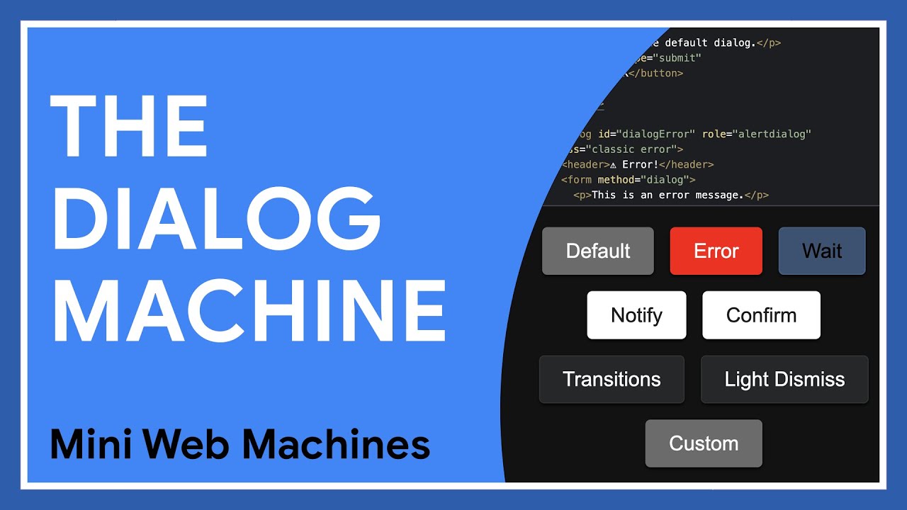

being on top of everything has never been so easy
<dialog>

Ep #84
Text Wrap


Jason and I "install it" 🤣

Lakitu is an OG cloud nerd.


Ep #83
:has() tips and tricks
Una and I expand on episode 61 about :has() by focusing specifically on use cases, tips and tricks. Get inspired and discover new ways to make reactive UI from CSS.

Videos from CSS Day 2024 are releasing weekly! Rachel Andrew's on Layout and Reading Order just dropped today!
& don't miss this one by Matthias Ott called Web Design Engineering With The New CSS.


:whispers: CSS motion blur

Ep #82
What's new in color functions
Una and I catch you up with the latest changes to color functions.

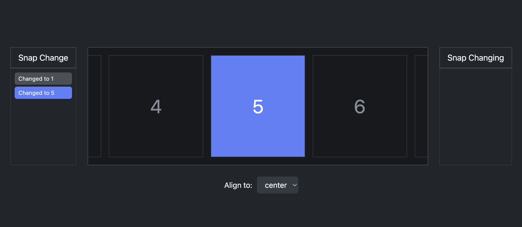
Preview two new JS events:scrollSnapChange & scrollSnapChanging
Watch me as I explain what's happening in this scroll snap event visualizer.
Try it in Canary by turning on #enable-experimental-web-platform-features

Ep #81
Trigonometric Functions
Una and I make math practical for the UI Engineer by avoiding the complex side of the mathematics and instead, focus on use cases.
This is the episode about math in CSS we've always wanted. Follow along as we surprise ourselves over and over with how inspiring the applications of these concepts are.

Ep #10
🎙️ Bad At CSS Podcast
David East and I dive into a list of things we think are time wasters disguised as time savers.
⤷ badatcss.com · youtube · spotify


What's in your toolbelt?

Calendar prototype with sticky headers:
⤷ try it on Codepen
or checkout an SSR fork from tbeseda on Mastodon that can render many years 🤘🏻💀

![a code example is shown where &[class*='--github'] is the crucial key to simulating a BEM modifier class](/media/bem-in-css.png?__frsh_c=j9g9rst1q0qa)
Vladyslav Zubko has the cure?

At the rad CascadiaJS conf today in Seattle.
It's beautiful outside, cool cats inside; stoked for 2 days of learnin and chin waggin.


Ep #80
Animating to and from top-layer
Una and I went over popover and dialog last week, and this week we're helping you animate and transition them! Learn about @starting-style, overlay, :top-layer, ::backdrop, transition-behavior, :popover-open and much more.

Ep #79
Popover and Dialog
Una and I are back in Season 5 of the CSS Podcast! We discuss popover and dialog, how they're different, and how to animate them.
Popover and dialog are both Baseline now 👀

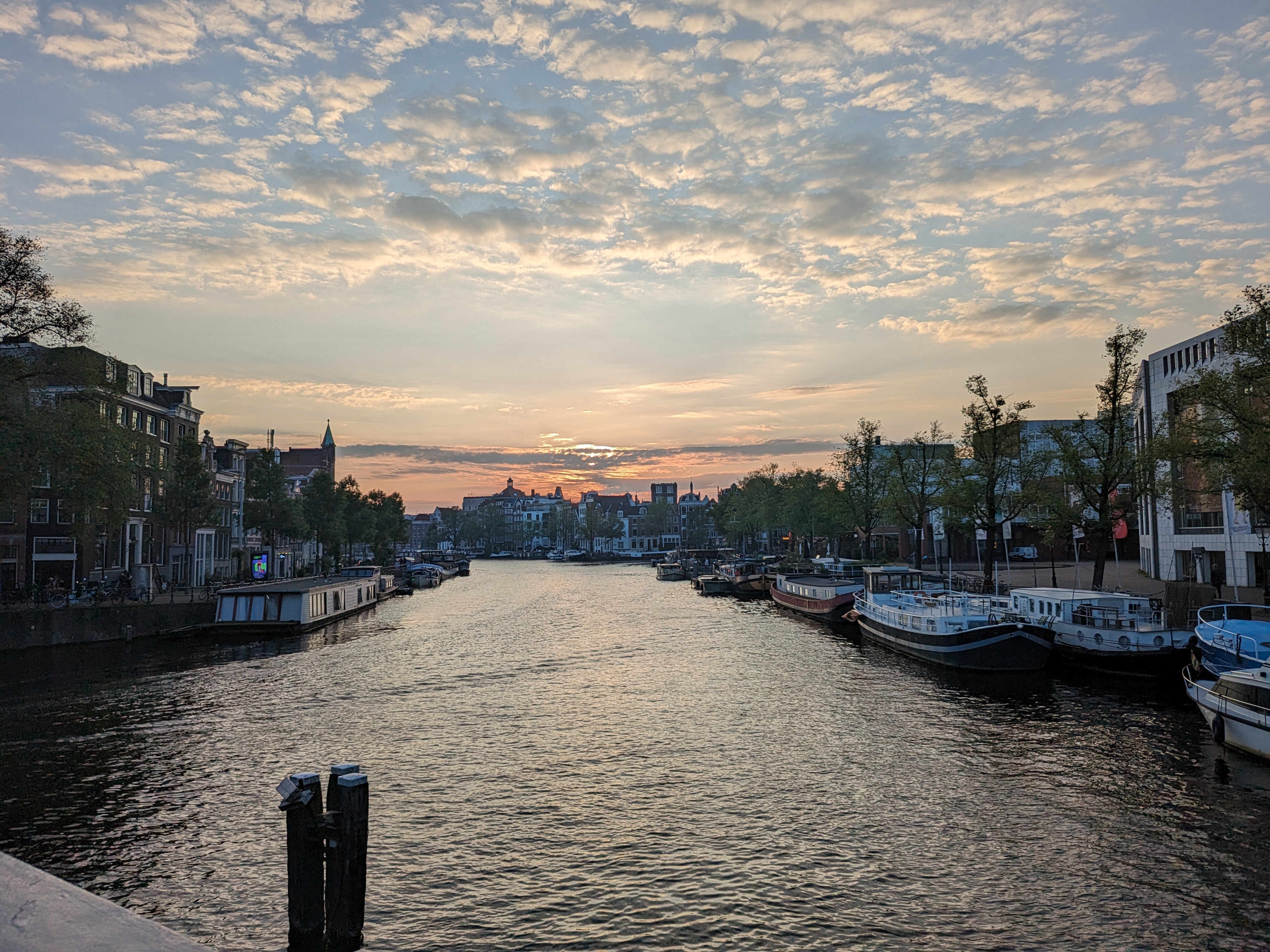
So excited to be back in Amsterdam for CSS Day! Find me at a booth, ask me about CSS carousel, typography, devtools, or whatever! See you there!
Find the videos here if you can't make it, they're super worth it.

Ep #9
🎙️ Bad At CSS Podcast
David East and I discuss (and show on YouTube) how rad single keyframes can be.
⤷ badatcss.com · youtube · spotify


Physics in CSS!
I transferred a JS physics function into CSS thanks to sqrt(), exp(), sin(), cos() and @property.
:root {
  --mass: 1;
  --stiffness: 100;
  --damping: 5;
  --start-velocity: 0;
}
Check it out on Codepen. Change the properties and see a different animation.

There's a whole next level of CSS centering that's about to land on y'all and blow yer mind.
I warned you.

Ep #3
The Looper Pile - Mini Web Machine Fusion
⤷ layout a "Looper" with the "Pile"
This episode represents the overarching theme of the series! Combining small bits of code together can be a great way to build larger experiences.


Prefer the light or the dark mode? Try it on Codepen.

Ep #8
🎙️ Bad At CSS Podcast
David East and I discuss container queries and try to tell you everything you'll need to know.
⤷ badatcss.com · youtube · spotify


Microsoft Build, that was fun!
Chuck and the Whiskey Web and Whatnot show, that was SUPER fun.

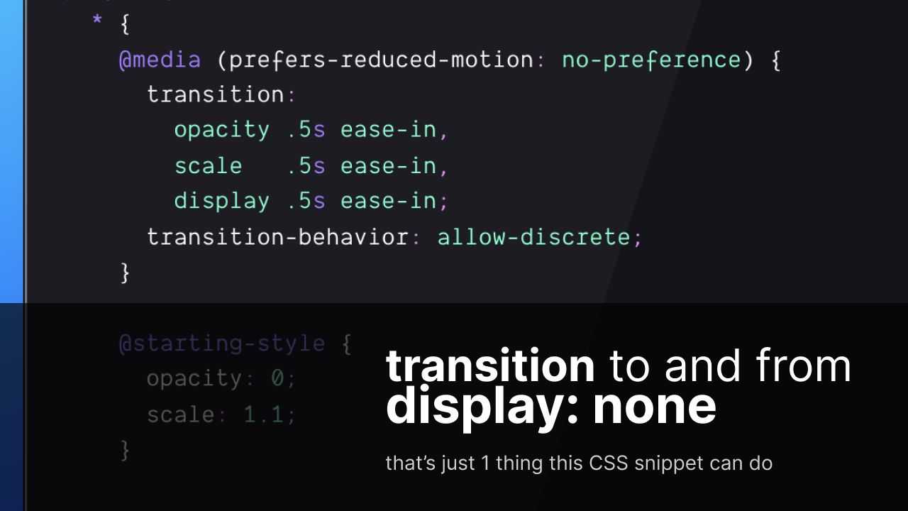
How to leverage first render and display: none as transition triggers for any element

August 17th - @Mr. Smalls Theater
Frostapalooza!
I'll be playin guitar 🎸 in 2 ✌️ songs at a benefit concert extravaganza called Frostapalooza; for Brad Frost's birthday!
You should come! Snag a ticket


Normally @keyframes would be used for this technique, but with @starting-style we can transition.
* {
  transition: opacity .5s ease-in;
  @starting-style { opacity: 0 }
}
Triggers via:
none to a visible display valueI feel like there's more use cases to explore. Let me know what you find‽

CSS4 RFC is live and ready for community feedback!
The CSS4 Community Group has been meeting weekly to categorize every CSS feature into CSS3, CSS4, and CSS5.
Yep, you read that right, CSS5.
We want to hear from you. Help us ensure we've mapped the features into buckets you agree with, can teach, can learn, and can grow with.


Ep #2
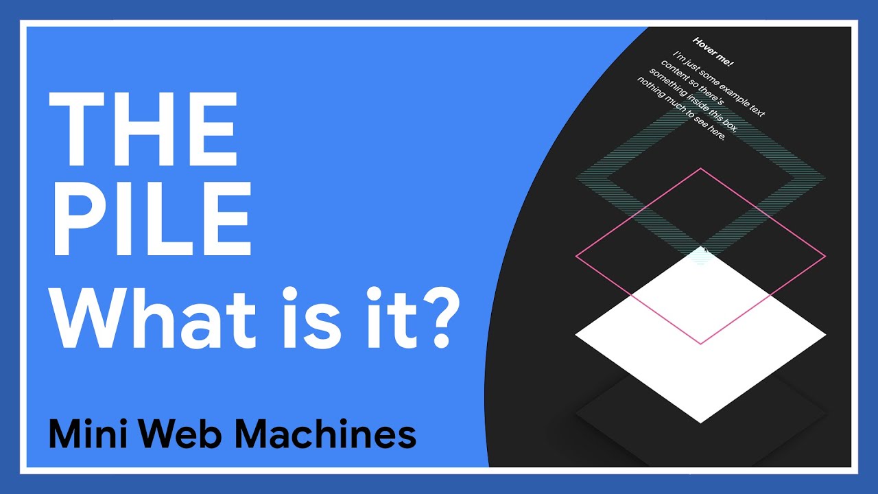
The Pile
position: absoluteThe latest Mini Web Machine on Chrome Developers · Tiny bits of code that power great UX.

The rad Kevin Powell and I share our favorite CSS features that aren't new but are seldom used.
How many of the 23 did you know‽

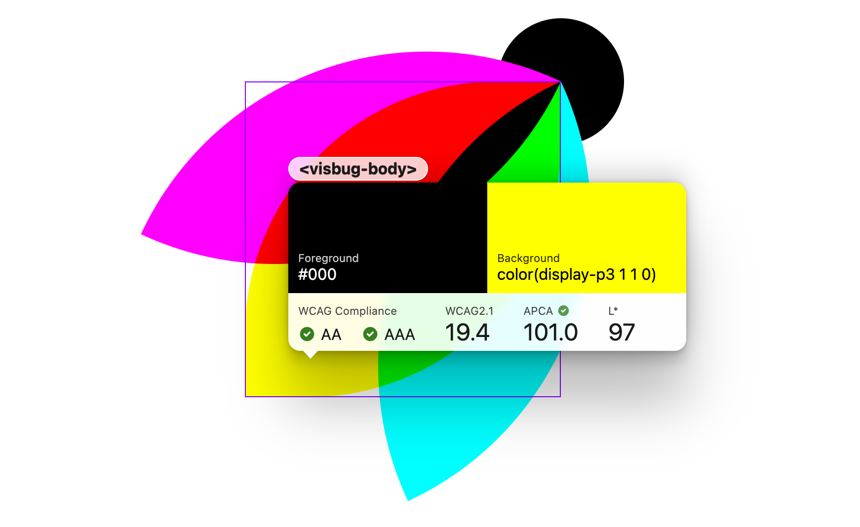
Some much needed updates are ready for y'all!

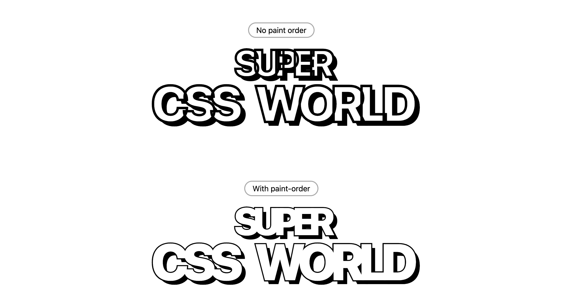
Here's a fun use case for CSS paint-order

Introducing the GUI Challenges series successor:
Mini Web Machines!
Tiny bits of code that power great UX.

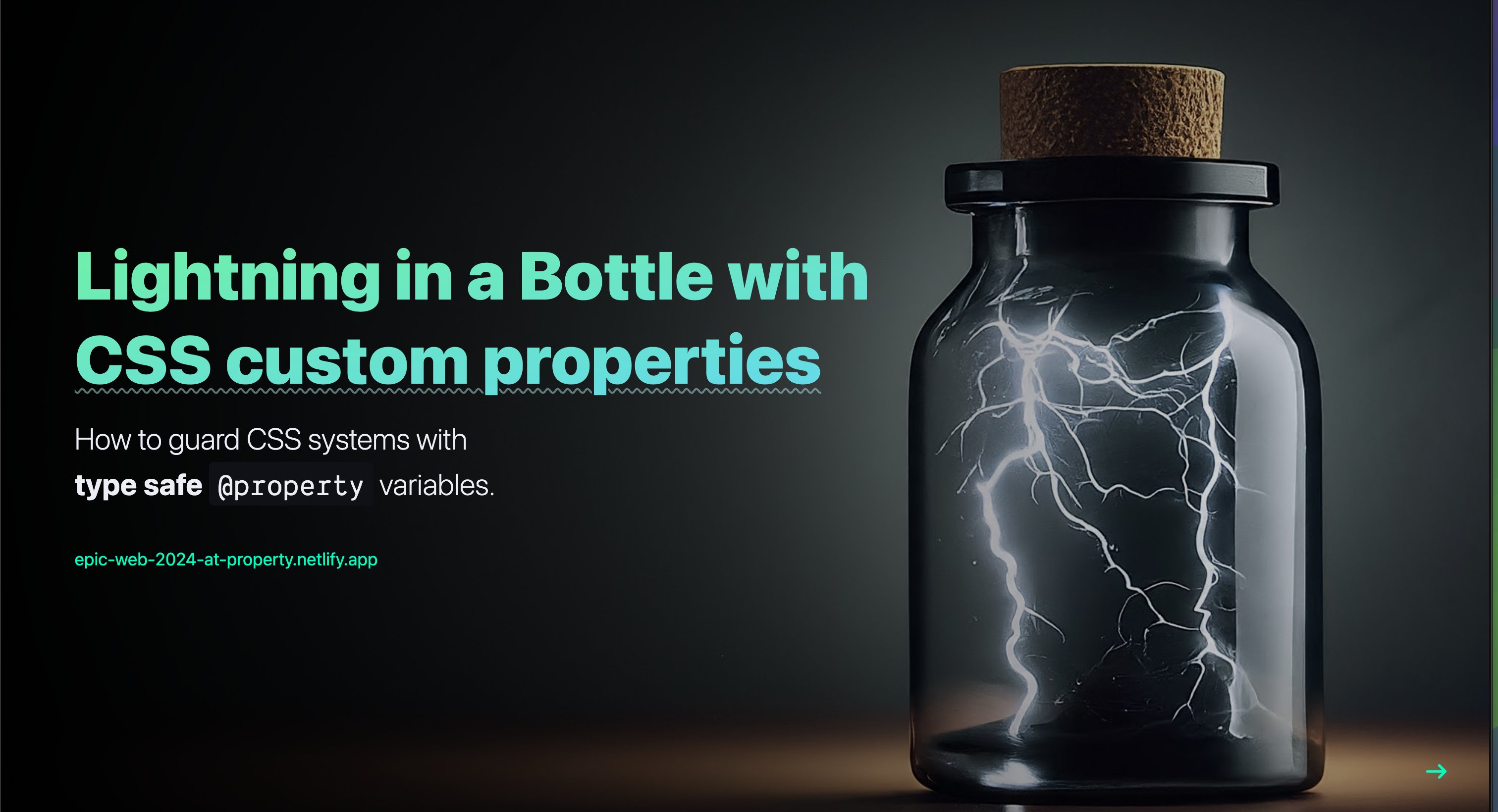
I had the pleasure of speaking at Epic Web Conf in Park City, Utah!
My talk was titled:
Lightning in a Bottle with CSS Custom Properties
Took a workshop on Remix and Shopify, watched to great talks about the web, OneWheeled, and hungout with Kent, Una, Chan, Annie, Ryan, Theo and many more 🤓
Lovely event, people, & location.

Screen shakes are so cool in video games…
Web buttons can do that!

A gradient border image, transparent at the edges, looks like it thins out as it fades out.
.effect {
  border-image:
    linear-gradient(
      transparent,
      var(--indigo-6),
      transparent
    )
    1 / 4px /* slice n' size */
  ;
}



Gallery layout rotation and interaction animation with View Transitions.

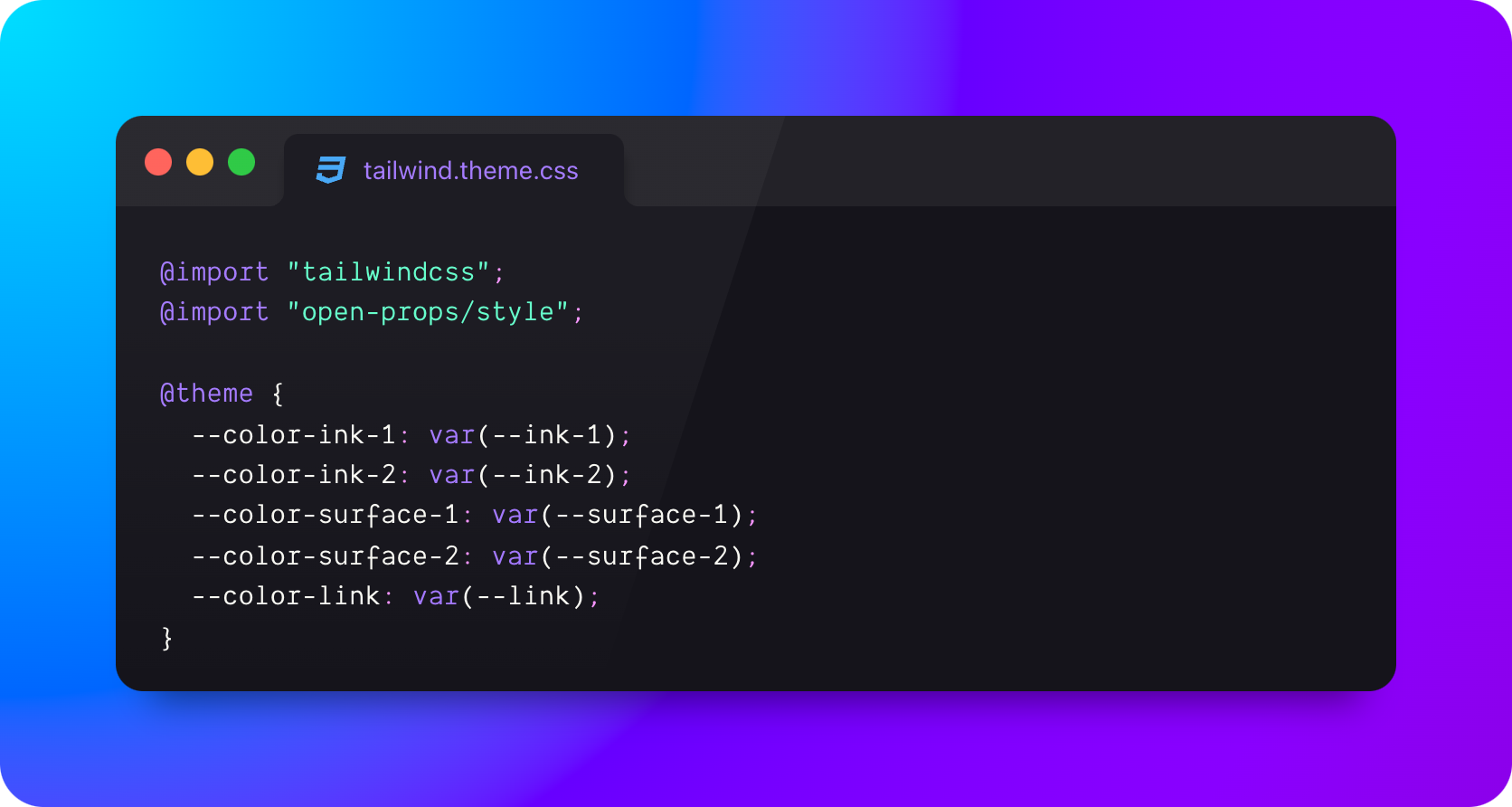
Kinda nice to ditch a JS file in this instance.

A bit of what I've been up to

Ep #7
Dave Rupert is bad at CSS
field-sizing:user-invalidcontent-visibility⤷ badatcss.com · youtube · spotify


Transition a popover in and out of the top layer penthouse

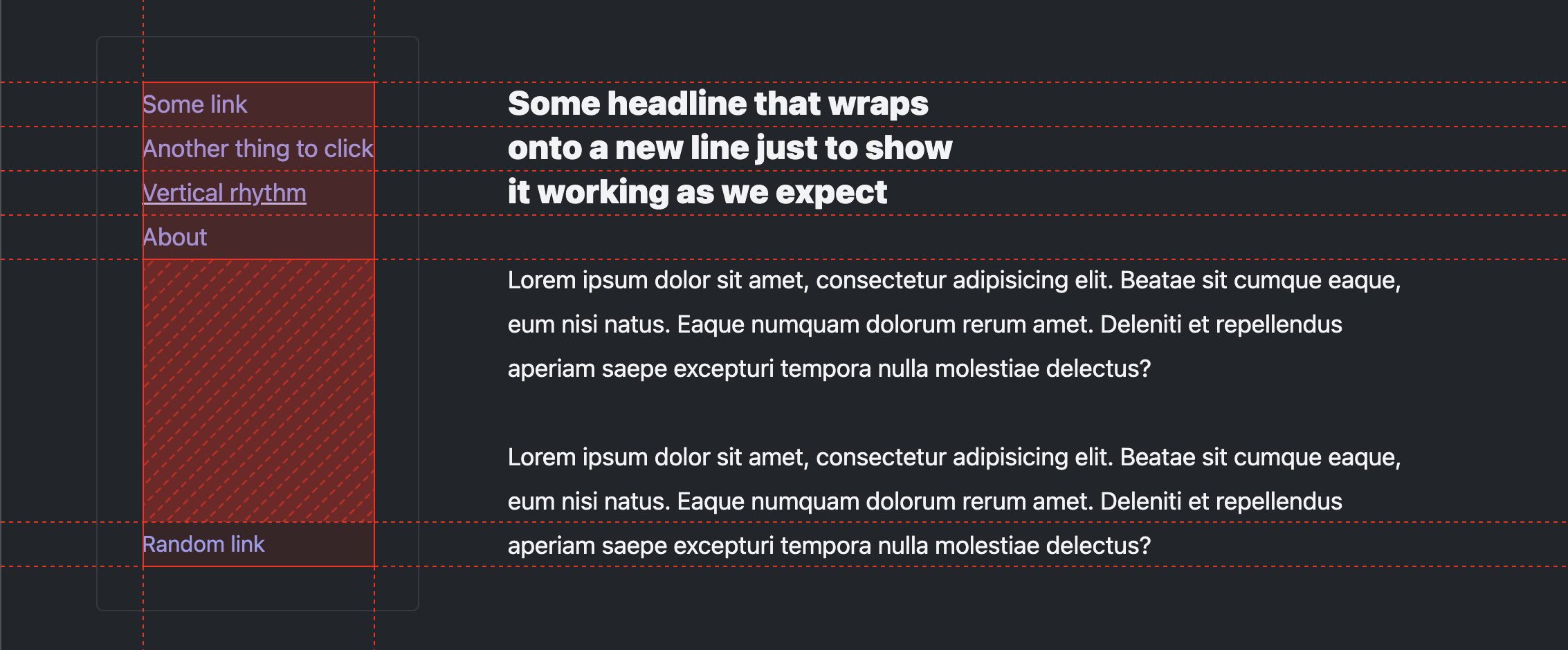
It's much more than vertical rhythm on the web

Bluesky mentions are now collected and shown on notes and blog posts on this site, just like Mastodon.

Ep #6
New Year, New Resolutions:
A look at me and David's CSS goals for 2024


Beautifully shot interview with Jason Lengstorf about:


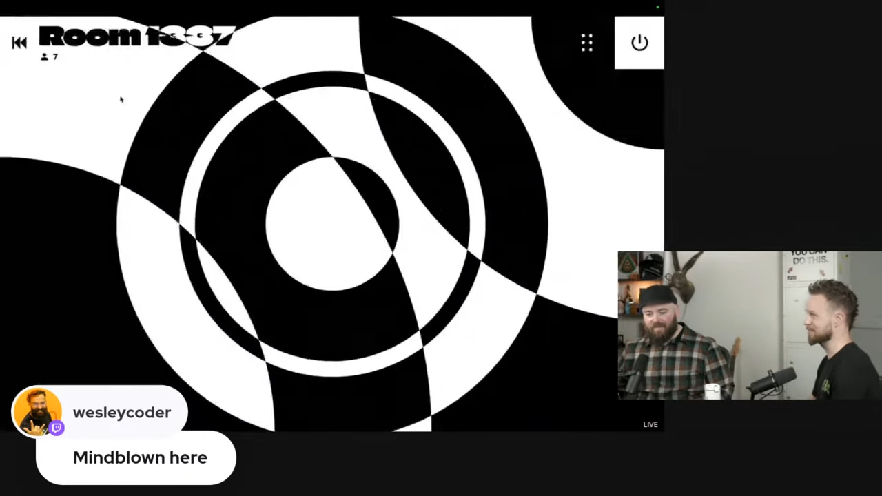
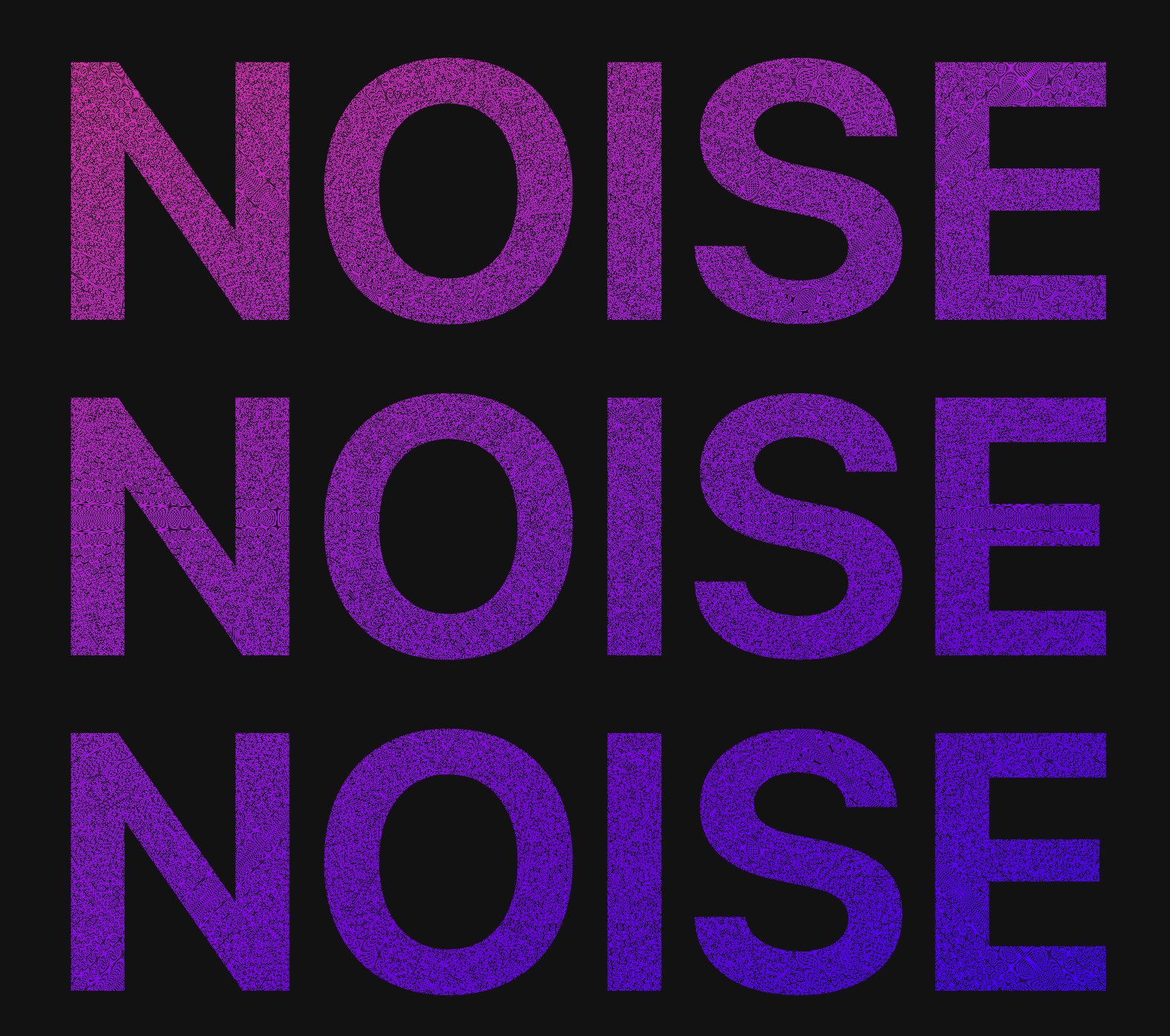
I made a brutalist noise experience with Svelte, PartyKit, audio streams, gradients and blend modes. Jason and I go through the code, giggle, and cause some visual chaos.

Hung out with the super fun Kelvin Omereshone and chatted about, you guessed it, CSS!


Gradient on gradient action.

document.startViewTransition
// too much to write

// makes alias: short for transition
const txn = document.startViewTransition

txn(async () => {
  // much better
})
One alias could save a lot of characters.
sounds like a Geico commercial…

A practical introduction to Scroll Driven Animations with CSS scroll() and view()
My first Codrops article 🤓

Radio groups are so powerful! Combine them with :has(), animated grid-template-columns
and linear() easing and you've got yourself
a neat little single picker UX.

A CSS bento-like grid that's aware of the number of children and aspect ratio available thanks to :has() and @container.
Shout out to view-transition's for making the interactive demo so much more compelling.

is it time to forget about physical properties like margin-top and left?
Can't throw out the x/y transforms tho 😭

Happy New Year!

Thinking on ways to make a Comparison component
In this GUI Challenge,
I use grid, masks and an <input type="range"> to stack and compare 2 elements and their contents.


✅ 2 lines of CSS
✅ a courtesy media query
✅ a keyframe

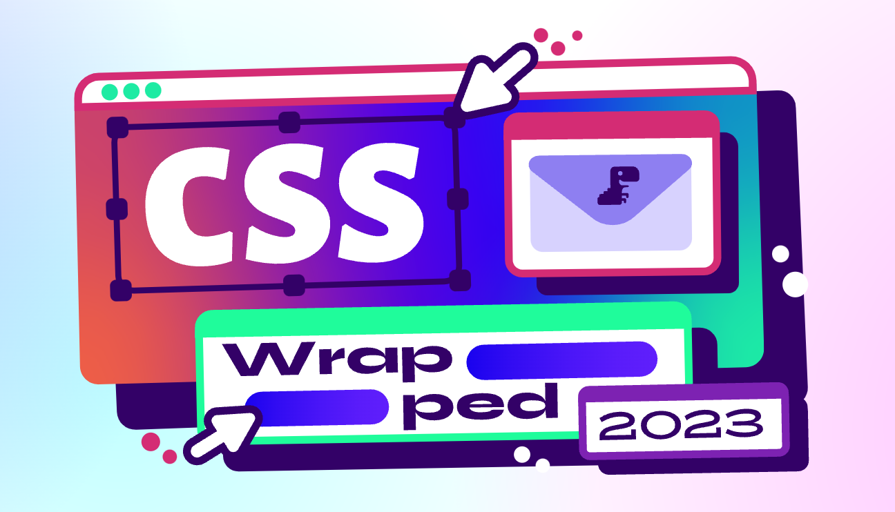
Una, Bramus and I put together a 2023 Wrapped for CSS 🤓

Thought this focus / interaction effect turned out nice; maybe you'll like it and make use of it too.


A guide to getting started with Next, StyleX and Open Props.

--atom: 0.15957s;
via Open Props

I learned you can use % for chroma!
.percentage-chroma {
  color: lch(50% 50% 200);
  color: oklch(50% 50% 200);
}
Added 2 examples to my CSS Color Syntax Mega List.

Thinking on ways to solve Picklists
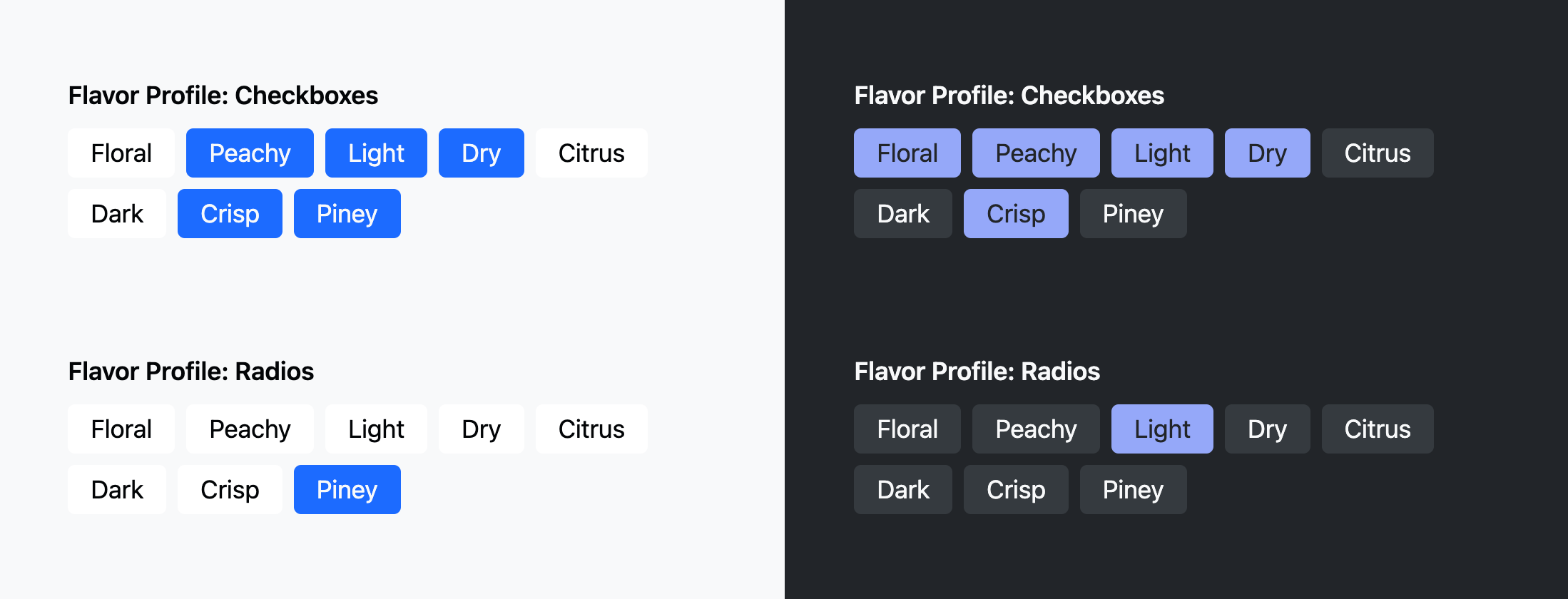
In this GUI Challenge, I show how to use leverage the power of checkbox and radio groups for beautiful and accessible picking UX.


Ep #5 🎙️ Bad At CSS Podcast
Jason Lengstorf, David East and I chaotically discuss CSS, container queries, and that pesky clamp() function 🖕.


Thanks to Roman Komarov's fork, I hoped for a CSS only solution to filling a range input's progress style with a gradient.

Steal this minimal code setup for a nice comparison component.


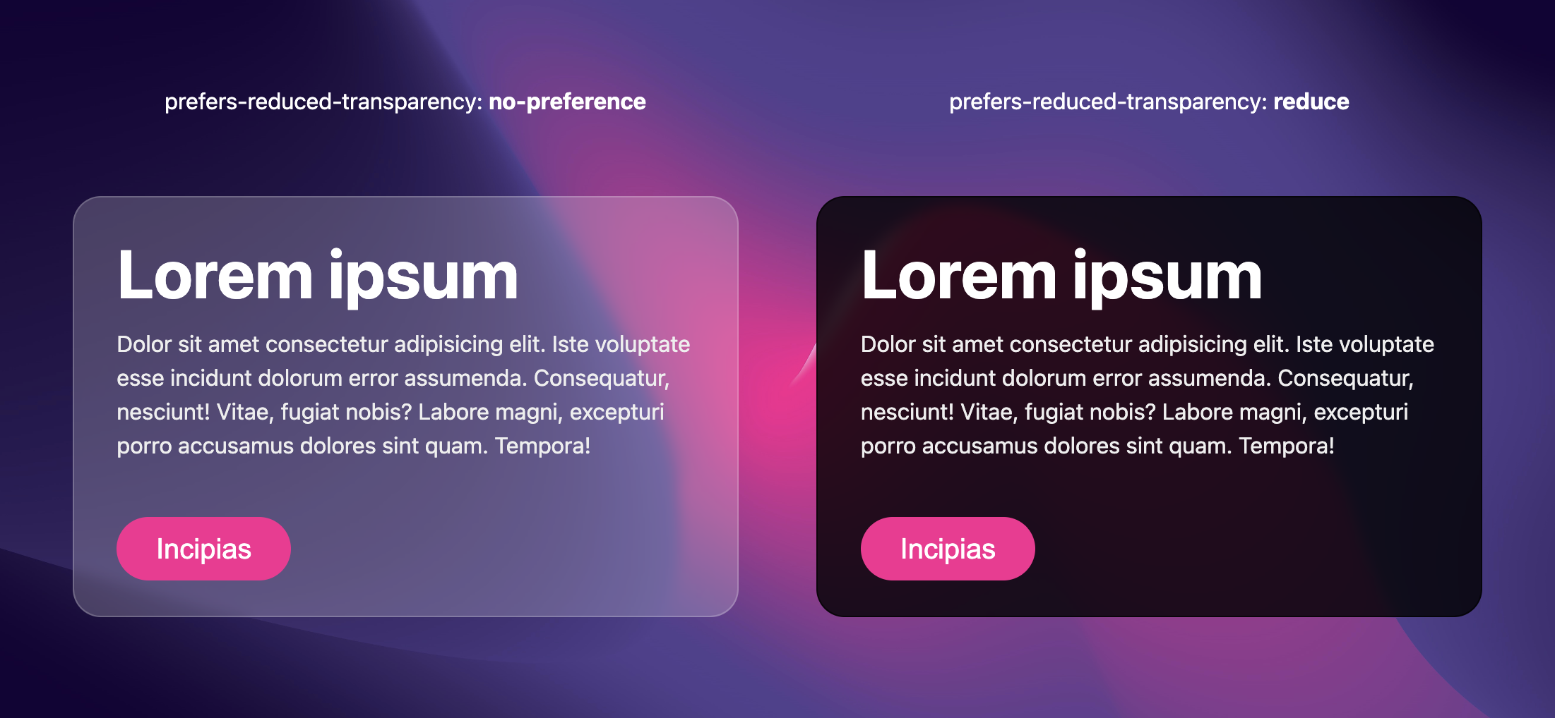
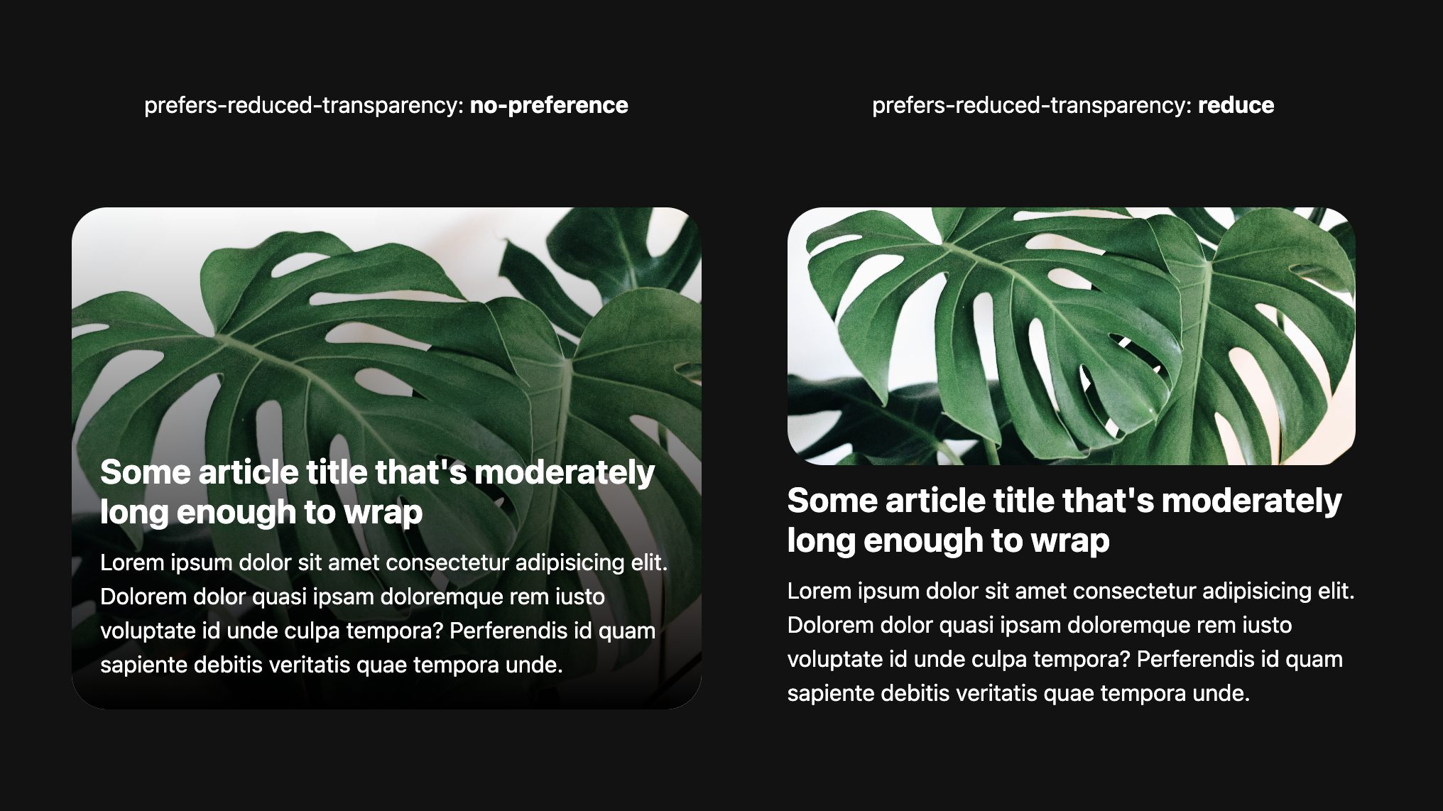
I wrote about CSS prefers-reduced-transparency on developer.chrome.com 🤓

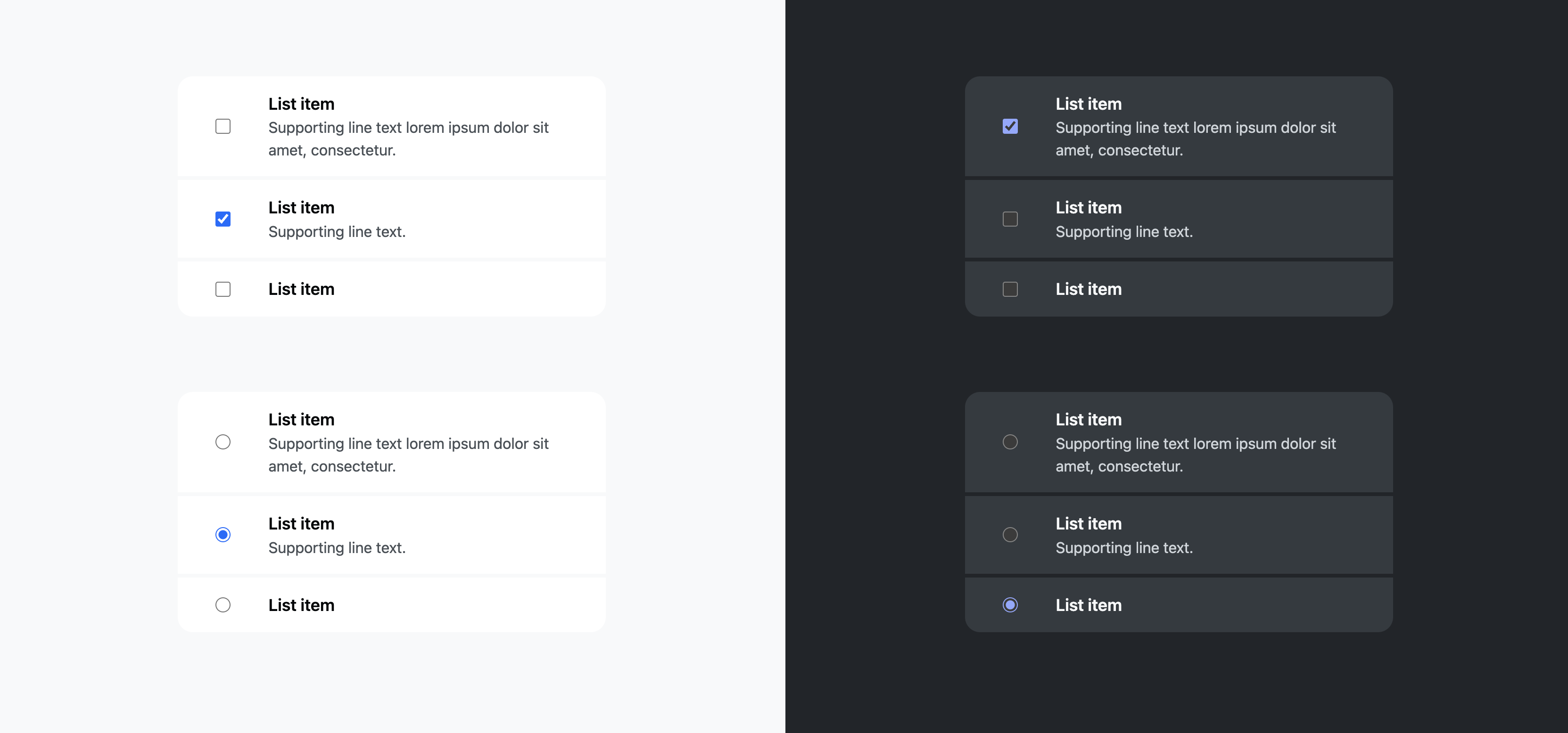
Checkbox and radio groups have special powers with keyboard and screen reader interactions; leaning into them can lead to some rad UI:
Go ahead, open them up and give it a try!

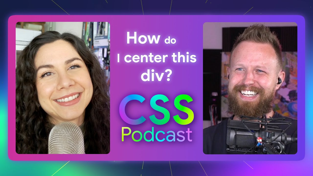
How do I center this div?
Una and I discuss CSS centering, and all the different ways CSS has your back.
Turns out, there's A LOT of ways to center.

NEW
5 bounce easings added to Open Props!
.box {
  animation: drop 1s var(--ease-bounce-2);
}

Thinking on ways to make spoopy Halloween Projections
In this GUI Challenge, I emulate a Halloween projector effect I saw on a wall.


Original Codepen set up a vibrant radial gradient in each corner and adjusts their size so their color crossover created a swirly effect.
The animated version uses @property to interpolate each radial gradients position and adds a radial gradient size slider, so you can find other swirly moments of your own.

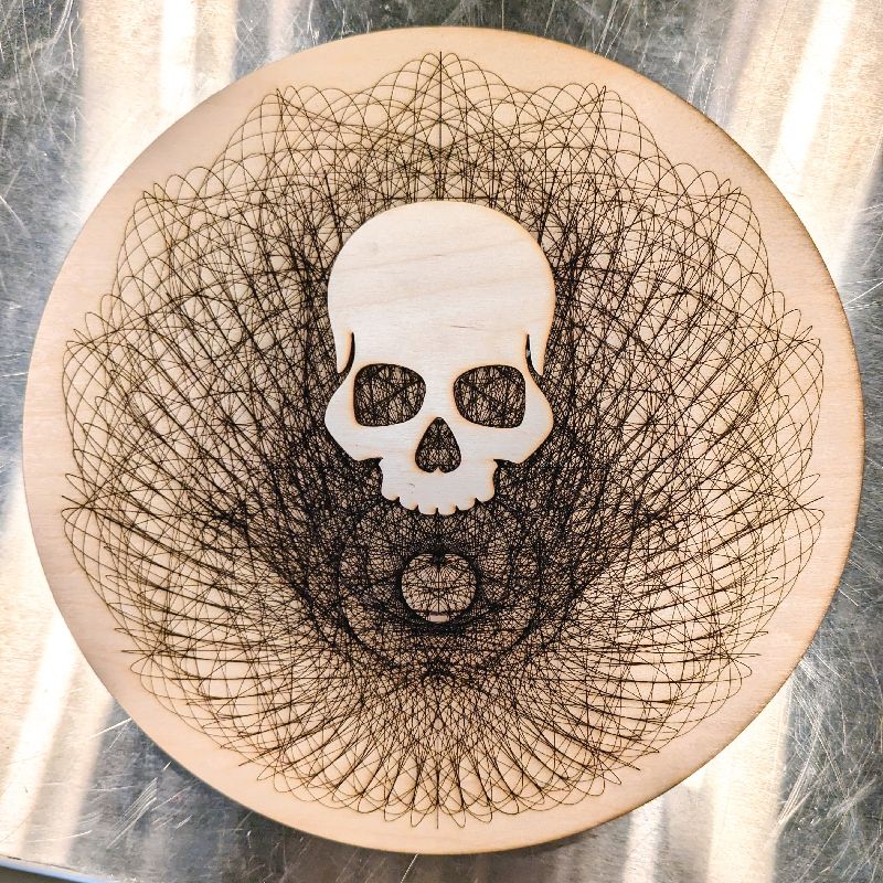

I've got a new post over on developer.chrome.com!
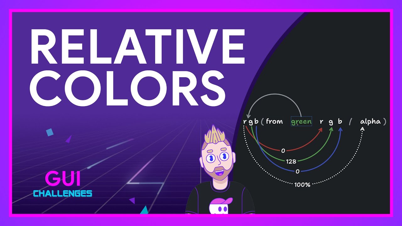
Everything you need to know about
CSS Relative Color Syntax 🤓


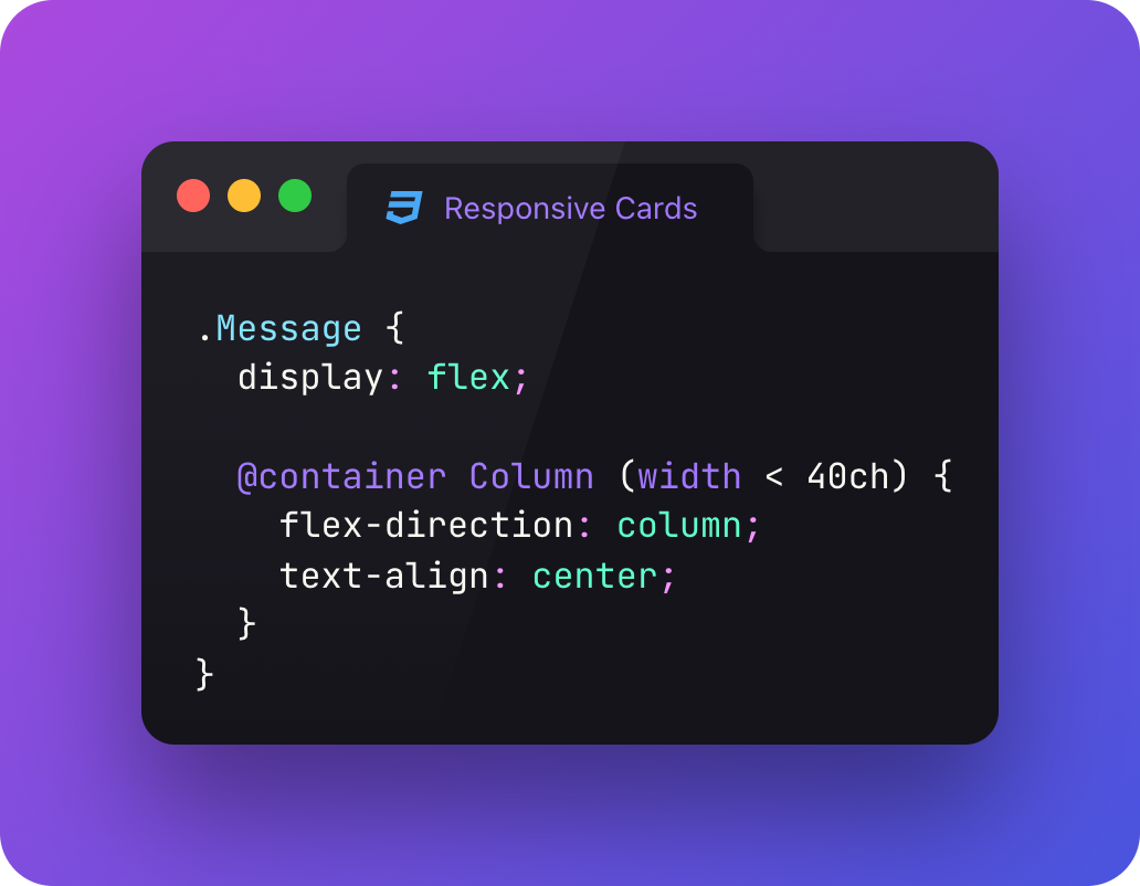
@Container pattern
✅ nice inline flex layout when there's room in it's Column container
if not?
✅ switch to a nice block layout and center the text
I like the ch unit for this since I'm wanting to switch based on available reading length for the text 🤓
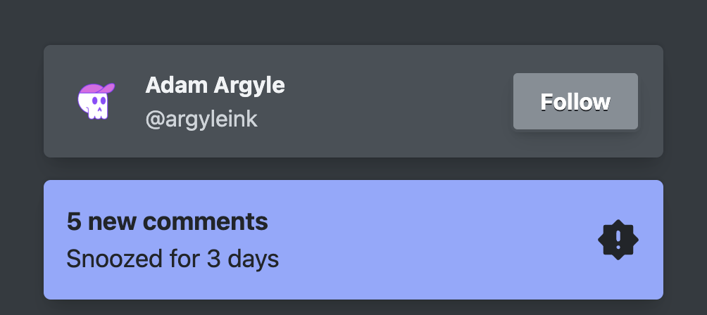
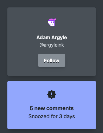

Thinking on ways to solve relative color
In this GUI Challenge, I show you how to use CSS RCS (relative color syntax) for lightening, desaturating, opacity, grayscale and more.
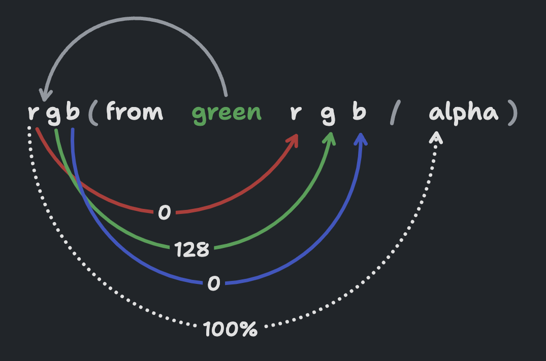
oklch(from hotpink calc(l - 20) c h)
hsl(from hotpink h calc(s / 2) l)
hsl(from hotpink h s l / 50%)
hsl(from hotpink h none l)
There might be one or two RCS features you didn't know 🤓

Bramus explains @scope on developer.chrome.com and his personal blog with this quick introduction.
@scope (.Card) {
  > header,
  > footer {
    background: hsl(none none none / 20%);
  }
}
@scope is new in Chrome 118

Ep #4
🎙️ Bad At CSS Podcast
David East and I discuss TypeScript; David defends it, and I attack it. I'll probably get mega roasted for this.
tldr;
I love TypeScript, for you.


CSS relative color syntax

NEW
🎙️ Bad At CSS Podcast
David East and I have a special guest:
Chris Coyier 🎉

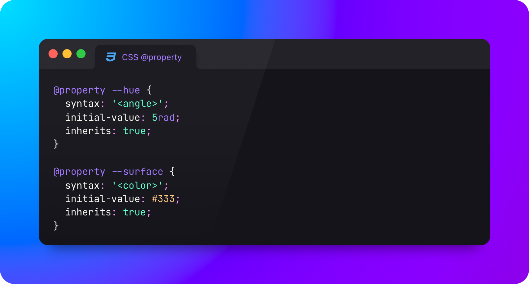
Fail safe, reliable, & deeply nestable.

Next up on The CSS Podcast…
Ep #71
Why do I have layout shift?

Was on The CSS Survey's Live Stream Party!
✅ give Sacha and Hui a follow!
✅ sink your teeth into that juicy data
✅ hear predictions and suprises!
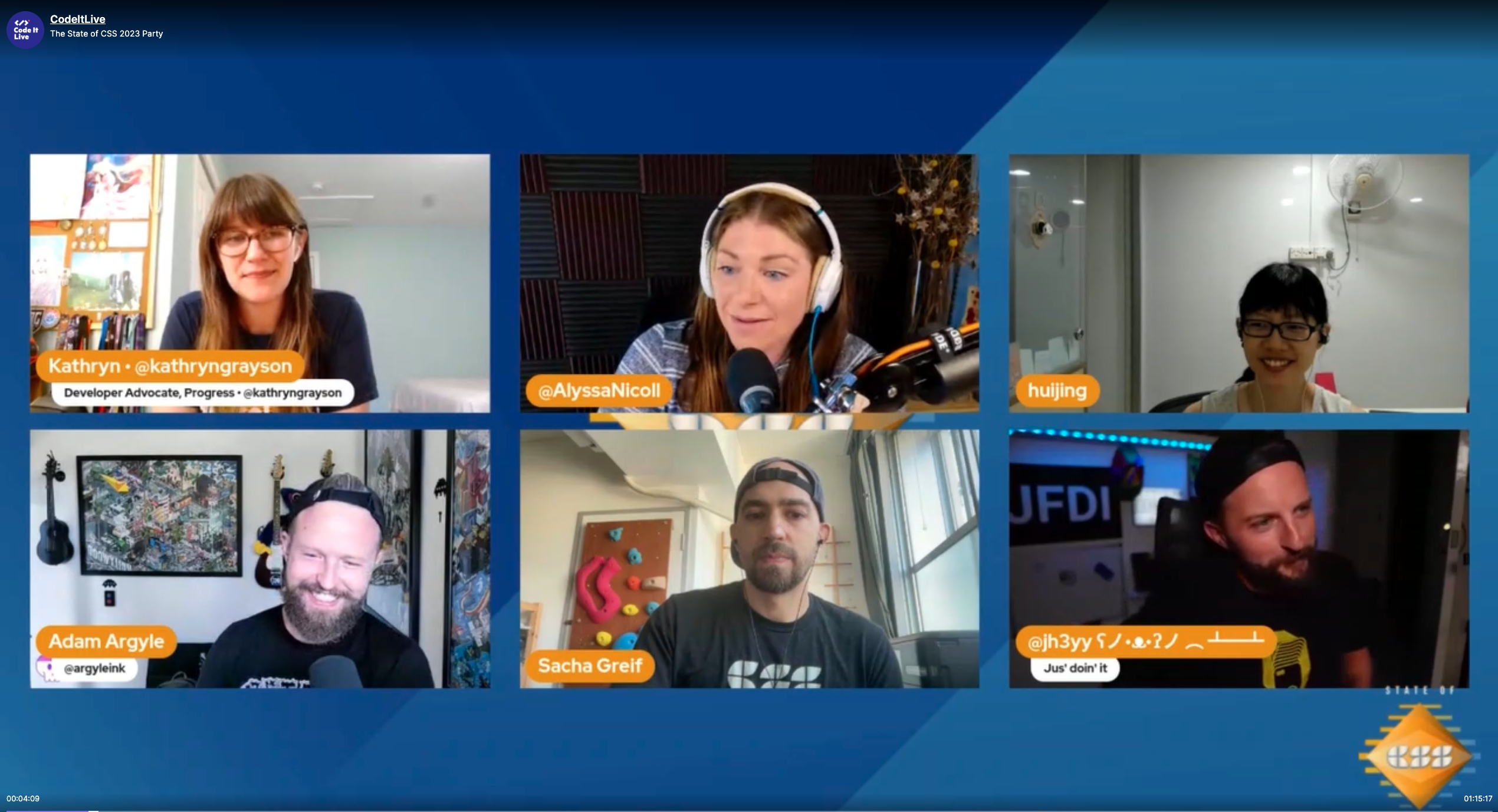

Next up on The CSS Podcast…
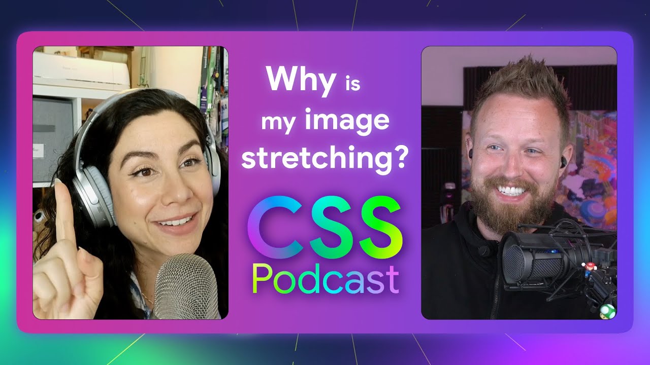
Ep #70
Why do I have a distorted image?

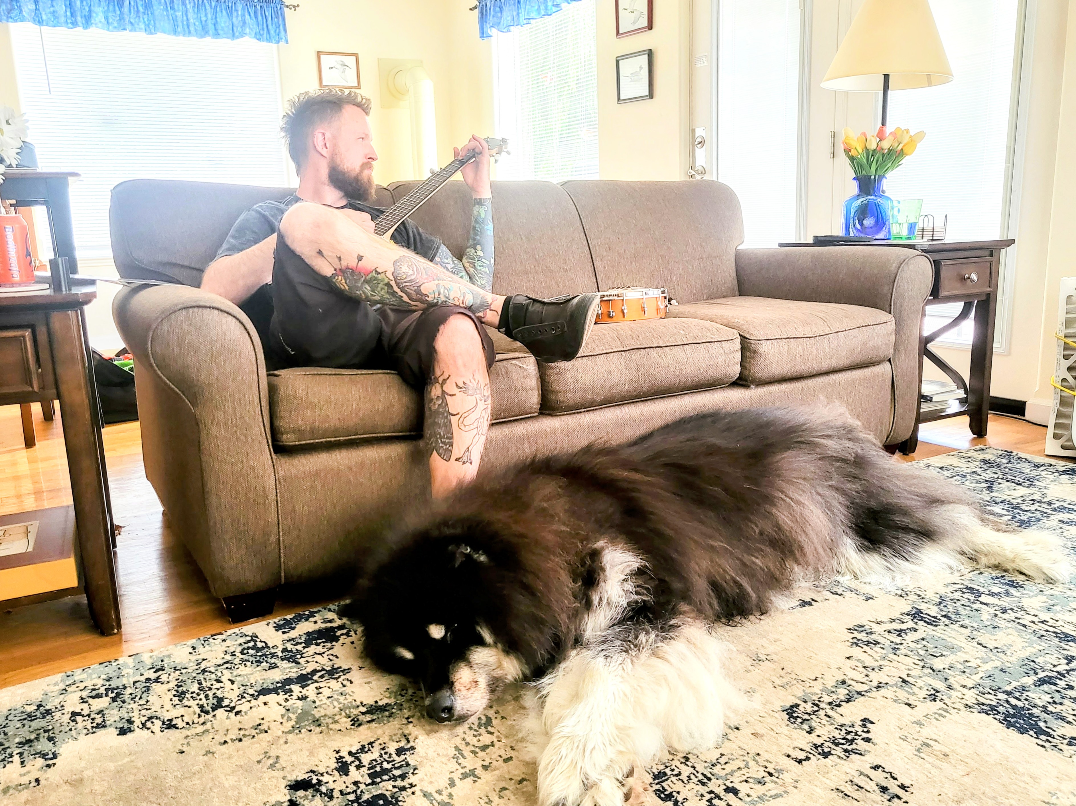
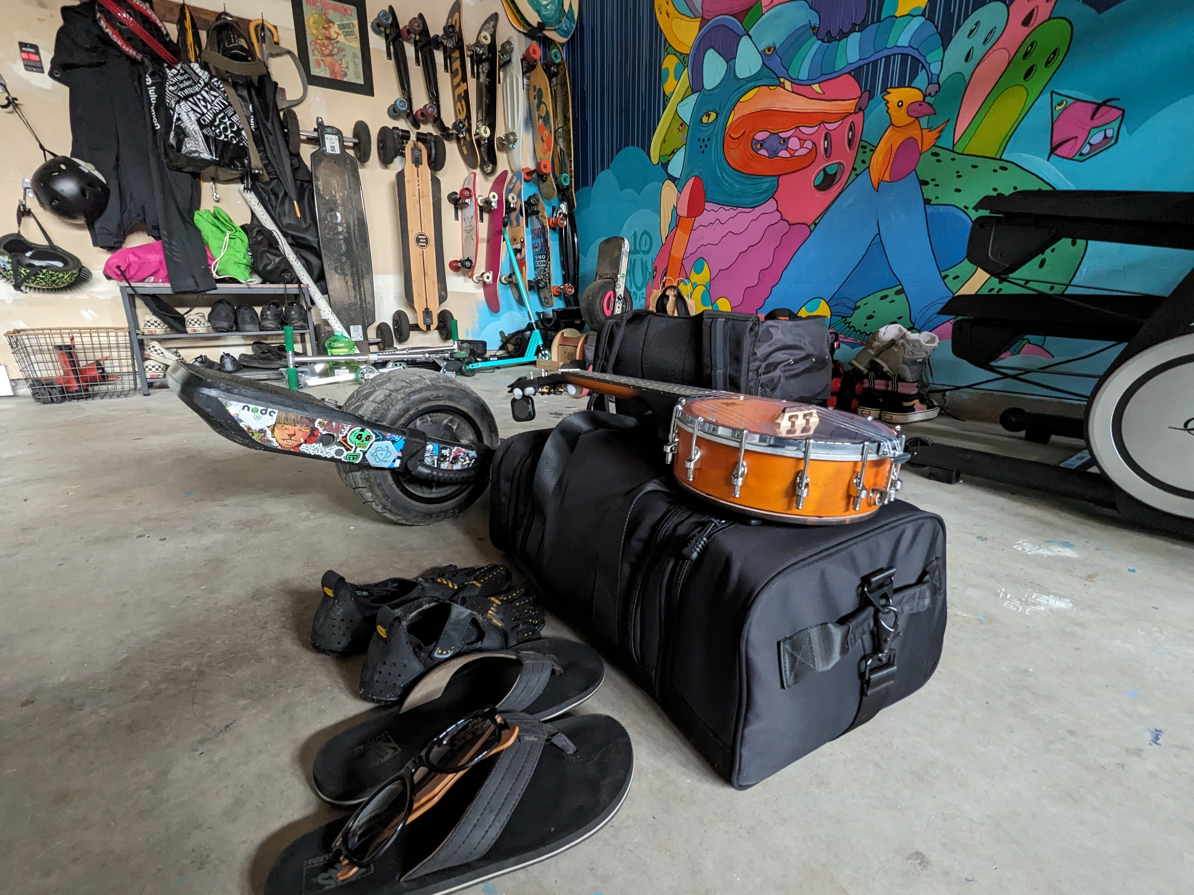
Had a great vacation!
✅ kids at grandma's
✅ chilled hard w/ my partner
✅ bought a banjo! (always been intimidated)
✅ played a lot of banjo and banjolele
✅ built a CSS demo or two…
❌ play video games




Bad At CSS Podcast
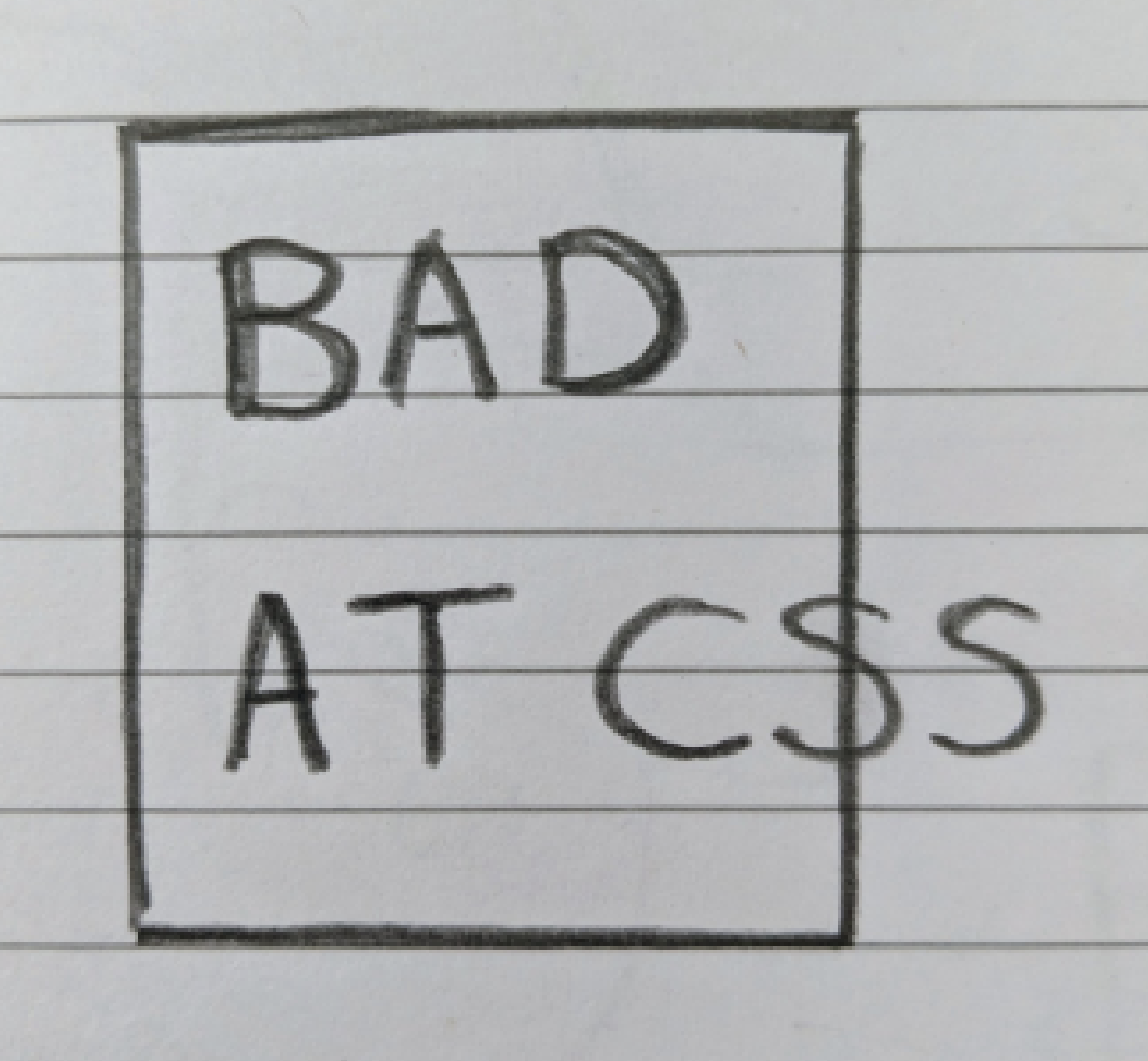
⤷ logo made in the browser
✅ intentionally no font
✅ lack of any styles 😉
✅ looks like you're in devtools
✅ bad layout
✅ bad colors
✅ box around bad is bad


Next up on The CSS Podcast…
Ep #68
Why is it overflowing?

🎙️ The Bad At CSS Podcast
David East and I host, and sometimes bring on an occasional guest 🤓

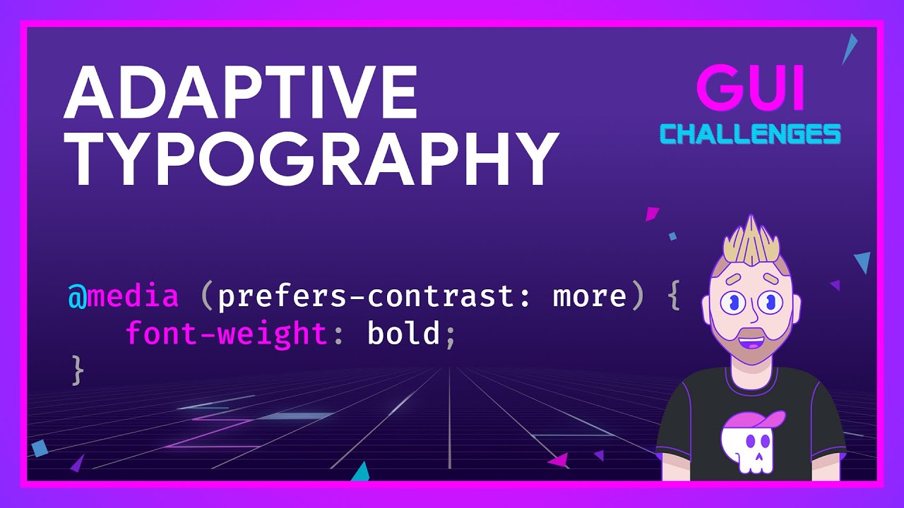
Thinking on ways to solve Adaptive Typography
In this GUI Challenge,
I show how to use the prefers-contrast media query to adapt both system and adaptive fonts to match user's contrast preferences.
Contrast is more than just color

Experimental #CSS carousel featuring:
subgrid scroll driven animations (SDA) oklch() @property @layer
Lots of code comments
to help break down the effects 🤓
✅ SDA changes hue/theme
✅ SDA toggles next/prev
✅ SDA syncs dots
Try it in Canary with #experiments enabled

New season of The CSS Podcast has begun!
Ep #67
Why isn't z-index working?

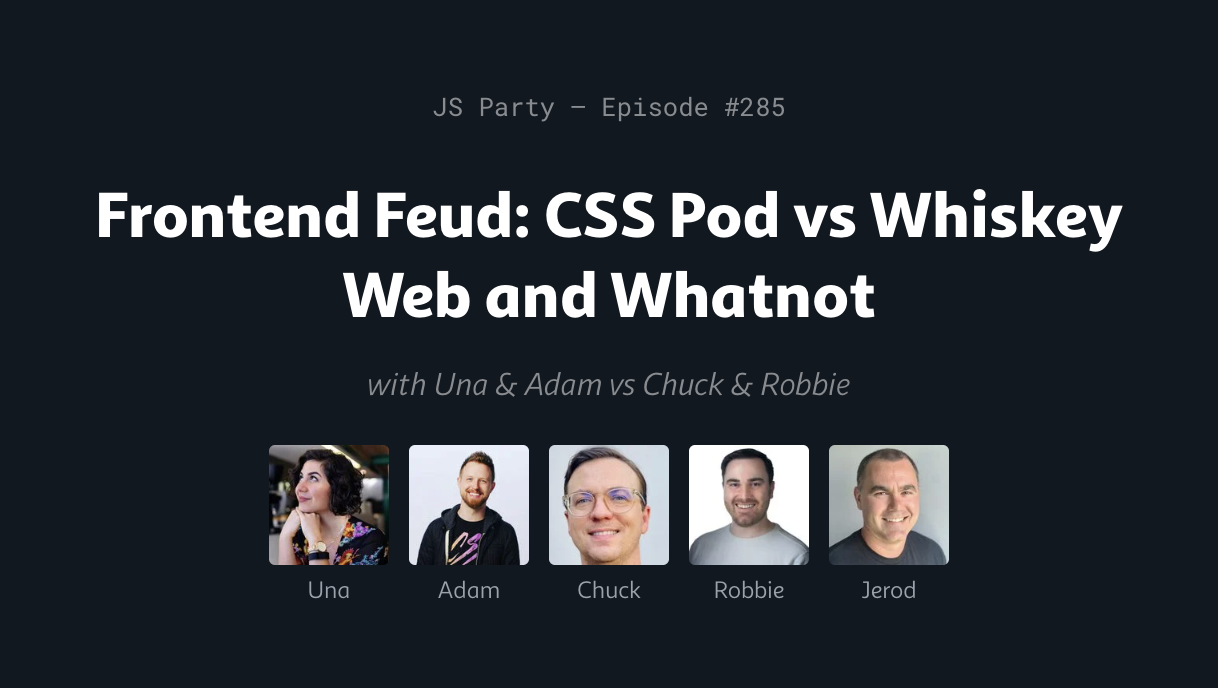
Was on JS Party!

Thinking on ways to solve a Morphing Button
In this GUI Challenge,
I show how view transitions can upgrade the experience of changing the innerHTML of a button by animating the change.


Was on the @coderyan show!

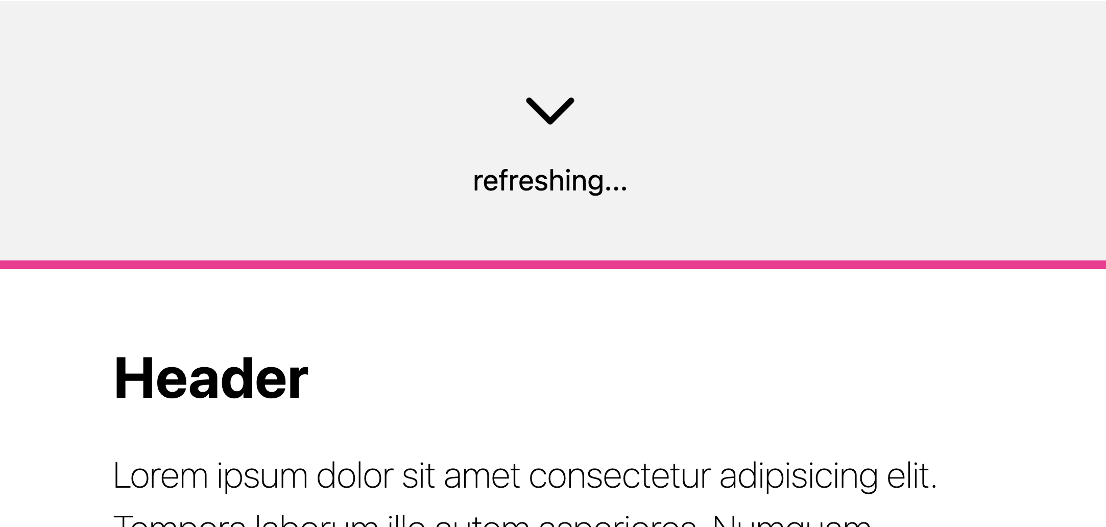
Do not take the State of CSS Survey
"Nice Adam" wants you to take it;
naturally I want the opposite

Scroll snap handles the scrolling stop points, SDA handles the animations and scrollend provides the event needed to trigger it all.

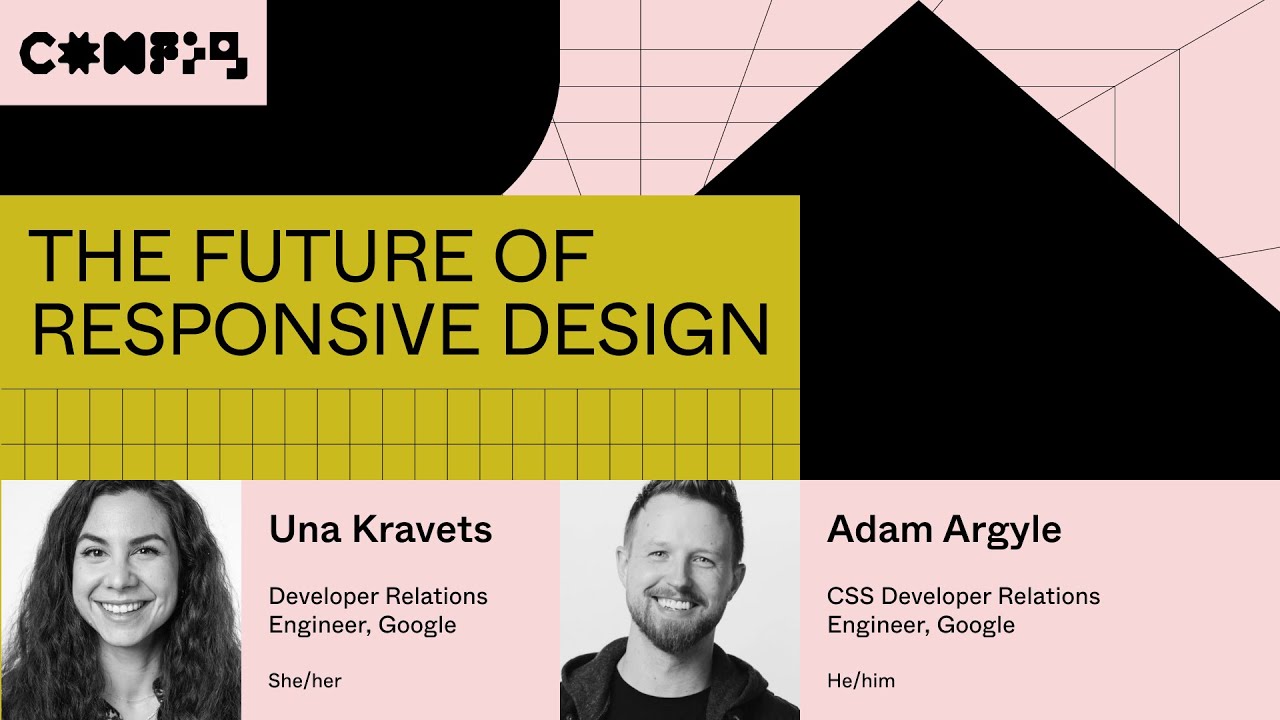
Spoke at Figma Config with Una!
The Future of Responsive Design
All about how the width of the viewport was never that relevant, it's more about the space a component has, the children type and count, and so much more.

Was on the Cloudinary DevJams Podcast!
We chat about making the nerdy.dev site with Deno and Fresh, and of course we chat all about how I'm serving images 🙂


Vertical rhythm thanks to the rlh unit.
Bonus:
scales with the user's font size pref 😎

Long live the indie web 🤘🏻💀

I've been unleashed.
What evil will I do first?
Perhaps, I'll change one char somewhere..
and break the build.
muahahahaHAHAHAAAAA

Co-MC'ed CSS Day 2023 with Michelle Barker 🤘🏻💀
catch up on all the talks here
What a blast, totally was with my people. I'm especially proud of a few dad jokes:
<popover> and have a <dialog> with me"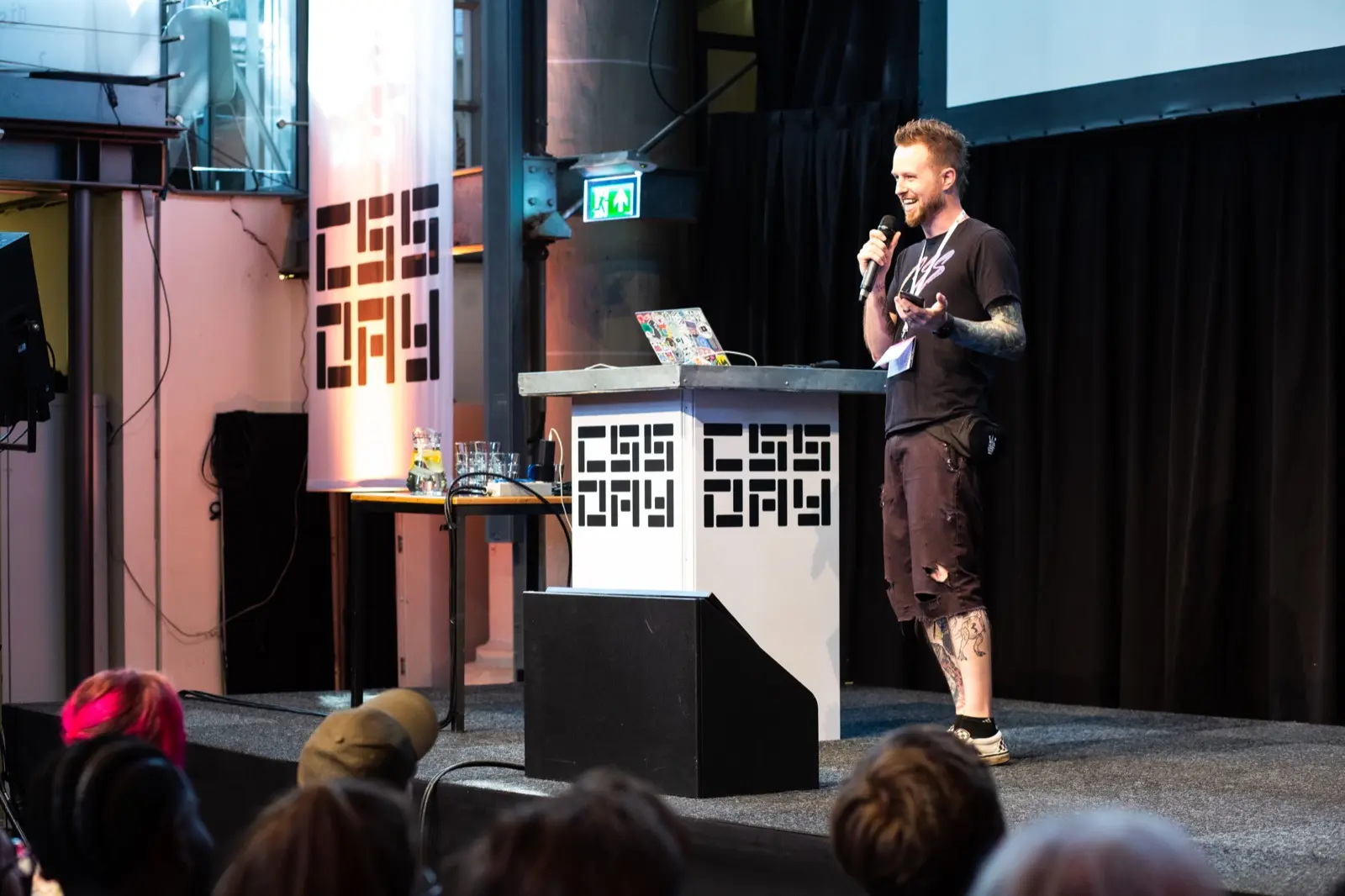
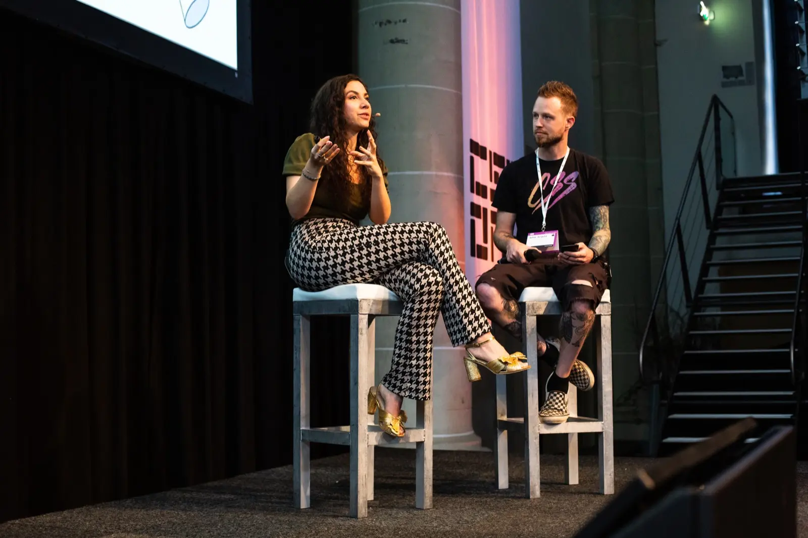
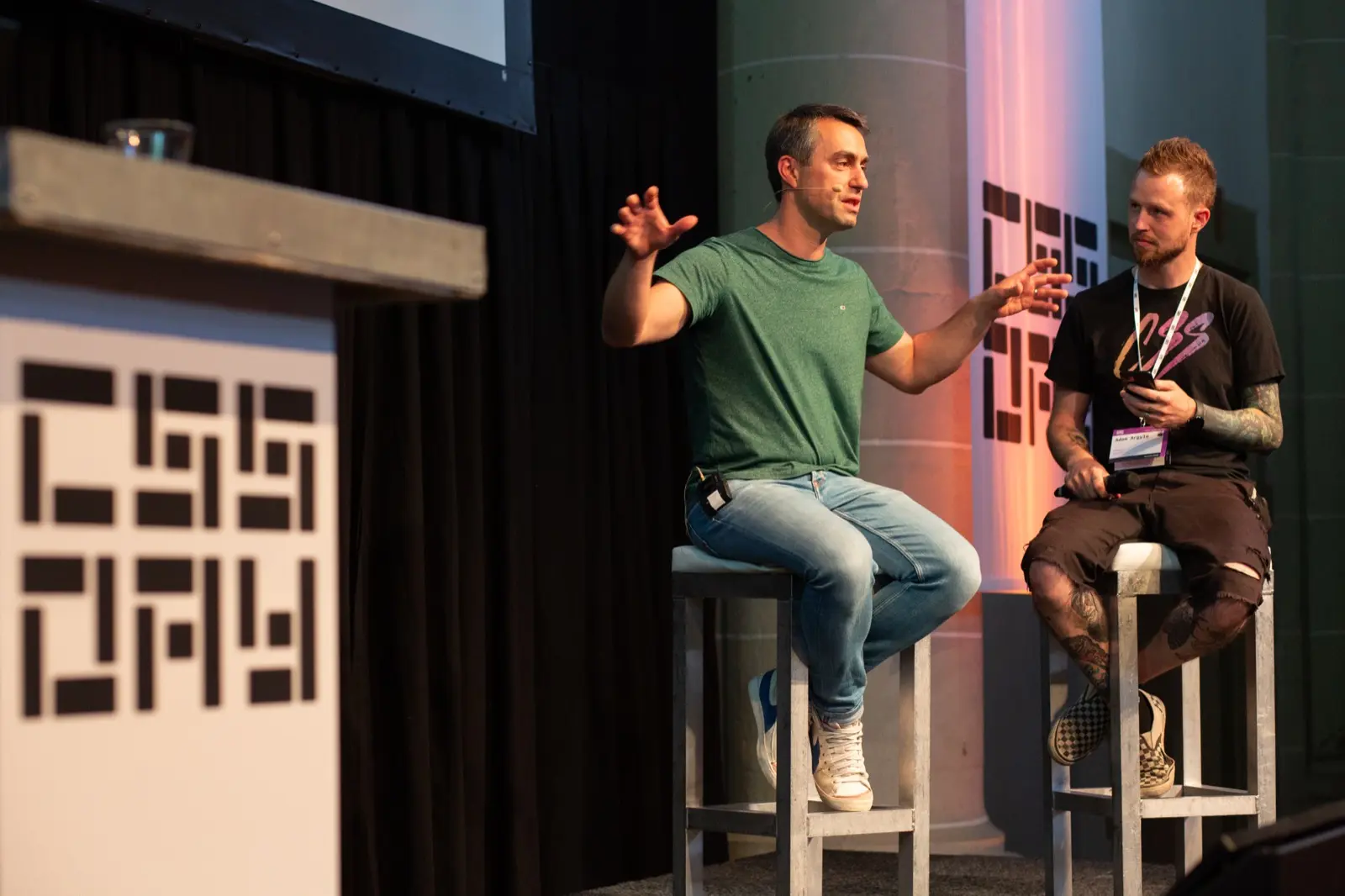
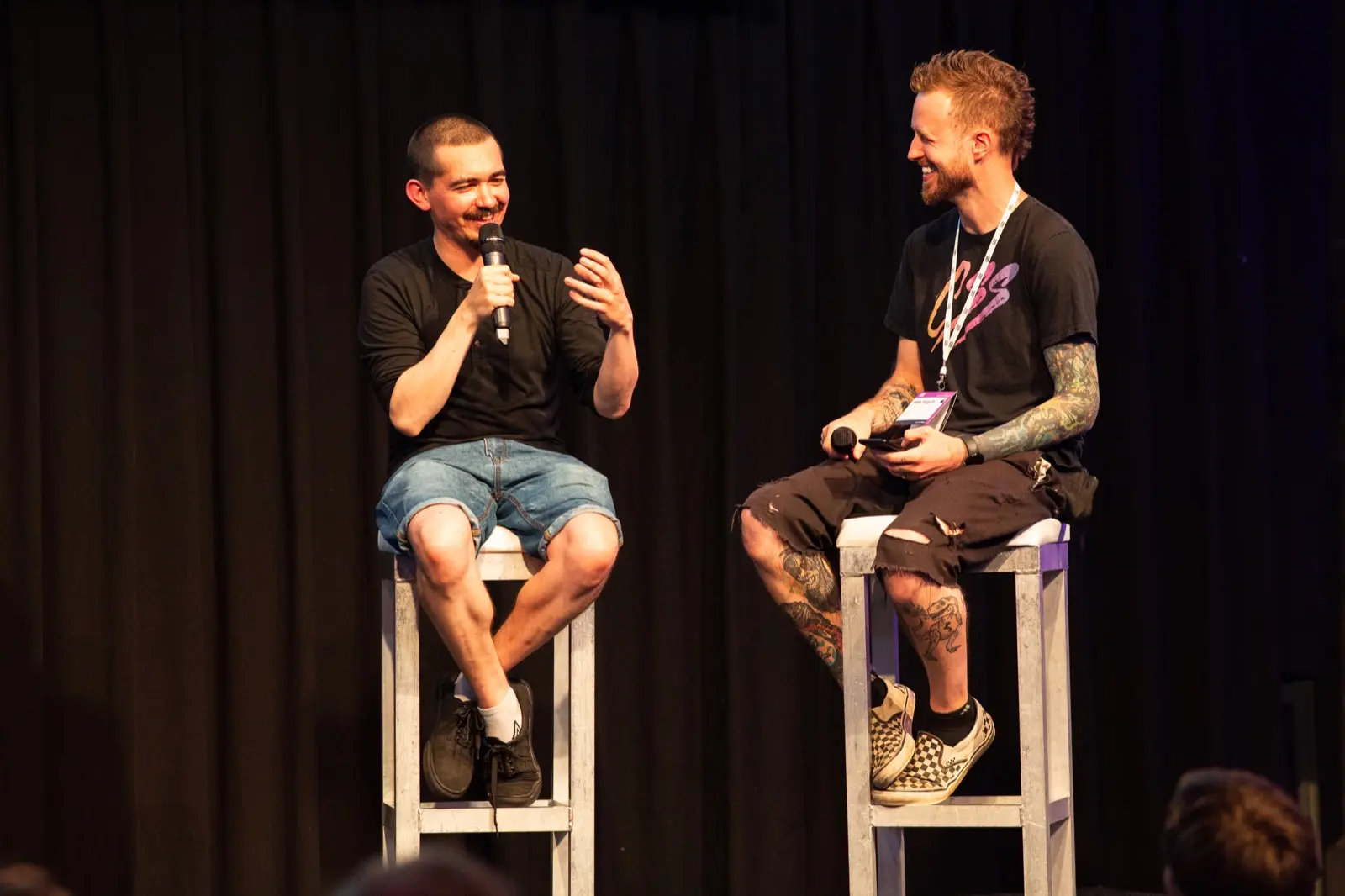
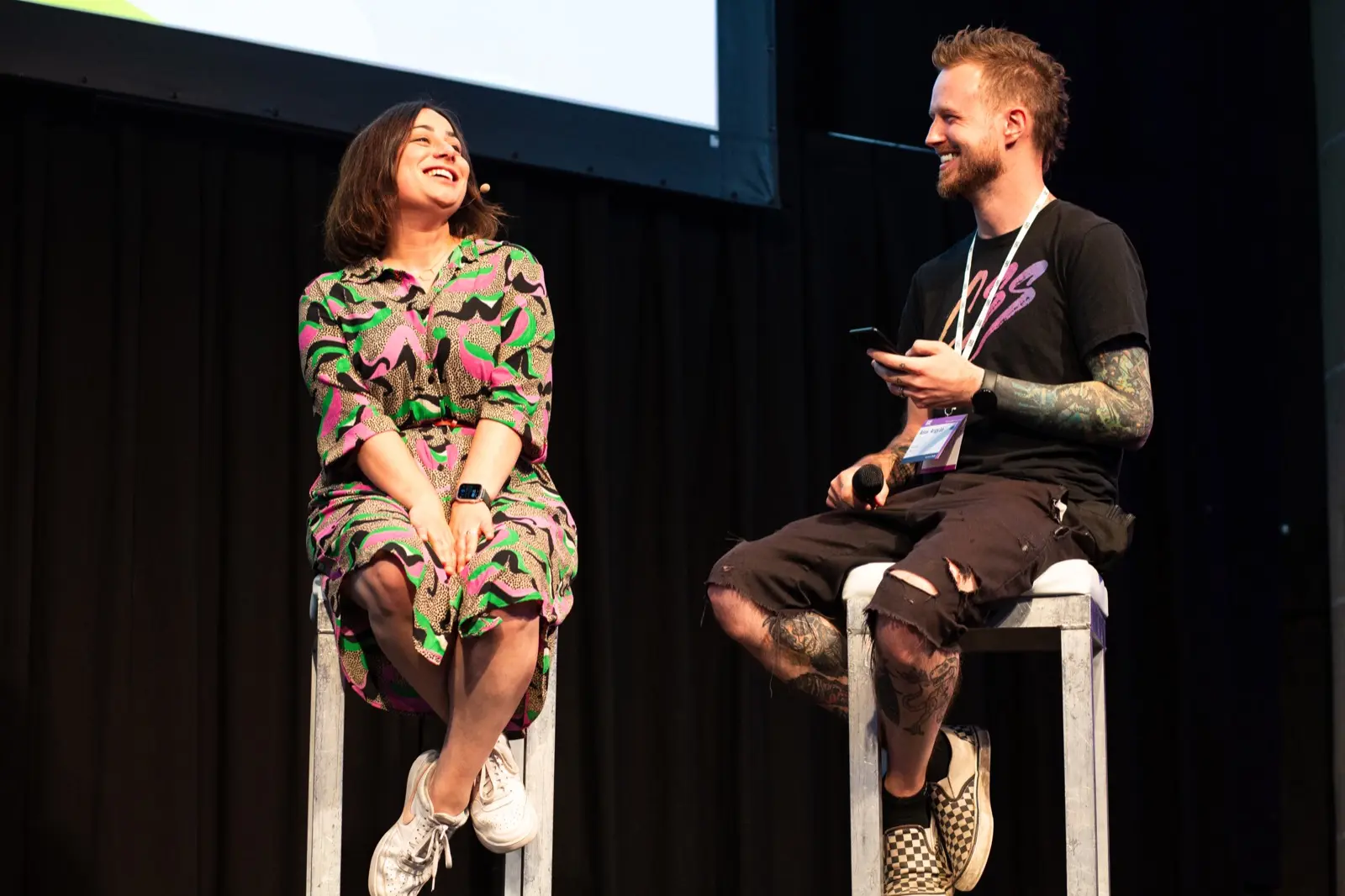

Spoke at Smashing Conf!

How to create personalized web experiences
I spoke at Google IO again!
Here's a link to my talk.


Upcoming talks!

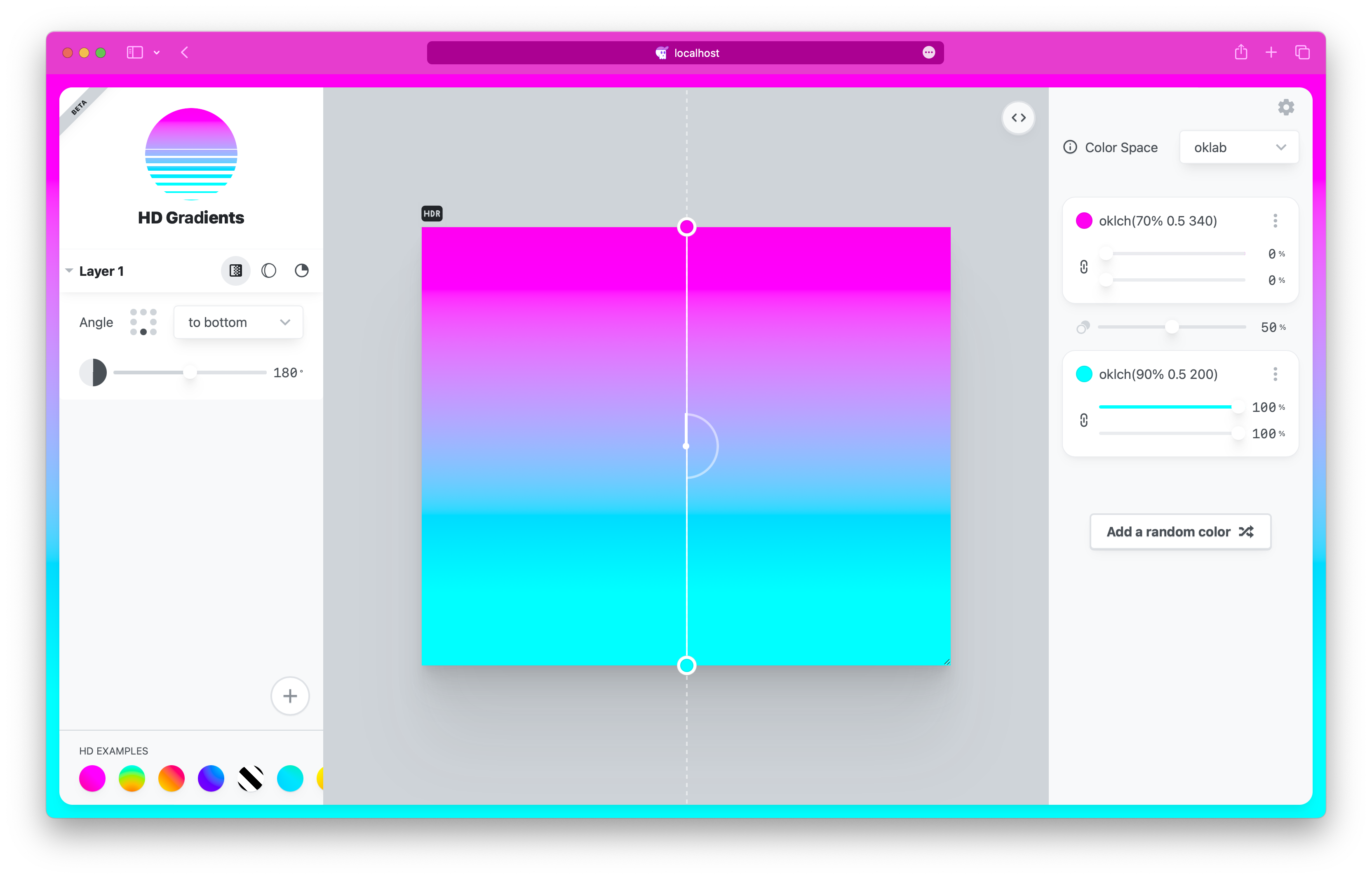
Currently in beta, this tool empowers designers and developers with tooling for the latest syntax and features of CSS gradients and wide gamut colors.


Two conic gradients, Open Props beta okLCH prop pack and a hue slider.

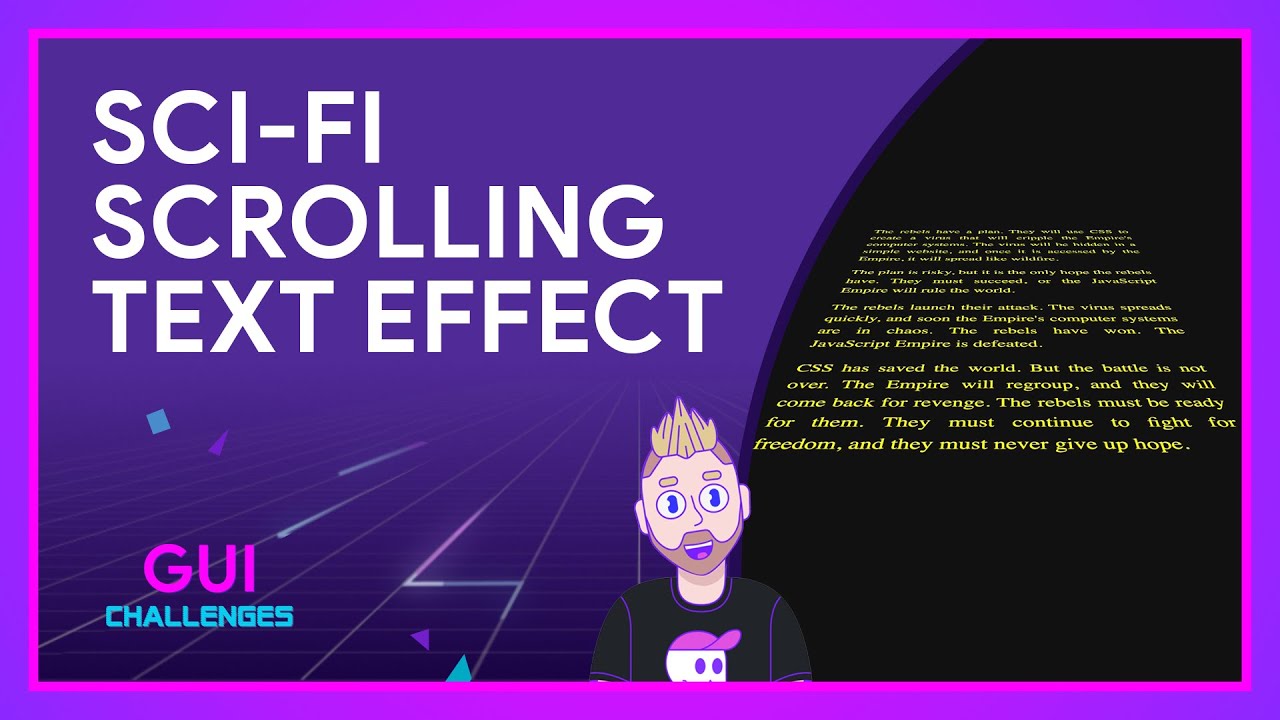
Thinking on ways to do 3D SciFi Text
In this GUI Challenge, I use CSS Scroll Linked Animations to 3D tilt a few paragraphs of text, and on scroll, make them appear to vanish into the far edges of the galaxy.

Google IO talk done!
Success selfie at the 🆕 Seattle office's Neon Staircase 🤘🏻💀


Multiple hard stops in a radial gradient sized as farthest-corner, this is me changing the x position first from 0 to -100, then the y in the same manor.


Viewport widths n' color gamuts;
As each widen, adapt the UI.

.classic-gradient {
  background-image:
    linear-gradient(45deg,
      white,
      black 0% 20%,
      white 0% 40%,
      black 0% 60%,
      white 0% 80%,
      black 0% 100%
    )
  ;
}

🆕 post on developer.chrome.com
wrap your head around…
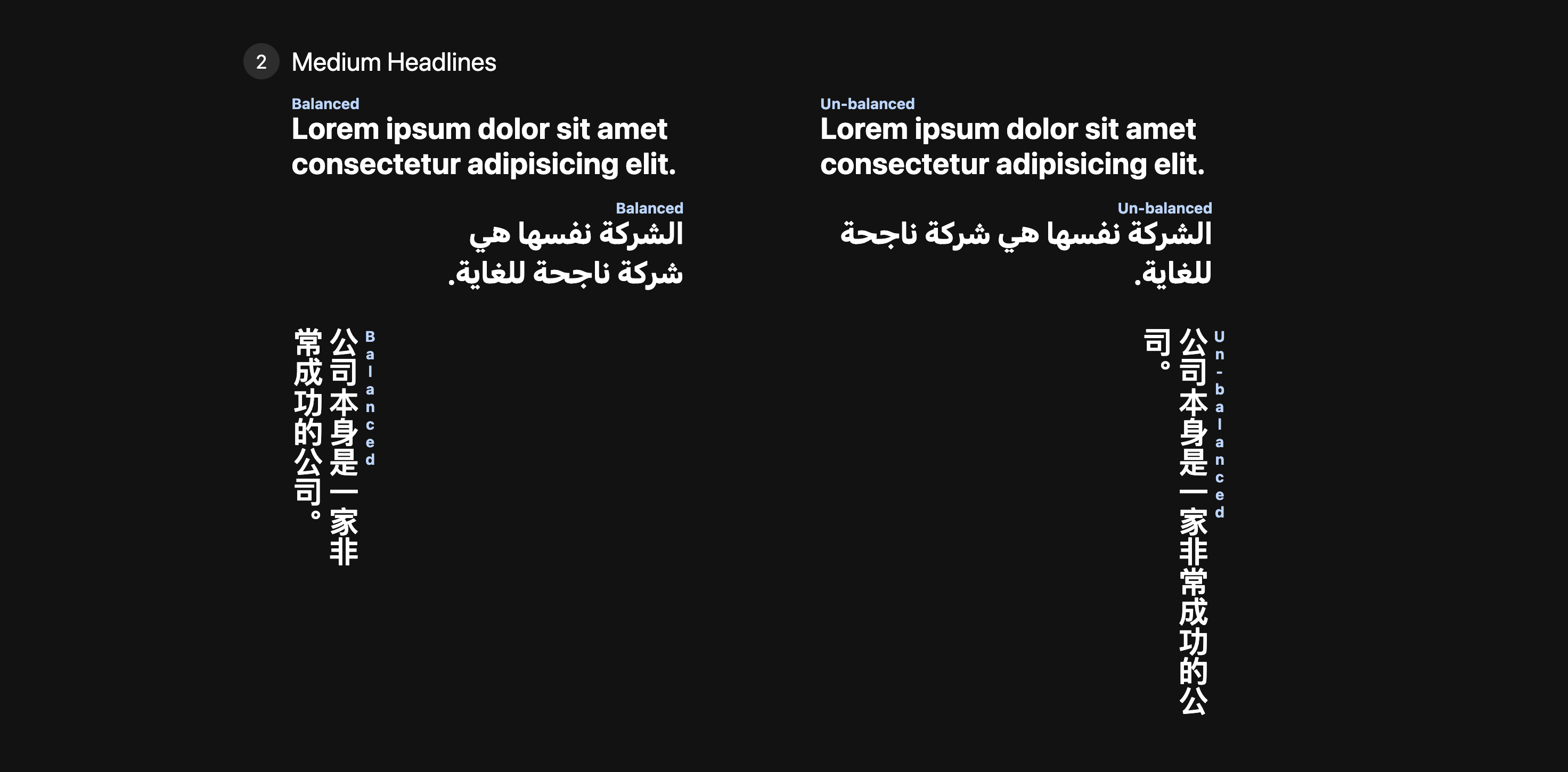
#CSS text-wrap: balance
✨ balanced headlines ✨
with one magical line of CSS
only Chrome Canary atm, details in article

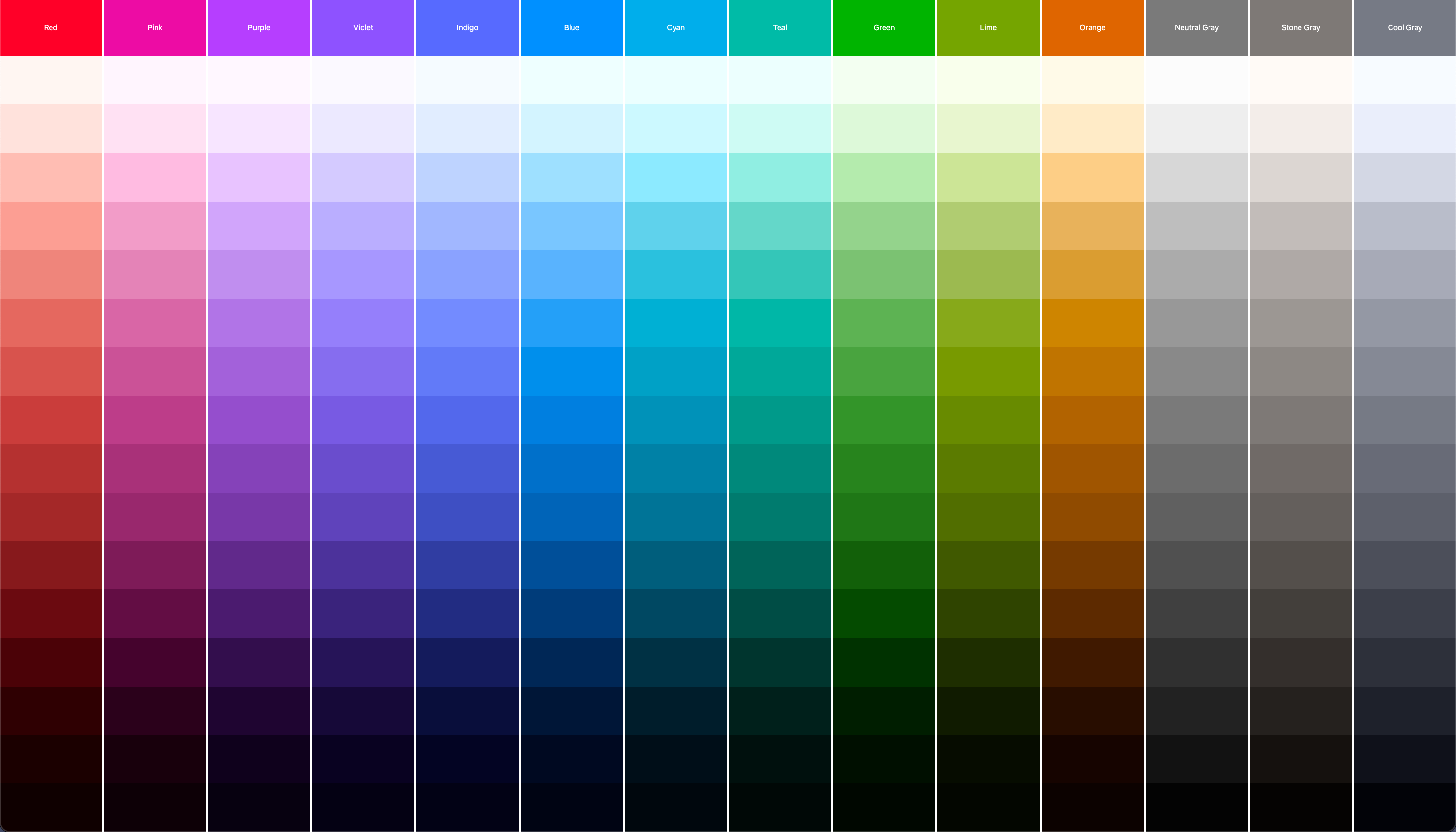
360 palettes for the price of one.

Was on the @PodRocketPod!
Me, Stephanie Eckles, and Stacy Kvernmo team up and answer questions about UI and UX.


#VisBug won an award 🤯
Chrome Web Store
Favorite of 2022
This award is legit! Heavy, clever and minimal. Truly a trophy I'll keep around for a long time!
Thanks everyone for the support!


🆕 post on web.dev
6 CSS snippets every front-end developer should know in 2023
Toolbelt worthy, powerful, and stable CSS you can use today.


Radio groups naturally have cyclical roving tab index, but, I put them into a circle and now it really looks cyclical hehe.

Thinking on ways to solve Switch Groups
In this GUI Challenge, I show how to take a fieldset packed with a radio group, and turn it into a switch group that controls text alignment.


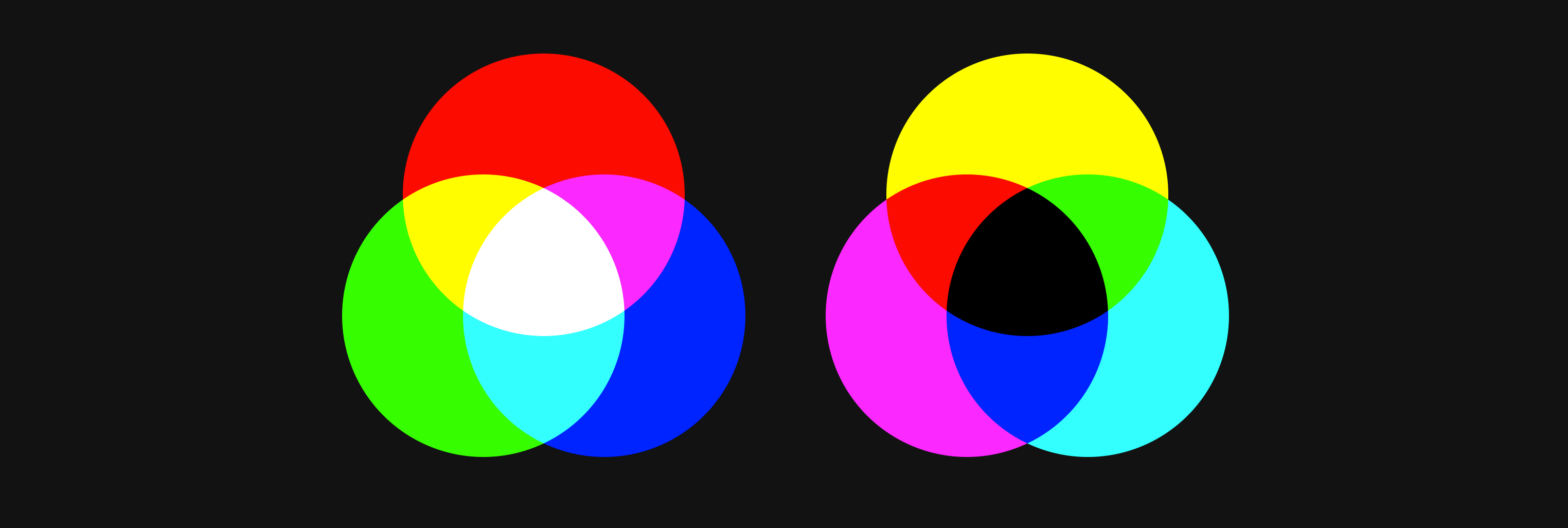
Relative color syntax is a better way, but still fun to know this trick.

New post on DCC about CSS Nesting


hehe


Deno & Fresh have been rad.
Same goes for Deploy.
but…
95% of the issues have been deps.
I have deps on NPM, deno.land, esm.sh, and unpkg… if any of these services hiccup, and I try and build; builds fail.
No single service can serve all the modules I need, and I don't need that many
💩🌈

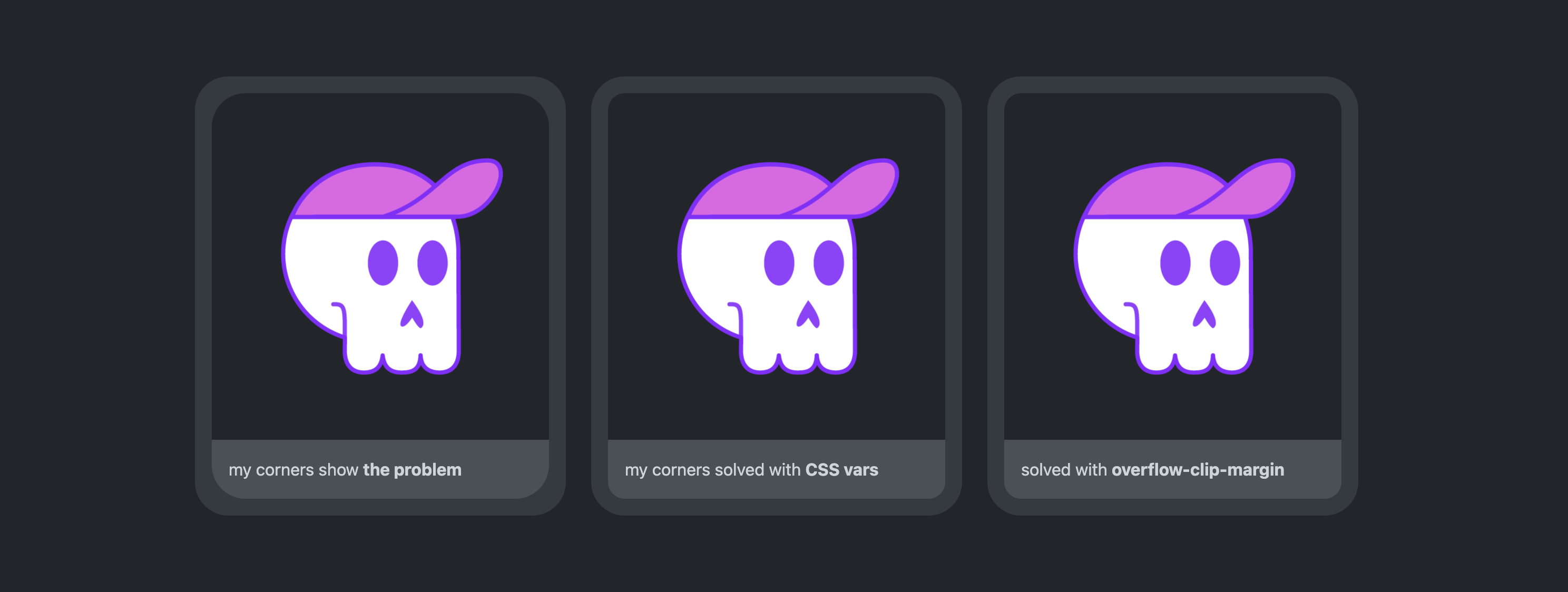
An alternative solution for nested border radius that clips the content-box.

I'm fallin behind getting my hands on some #CSS stuff!… Src of my FOMO:
Hella powerful stuff there that I really don't want to let get away from me.


Quick example of how to make that striped mask on the bottom of the circle gradient.

afk.

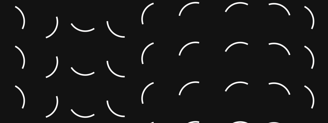
Recreate an indeterminate spinner from Spotify, building off a tip from last week 🤘🏻💀

37 today. Maybe I'll upgrade this 2011 Mac Air.

This felt like a future of library customization, using @layer:
/* <tool-tip> styles */
@import "tool-tip.css" layer(components.tooltip);

/* later, in some-new-context.css */
@layer components.tooltip {
  .some-new-context tool-tip {
    --_bg: var(--surface-1);
    --_shadow-alpha: 15%;
  }
}
Scope the import, then append tweaks into that scope from anywhere. Safe and sound.
Rad stuff.

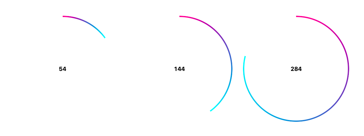
Two gradients, one's a mask and the other is the angle / completion.

Gettin the wiggles out before bedtime;
kids night club style.

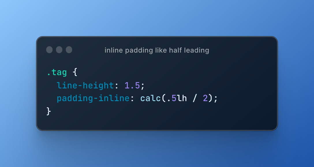
Complimenting half leading with the lh unit on inline padding

Math color palettes = letter spacing
Optical color palettes = kerning

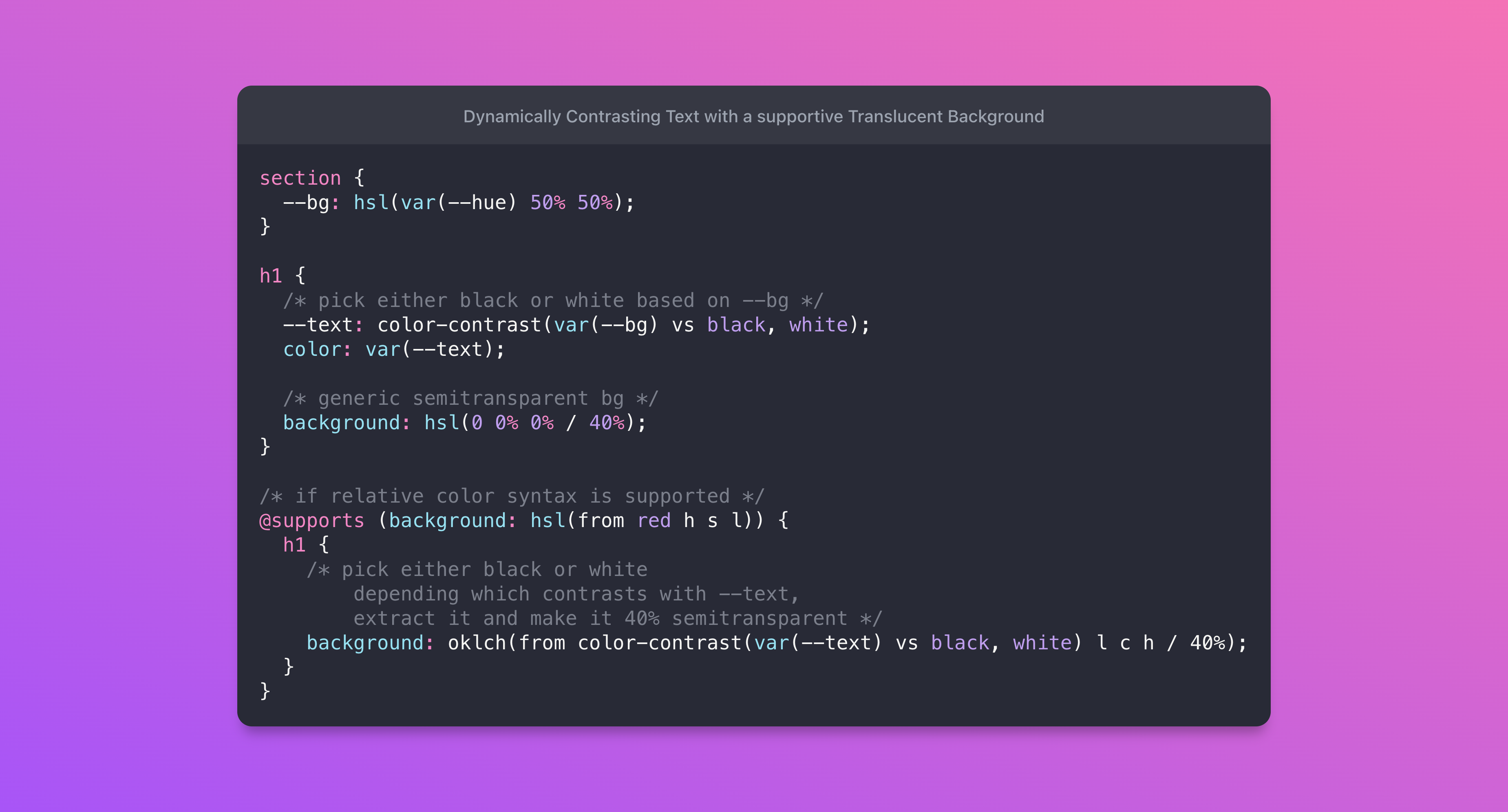
With relative color syntax and the color-contrast() function, we can achieve a robust and dynamic overlay effect.

Meet the new web color spaces!
It's the article I wish I had when learning about CSS color updates.



I chose clip-path and skew(), what do you choose?

CSS color tip!
Need a rainbow gradient? Let <hue-interpolation> do the work.
.vibrant-rainbow {
  background: linear-gradient(
    to right
    in hsl      /* vibrant gradient HSL colorspace */
    longer hue, /* hue-interpolation set to longer */
    red, red    /* now red to red goes all the way around */
  );
}


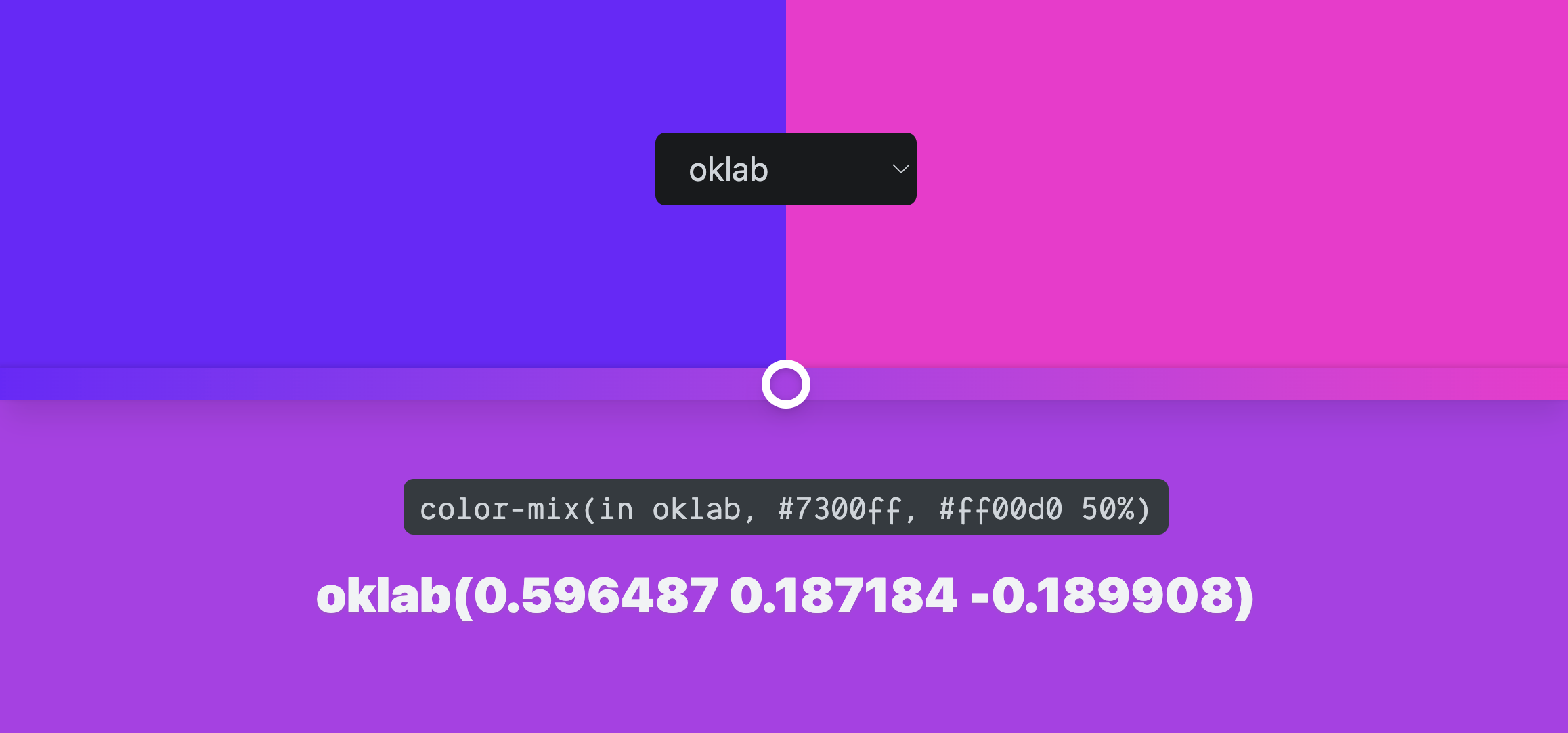
CSS color-mix()
I've got a new post on Chrome Developers with everything you need to know.

TcsS - Typed Cascade Style Sheets
Why hasn't this been made yet? CSS has all the type information needed to create a comparable experience to TypeScript.


Tokens, house props, adaptive props, pseudo-private props, partial props, mixin props, swappy props, style query props, meta lang props and typed props. Oh my!

Delete your timeout functions and shake off their bugs, here's the event you really need: scrollend.
Read all about it on Chrome Developers and checkout the polyfill I wrote on NPM.

Proud to share I'll be MCing CSS Day 2023 with Michelle Barker.

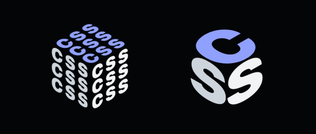
A 2023 take at an adaptive CSS logo, thing.

Service worker update:
Let me know if anything has broken!

2023 prediction:
libraries move to or build upon Deno instead of Node.

![setInterval(() => {
document.startViewTransition(() => {
h1.textContent = word[index++]
})}, 500)](/media/text-replace-transitions.png?__frsh_c=j9g9rst1q0qa)
With view transitions, even replacing text can become a custom animation.

Art with the kids 🤘💀


This brings us to a total of 54 CSS length units.

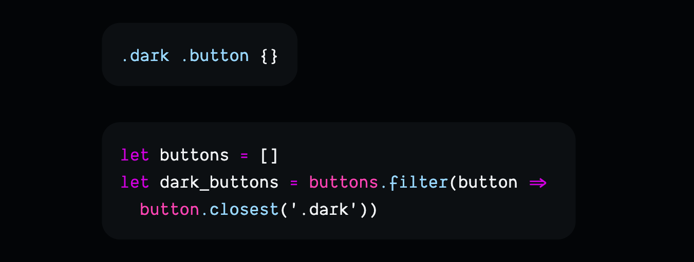
Thoughts on arrays in JS and selectors in CSS


Read about the tech behind this new site and all the APIs I'm playing around with?

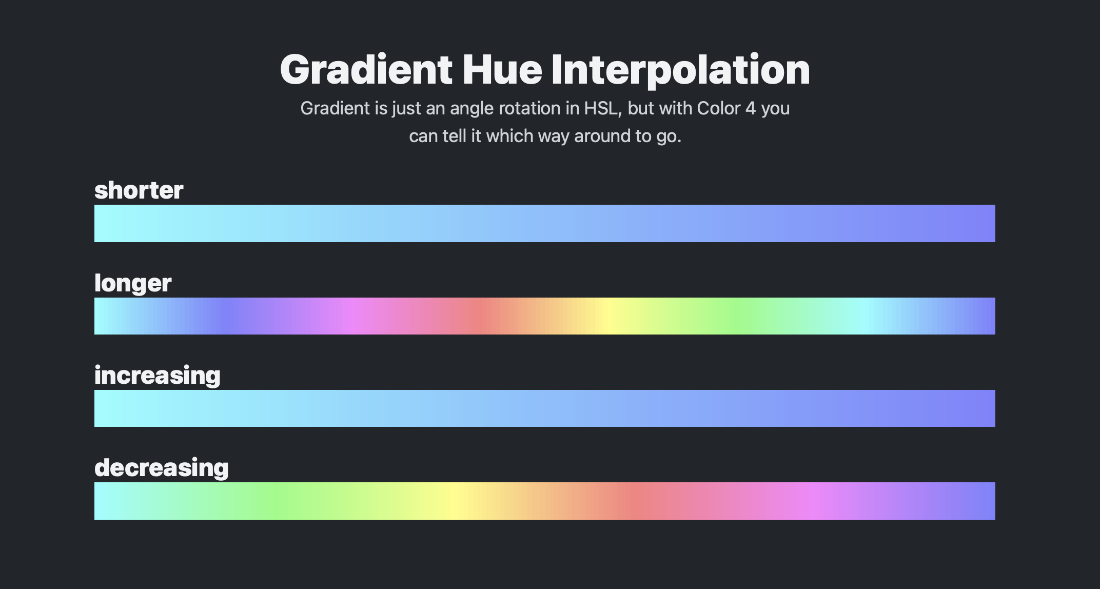
Tell the browser to take a different route when building gradient steps.

I find this so much more readable.
@media (width <= 720px) {}
Caniuse says we're waitin on Safari to bring it from TechP to Stable; aka plugin still required 😭

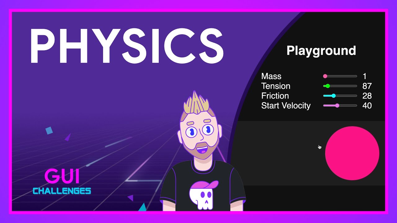
Thinking on ways to do UI Physics
In this GUI Challenge, I use requestAnimationFrame and custom properties to make bouncy and jelloey springy UI effects.

Individual transforms
are rad.
when you don't need to manage the order

Things CSS Could Still Use Heading Into 2023
Just a couple of ideas!
Chris Coyier
Missing text-wrap tho!
h1, h2, h3 {
  text-wrap: balance;
}

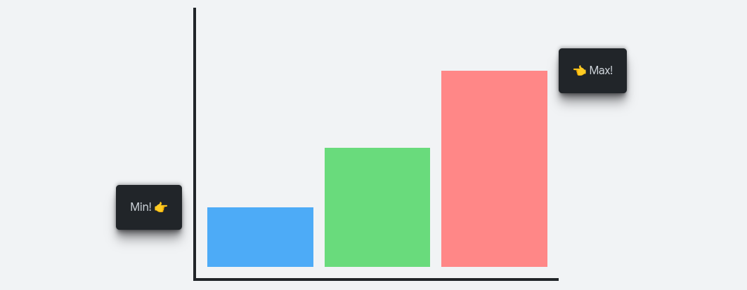
Name an anchor, position stuff to it.

html:has(.CertainItem:focus-visible) {
  scroll-snap-type: y mandatory;
  scroll-padding-block-start: 100px;
}

.CertainItem:focus-visible {
  scroll-snap-align: start;
}
On demand with :has(),
when a certain item is focused..
snap dat item into a nice position.

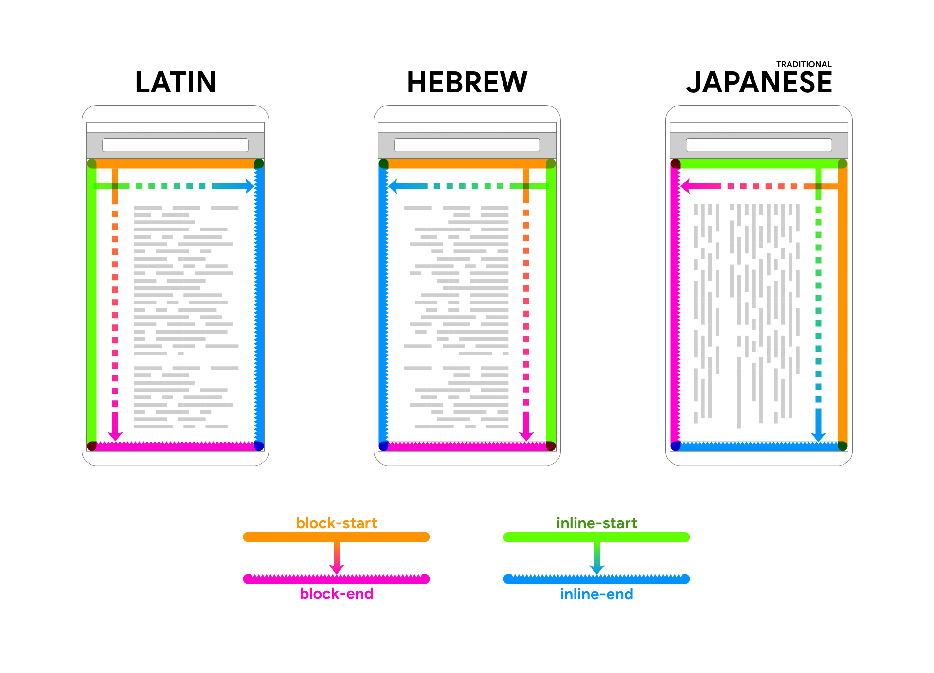
Logical Properties
Learn once, works everywhere.
MDN · Learn CSS · web.dev · The CSS Podcast

Domain's moved 👍
Soft launch of nerdy.dev successful 🤘💀
Still more work. Expect change!

Need a dropcap?
Try the lh unit 🤓
::first-of-type::first-letter {
  line-height: 1;
  font-size: 3lh;
  float: start;
}


In ~1 minute you can have FLIP-like animation on your page with View Transitions.
document.startViewTransition(() => {
  // modify the dom
  // - hide stuff
  // - move stuff
  // - whatever!
})
Game changer.

layouts are loops.


I didn't have any expectations going into this, but sure came out feeling proud: The CSS Podcast, Open Props, Learn CSS, Nesting.. all toppin the charts 🙂

5 years at Google 🎉

a design tool is like a workspace with pre-squeezed paints ready. bummer is.. many artists have a preference in their paint and ink brands.
soon web browsers will offer the choice, will graphic design tools?


Lightness != Luminance

Grid and
Subgrid
layout slots
with named areas are rad 🤘💀
Placing things by name like search, tab bar, and home bar can be sweet.
Try it
(experiment in Canary, Safari Tech Preview or Firefox)
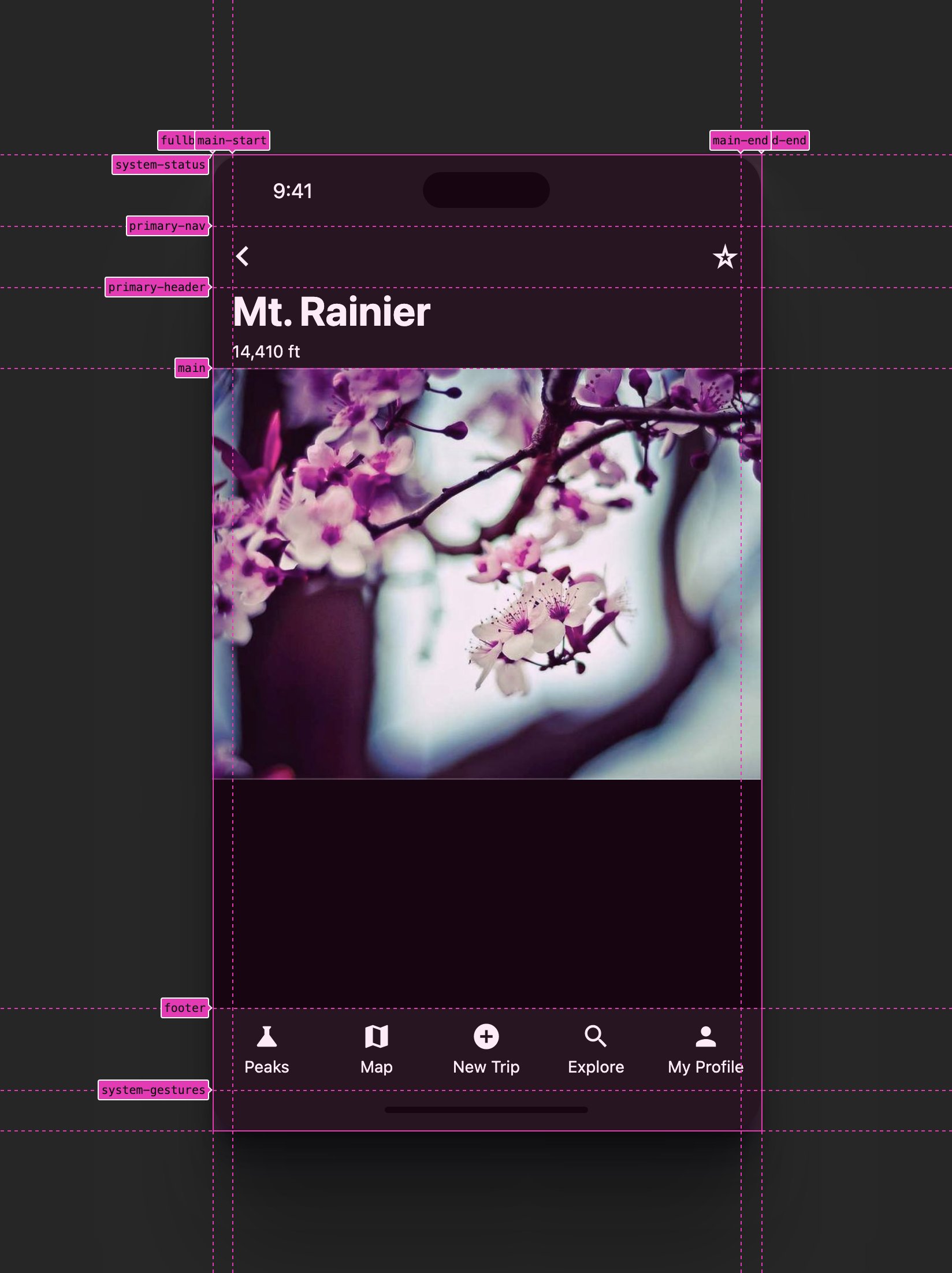
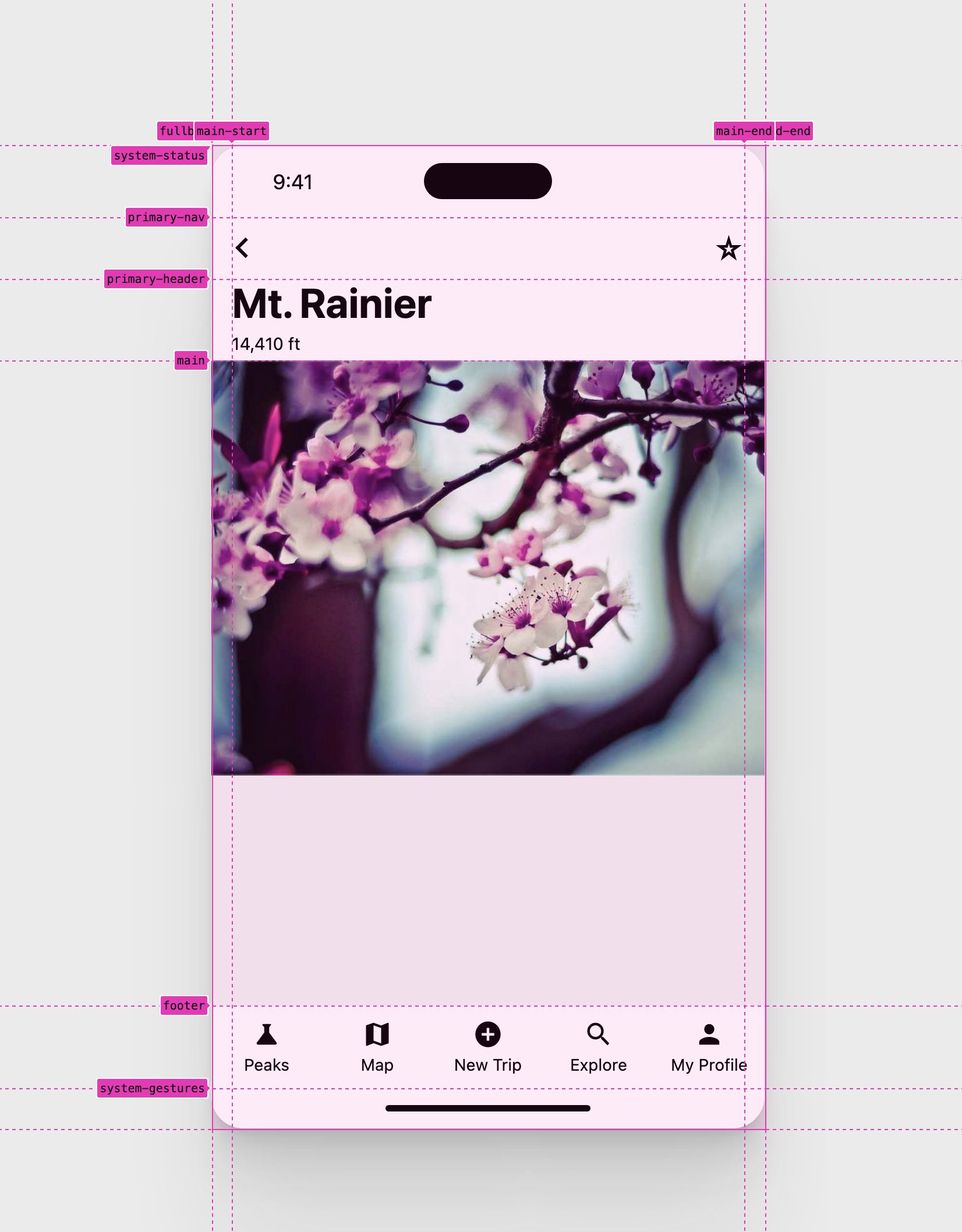

use :has() for when an element doesn't have some other element as a child, like a card without a heading 🤓
.card {
  ...
  &:not(:has(h3)) {
    /* .card's without h3's */
  }
}


DevTools You Didn't Know Existed
The daily.dev show.


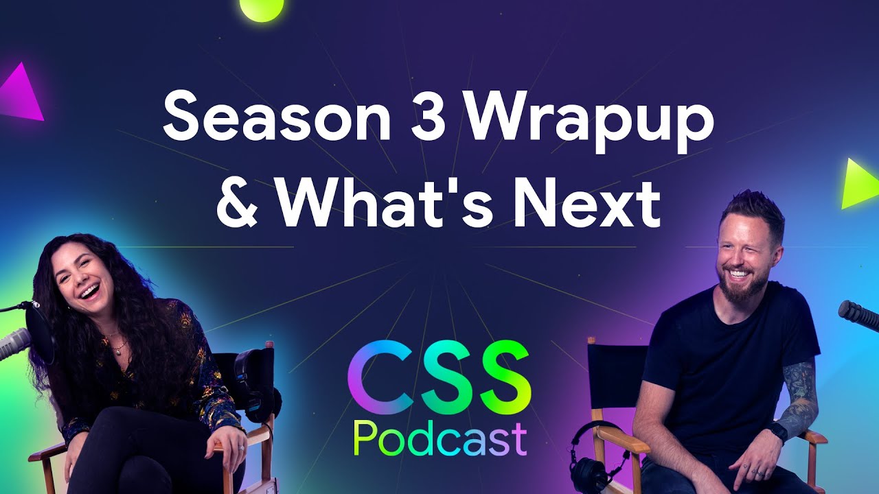
End of Season 3 of the CSS Podcast:
YouTube | Podcast!
Had a blast, CSS is so rad ❤️

a rad #CSS one-liner for your hot topics
@layer demo {
  h1 {
    text-emphasis-style: "🔥";
  }
}

Thinking on ways to solve card stacks
In this GUI Challenge,
I
animate a stack of cards using transform origin,
grid and
:has().


Subgrid
Una and I discuss subgrid, a special value for grid-template-rows or grid-template-columns. Learn the basic, use cases, tips, tricks and gotchas.


Oh Snap!
Spoke at CSS Cafe. Watch on YouTube, Peep the slides.


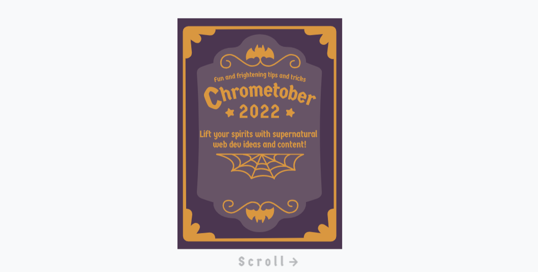
Announcing Chrometober!
Just like Designcember but hauntd! Checkout the blog post Building Chrometober by Jhey for lots of great details about the process.

Made my
first commit
to the HTML Spec for the
scrollend
event.

Thinking on ways to solve transitions 🧟♂️
In this haunted GUI Challenge,
I live
code CSS clip-path transitions, demo some rad effects, and cover gotchas. If you don't know clip-path, you will by the end.


State of CSS Frameworks

Oh snap!
Spoke at An Event Apart in Denver on all the magical things you can do with CSS scroll-snap!


Thinking on ways to solve tooltips
In this GUI Challenge,
I
build a <tool-tip> custom element with
:has(),
transforms,
and logical properties.
Besides a small backup script for :has(), it's all CSS powered.


Thinking on ways to solve the cafe wall illusion
In this GUI Challenge, I recreate a classic illusion with CSS.


On the Learn with Jason show!
Jason and I bring a NextJS app to life with Open Props. Even get to do a little animation 🙂

Thinking on ways to solve carousels
In this GUI Challenge, I try and make an accessible, responsive, adaptive and decently full featured carousel.

Spoke at the super rad CSS Day in Amsterdam on CSS Scroll Snap.
Watch the video, peep the slides
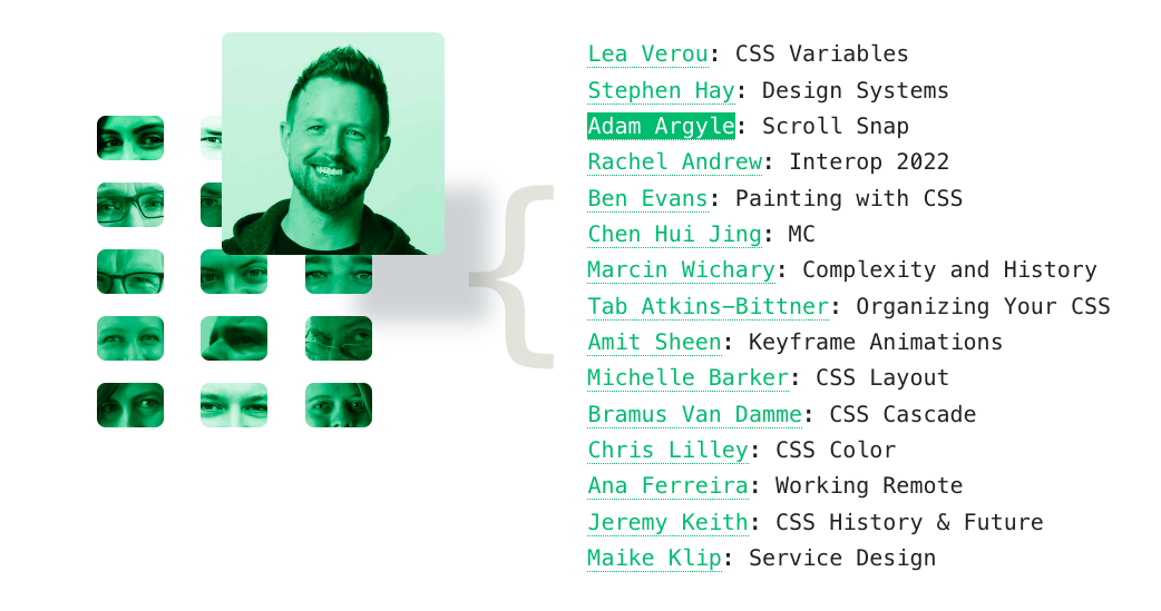

State of CSS 2022
Spoke for a Google IO video and wrote an accompanying mega blog post.
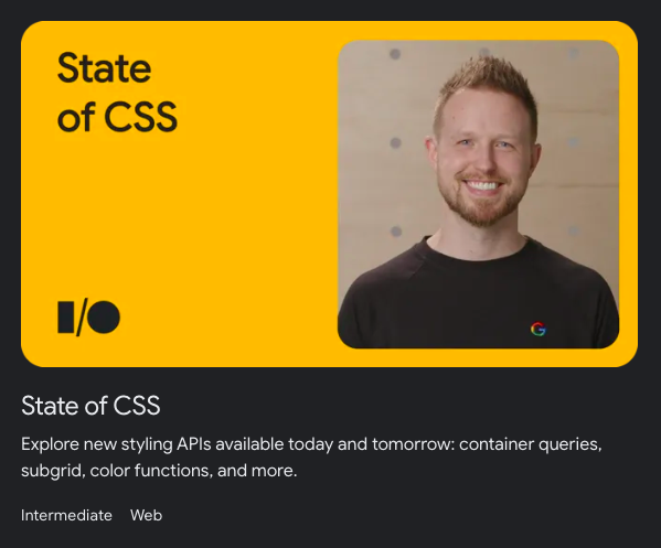


A single use custom element.

Was on @KendoUI's React Wednesdays, chattin about Open Props.

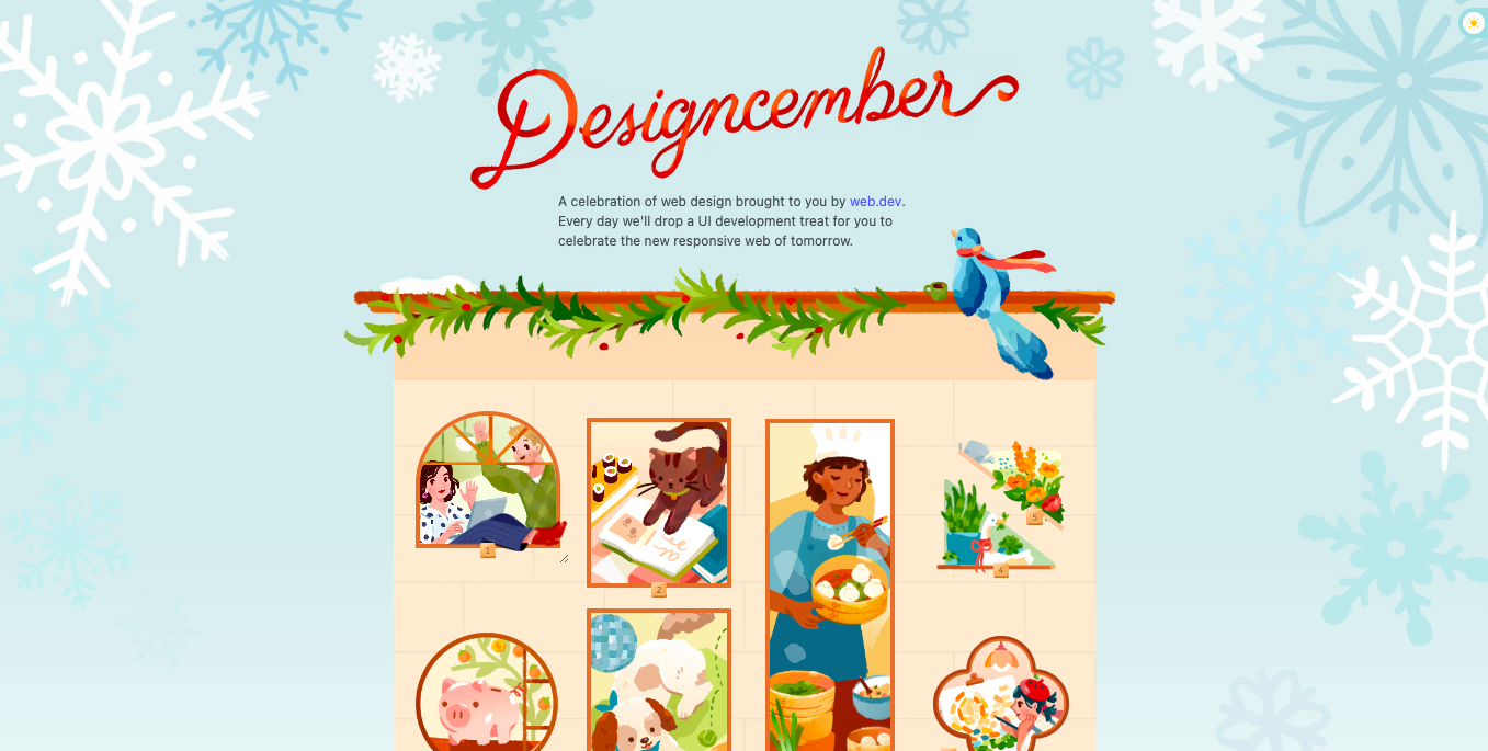
Announcing Designcember!
We on the Chrome Team use the site as a place to both test new web features all combined together, but also to showcase content from our team and others around the web.
Checkout the blog post Building Designcember for lots of juicy details.

Swyx and I chat DX vs UX, complexity cliffs in UI, and a little about design.

Announcing open-props.style
350 ✨free✨ CSS variables

UX/UI Designers are forced to design in px, in a world where accessibility is a legal requirement Christine Vallaure
Why designers should move from px to rem (and how to do that in Figma)

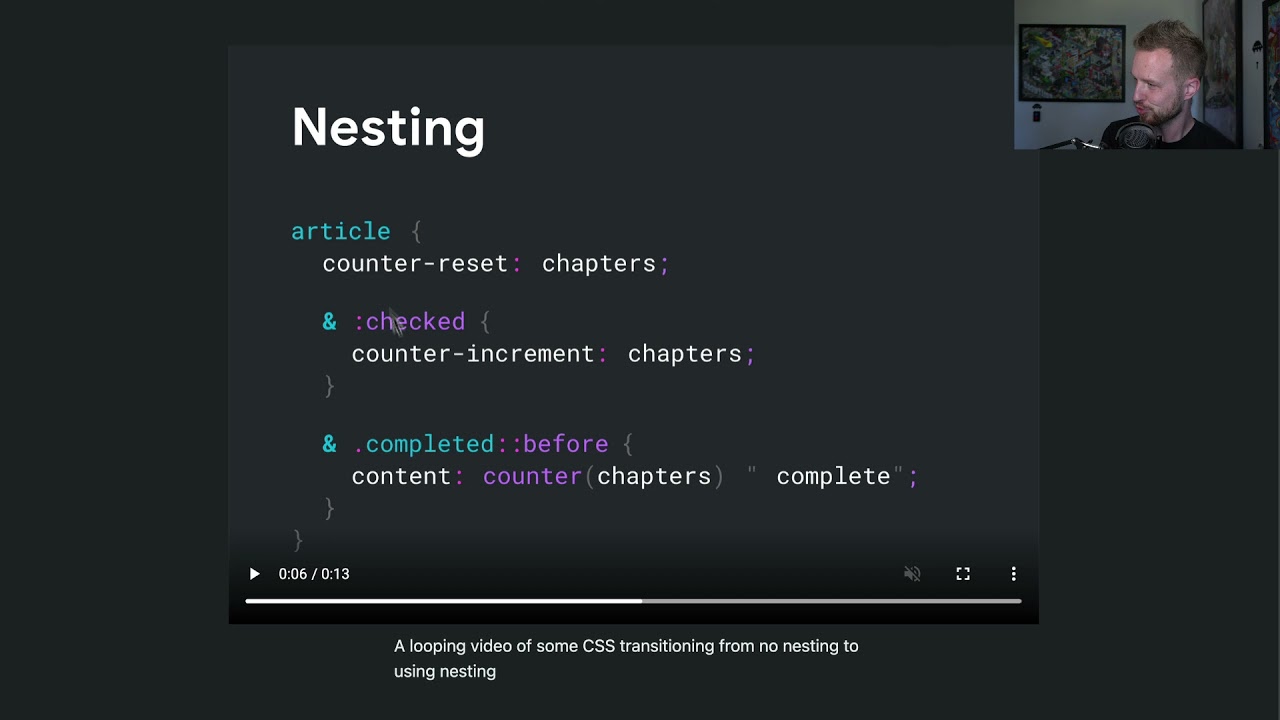
CSS Nesting for the W3C!

Billion Laughs Attack
aka: XML bomb 💣
A type of DoS attack aimed at XML parsers that with a few liens of code, aims to consume a ton of memory.
:root {
  --ha1: lol;
  --ha2: var(--ha1) var(--ha1) var(--ha1);
  --ha3: var(--ha2) var(--ha2) var(--ha2);
  --ha4: var(--ha3) var(--ha3) var(--ha3);
  --ha5: var(--ha4) var(--ha4) var(--ha4);
  ...
}
#CSS was a victim of this when custom properties were introduced.
Learn more on Wikipedia or the CSS Variables Spec.

I join Kevin Powell on Twitch to talk about my favorite up-and-coming CSS features.

CSS scroll-linked animations with Kevin Powell!

HD CSS Color
Spoke again at CSS Camp! This time on HD color, explore what we can use today and how to prepare for the future. Checkout the slides.

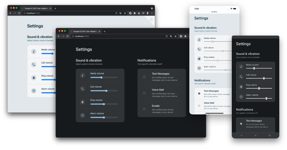
Color Gamuts of 2021
Spoke at CSS Cafe. Watch on YouTube, Peep the slides.


Google IO 2021
Gave a workshop on building a user-adaptive interface. CSS grid, flexbox, media queries, and much more.

Jecelyn and I show some of the ways Chrome DevTools supports designers.

What's New In CSS

Great Developer Tools
Spoke to the Stripe DX team in Seattle at their summit where I shared learnings from working with Chrome DevTools teams and creating VisBug. View the slides.

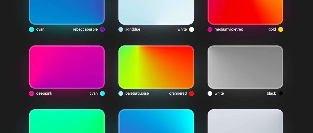
Announcing conic.style
Grab n' go beautiful and unique
conic-gradients.

What's New in 2020
Spoke online for London CSS, rapid fire CSS goodies like proposals, drafts, specs, tools & more. Check out the slides.

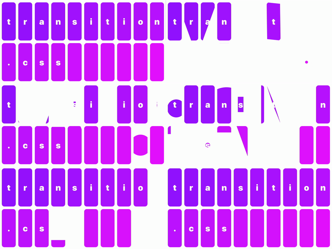
Announcing transition.style
Grab n' go (dont even need the lib)
clip-path
animations

4 layouts for the price of

Made my first commit to a CSS Spec.

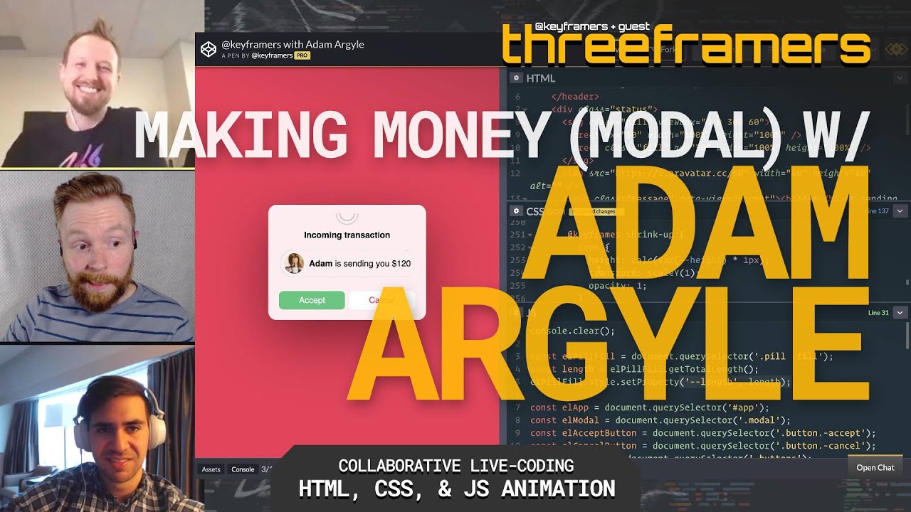
I join David Khourshid and Stephen Shaw on The Keyframers!

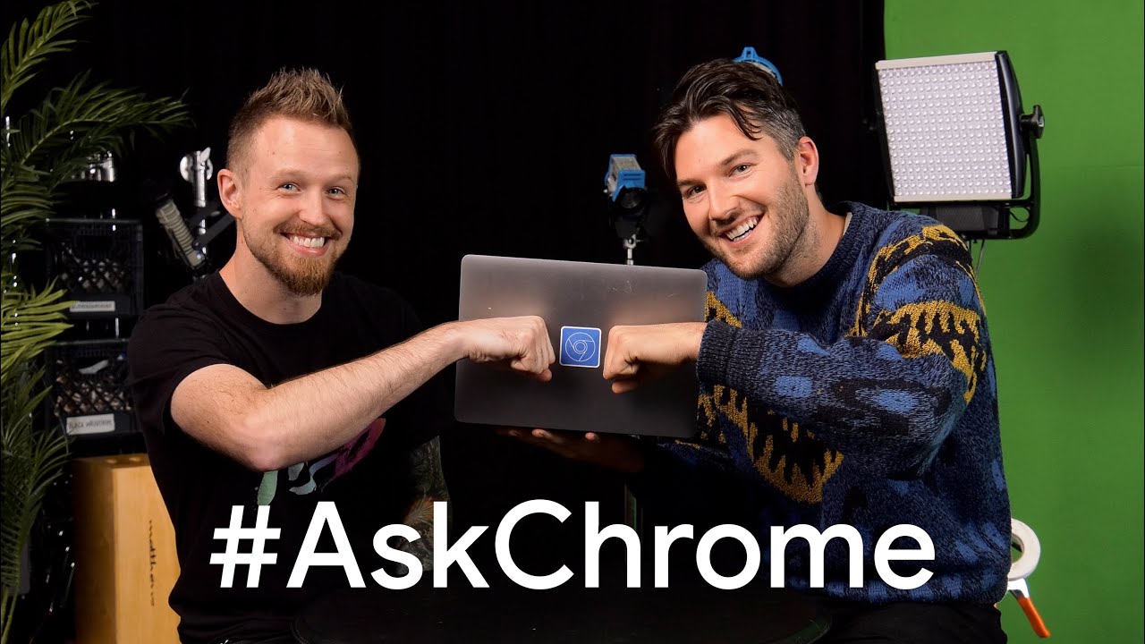
Kayce and I answer some DevTools questions 🙂

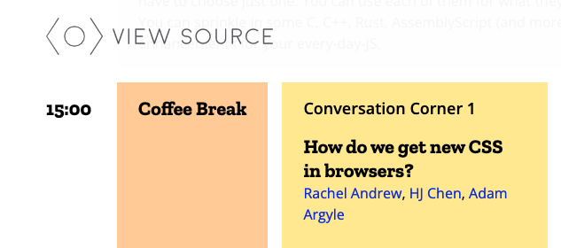
Corner at View Source Conf in Amsterdam

Chatted VisBug with Stefan Judis 🤘💀

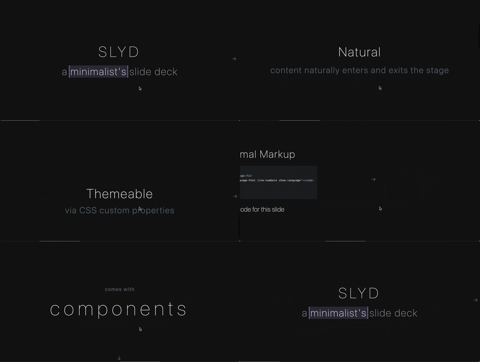
Released Slyd!
<slyds>
  <slyd>
    <h1>Slide 1</h1>
    <h2>subtitle</h2>
  </slyd>
  ...
</slyds>
Scroll snap powered, parallax featured, bi-directional slide framework.

I join Travis Neilson on the Google Design "Method Podcast" show to talk about VisBug!


Deceiving For Good
Spoke at Seattle Interactive Conf about using UX knowledge for good. See the slides.


Spoke at CSS Camp on how to slow the pace down in an app for anxiety free, frictionless UX.
Spoke at JS Camp on how to leverage PWA features to build realistic prototypes.
Both talks were in the beautiful city of Barcelona ❤️

MPJ(funfunfunction) and I chat CSS Grid.

Rick Viscomi and I chat about the role of design systems in modern web development and how they can change the dynamics between designer and developer.


Became a member of the W3C and CSSWG!

VisBug was made open source! Plus an interactive tutorial website that looks like a bunch of artboards that need fixed.
Watch the announcement at Chrome Dev Summit 2018.

Released Kung Fury! A syntax highlight theme.


Released blingbling.js!
import $ from "blingblingjs";
Micro-library of shorthands for DOM selection, events, and attribute manipulation in a super minimal ES module.


Released roving-ux.js!
import { rovingIndex } from "roving-ux";

rovingIndex({
  element: document.querySelector("#carousel"),
});
User's shouldn't need to tab through each item in a list to see the next list

I made a cameo in the keynote at Chrome Dev Summit 2018! Had a blast.. moment of a life time 🔥
I wore this shirt from TeeJungle, it was a thing.


Released ragrid.css!
<section grid="columns" vertically-aligned="bottom">…</section>
Works like auto-layout:
An intrinsic first, minimal set of layout attributes.


Spoke at TEDx, Tacoma: Embrace UI.
✅ Slides built with Node and sockets for palm held slide swipeys.
tldr; Embrace UI because it's all around you, and when it's working right it's helping you be more human.

Spoke at HTML5 DevConf in San Francisco about the cross platform (Android, iOS, Windows Phone) hybrid web app Lively.


🎓 Taught at Art Institute of Seattle:

Recorded my first set of tutorial videos. They were on #HTML5 for Intel's Developer Zone.

Gave my first front-end talk at an Adobe CreateNOW event in Seattle on HTML5 in Dreamweaver.
No posts match the current filters