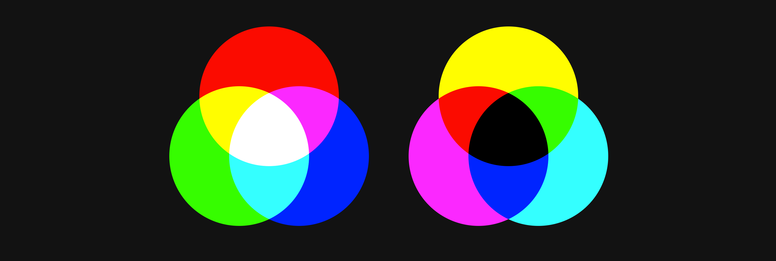
A very common task is to programmatically create non-opaque versions of brand colors. Comes in handy for hover effects, edge highlights, shadows, etc. Here's one way to achieve that with color-mix().
This post was prompted by Adam Wathan on Twitter:
For someone smarter than me (@argyleink?) can the new `color-mix()` function be used to adjust the opacity of a color with the right concoction of clever arguments?
— Adam Wathan (@adamwathan) March 9, 2023
color-mix(something, color-whose-opacity-i-want-to-override, some-way-to-specify-that-opacity)
The trick #
Ok browser, make red 25% opacity:
.make-transparent {
  background: color-mix(
    in oklab,
    red,
    transparent 75%
  );
}
To get that result, we mixed a 75% transparent hueless color with a fully opaque red, the result is a red at 25% opacity. 25% because specified in the mix that the transparent color is 75% dominant in the mix, leaving a remainder of 25% opacity for the red color.
Also, I chose oklab very specifically here, it gave me the mix I expected. Other color spaces did not. Glad I knew my color spaces.
Here's another one.
Make this 10% red, even more transparent. In fact, make it half as transparent as it is now.
.make-more-transparent {
  background: color-mix(
    in srgb,
    rgb(255 0 0 / 10%),
    transparent 50%)
  ;
}
Result is rgb(255 0 0 / 5%). See on Codepen.
Try it #
Chrome Canary, Firefox and Safari Tech Preview have color-mix(), we'll very likely see it cross browser by summer.
The better way #
Relative color syntax is much cleaner for this task.
It's also badass overall. Can't wait for it.
Make the red 25% opacity:
.make-transparent {
  background: rgb(from red r g b / 25%);
}
or the other example, you can either absolutely squash it by just setting it, or you can perform math on it, like cut it in half:
.squash-transparency {
  background: rgb(from rgb(255 0 0 / 10%) r g b / 5%);
}
or
.cut-transparent-in-half {
  background: rgb(from rgb(255 0 0 / 10%) r g b / calc(a / 2));
}
Resources #
- Try my color-mix tool at https://color-mix.style
- In depth
color-mix()post at https://developer.chrome.com/blog/css-color-mix/ - Get more familiar with colorspaces at https://developer.chrome.com/articles/high-definition-css-color-guide/

