

Someone across the room could hear the sounds from a device and know that it's coming from a Nintendo Switch.
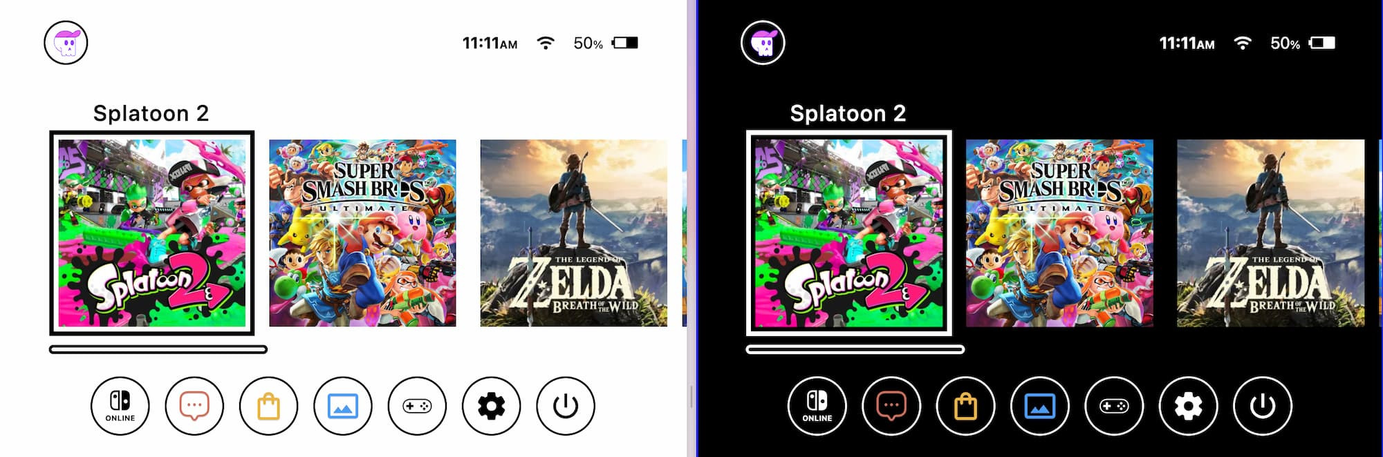
Just the audio alone is iconic; but that homescreen layout and scroll experience, :cheffs-kiss:
Let's remake it with CSS!
- light/dark theme + forced colors support
- automatic scroll UX upgrades based on user's browser capabilities
- keyboard, mouse, touch, allllll good
This is 1 of 3 scroll experiences I taught at CSS Day 2025. What a lovely conference!
HTML #
Structure #
I've found the following "3 element structure" for a scroller to help prevent headaches and gotchas across browsers. The structure supports you both in styling, interactions, and container queries.
.scroll--root: highest level container for the scroller, may have borders or spacing styles.scroll--viewport: the element withoverflow, containment and scrollbar styles.scroll--content: wrapper to aid in cross browser padding oddities or other impacts that an overflow container may apply to children
<section class="scroll--root">
  <div id="scroller" class="scroll--viewport">
    <ul class="scroll--content">
      /* your content */
    </ul>
  </div>
</section>
CSS #
Essentials #
These are the things you should always put on your scroller:
- use the
overflowshorthand and set both axes to prevent surprises overscroll-behaviorshould always match the scrolling axis- padding and
scroll-paddingshould always match - smooth
scroll-behaviorif the use is ok with motion
.scroll--viewport {
  overflow: auto hidden;
  overscroll-behavior-x: contain;

  padding-inline: var(--size-8);
  scroll-padding-inline: var(--size-8);

  @media (prefers-reduced-motion: no-preference) {
    scroll-behavior: smooth;
  }
}
See the @layer lessons.essentials in the demo for more comments.
Containerization #
Since a scroller of often extrinsically sized, it won't suffer from the side effect that container queries can cause (where they collapse). This makes scroller and container queries a natural pair.
- container shorthand lets me set the name and the type(s) in one spot
- container queries for children to use to ask this container questions about the width and height while also providing a context for container query units like
cqw - scroll-state for children to ask about which game is snapped
Plus, scroll-state queries on the scroller and on the snap items are meaningful and worth setting up while we're here.
.scroll--root {
  container: --homescreen / size;
}

.scroll--viewport {
  container: --homescreen-scroller / size scroll-state;
}

.scroll--content > li {
  /* children will use snapped scroll-state() */
  container-type: scroll-state;
}
See the @layer lessons.containerize in the demo for more comments.
Snapping #
Meaningfully, the Switch scroller snaps the scroll items to the left, in line with the layout grid. We can do this in CSS with just a couple styles.
Since the scroll-padding already matches the inline padding, the snapping here will match the alignment perfectly.
.scroll--viewport {
  scroll-snap-type: x mandatory;
}

.scroll--content > li {
  scroll-snap-align: start;
}
See the @layer lessons.scroll-snap in the demo for more comments.
Overscroll effect #
It's common for scrollers to offer an effect if you've reached the beginning or end; an overscroll effect. The most common is an elastic effect, like a rubber band is tight and preventing you from going further and when you let go it snaps back. We can do this with CSS scroll snapping.
Here's a moment where wrapping all your content in a .scroll--content container is valuable. The overscroll amount is the size of an invisible item at the beginning and end of the scroller. The browser will let you scroll to them, but since they won't have scroll-snap-align set and the scroller itself has x mandatory set, the scroller will never rest on these invisible overscroll spacers.
- The inline-start spacer will be
25cqi, offering a 25% overscroll vibe - The inline-end spacer will be larger at
90cqi, ensuring the last game can be snapped to the start
.scroll--content {
  display: flex;

  &::before,
  &::after {
    content: "";
    display: block;
    inline-size: 25cqi;
    flex-shrink: 0;
  }

  &::after {
    inline-size: 90cqi;
  }
}
See the @layer lessons.overscroll-effect in the demo for more comments.
Scroll Animation #
This was a personal addition, not part of the original Switch homescreen design.
It's subtle; fade out the game you just scrolled past. Leave a hint or peek of it, but dim it out. This reduced cognitive load and helps the eye maintain the alignment of the snapped game to the grid.
Here's the simple keyframes.
@keyframes leaving-scroller {
  to {
    opacity: .2;
  }
}
Here we use the keyframes on a game if the browser supports the feature, and I clamp the keyframes with animation-range to only run as the element exits the scrollport.
.game {
  @media (prefers-reduced-motion: no-preference) {
    @supports (animation-timeline: view(x)) {
      animation: leaving-scroller linear both;
      animation-timeline: view(x);
      animation-range: exit 50% exit 100%;
    }
  }
}
See the @layer lessons.scroll-animation in the demo for more comments.
Scroll State #
Here we'll use the scroll-state containerization work from an earlier lesson. Two things occur when a game snaps into place:
- the pulsing blue focus outline highlights the game and animates forever
- the title of the game slides up
By default I chose to always show the game titles, only applying the animation effect if the browser understands scroll-state queries.
Here's the keyframes for when a game is snapped:
@keyframes game-focus {
  from {
    outline-color: hsl(200 100% 50%);
  }
  to {
    outline-color: hsl(200 100% 80%);
  }
}
The game image uses the keyframes when it's parent .game parent container is snapped on x, and the image title slides down when it's parent game is not snapped.
.game {
  img {
    @container scroll-state(snapped: x) {
      outline: 5px solid blue;
      outline-offset: 5px;
      animation: game-focus .5s var(--ease-3) alternate infinite;
    }
  }

  figcaption {
    @media (prefers-reduced-motion: no-preference) {
      z-index: -1;
      transition:
        translate .5s var(--ease-spring-2) .2s,
        opacity .5s var(--ease-3) .2s;

      @container not scroll-state(snapped: x) {
        translate: 0 50px;
        opacity: 0;
      }
    }
  }
}
See the @layer lessons.scroll-state in the demo for more comments.
Colorization #
The goal of this section is to match the Switch Homescreen's scroller style with ::-webkit-* scroll features, while also providing a meaningful fallback with scrollbar-color. In addition to integrated colors and sizing, I also add a few interactive moments like when a keyboard is focused inside the scroller, or a mouse is hovering the thumb.
- Integrate scrollbar colors into the adaptive light/dark/forced colors themes
- Add hover and focus "hints and feedback"
Look at how cool the forced colors styles are. Transparent borders are your friend!

Compare that with the light and dark styles:

It takes a lot of selectors and styles to do this robust colorization, here's the chunk that does the work.
.scroll--viewport {
  &:is(:focus-visible, :focus-within) {
    outline-offset: -2px;
    outline: none;
  }

  &::-webkit-scrollbar {
    height: 10px;
  }

  &::-webkit-scrollbar-track {
    background: #0000;
    background-clip: padding-box;
  }

  &::-webkit-scrollbar-thumb {
    background: color-mix(in srgb,
      light-dark(
        var(--surface-4),
        var(--surface-2)
      ),
      #0000 50%
    );
    border-radius: 1e3px;
    border: 3px solid var(--surface-1);
  }

  &:is(:focus-visible, :focus-within)::-webkit-scrollbar-thumb {
    background: var(--link);
  }

  @media (hover) {
    &::-webkit-scrollbar-thumb:hover {
      background: light-dark(var(--surface-4), var(--surface-2));
    }

    &::-webkit-scrollbar {
      opacity: .5;
    }

    &::-webkit-scrollbar:hover {
      opacity: 1;
    }
  }

  @supports (-moz-appearance:none) {
    scrollbar-width: thin;
    scrollbar-color: var(--surface-4) #0000;
    transition: scrollbar-color .3s ease;

    &:is(:focus-visible, :focus-within) {
      scrollbar-color: var(--link) #0000;
    }

    @media (hover) {
      scrollbar-color:
        color-mix(in srgb, var(--surface-4), #0000 50%)
        #0000;

      &:hover {
        scrollbar-color: var(--surface-4) #0000;
      }
    }
  }
}
See the @layer lessons.colorize in the demo for more comments.
Content Introduction #
Finally, on load, introduce the content from the right, providing the hint that there's directionality in this games list, hinting at scroll.
The star of this effect is @starting-style.
.scroll--content .game {
  @media (prefers-reduced-motion: no-preference) {
    transition: transform 1s var(--ease-spring-2);
    transition-delay: calc(var(--i) * .05s);

    @starting-style {
      transform: translateX(100vw) translateZ(calc(var(--i) * -1px));
    }
  }
}
See the @layer lessons.loading-animation in the demo for more comments.
JavaScript #
Iconically, the Switch homescreen has both haptic and audibal feedback for your interactions, specifically to the scroller.
- Snap "click" when the scroller rests on a game
- Pop sound as each game passes by the snap area
- Haptic feedback as a game passes over the snap area
- Ability to tap to snap
Preload #
First let's preload the sounds so they can play instantly at first.
const sounds = {
  snap: new Audio('https://assets.codepen.io/2585/snap.mp3'),
  pop: new Audio('https://assets.codepen.io/2585/pop.m4a'),
}
Tap to snap #
If a user clicks a game, scroll it to the snap position.
scroller.onclick = event => {
  let target = event.target.closest('.game')

  if (target) {
    scroller.scrollTo({
      left: target.offsetLeft,
      behavior: 'smooth'
    })
  }
}
Vibrate and pop #
The lovely scrollSnapChanging event is perfectly fit for this task.
scroller.onscrollsnapchanging = event => {
  navigator?.vibrate(50)
  sounds.pop.play()
}
Snap #
The complimentary scroll event scrollSnapChange is perfectly fit for reporting scroll has ended and it's rested on a new snap target.
scroller.onscrollsnapchange = event => {
  sounds.snap.play()
}
Outro #
You made it, which means you definitely picked up some new tricks. Go forth and make great scroll experiences!
I'll share a link to the talk if/when it comes out, which provides a lot of commentary on these decisions and styles. But also, in case it wasn't clear in the blog post, check out the demo for all the comments, they should help connect all the dots.