RSS FeedTwitterMastodonBlueskyShare IconHeart IconGithub IconArrow IconClock IconGUI Challenges IconHome IconNote IconBlog IconCSS IconJS IconHTML IconMedia IconGit IconSpeaking IconTools Icon
My google avatar.
DevRel@Google
notecss

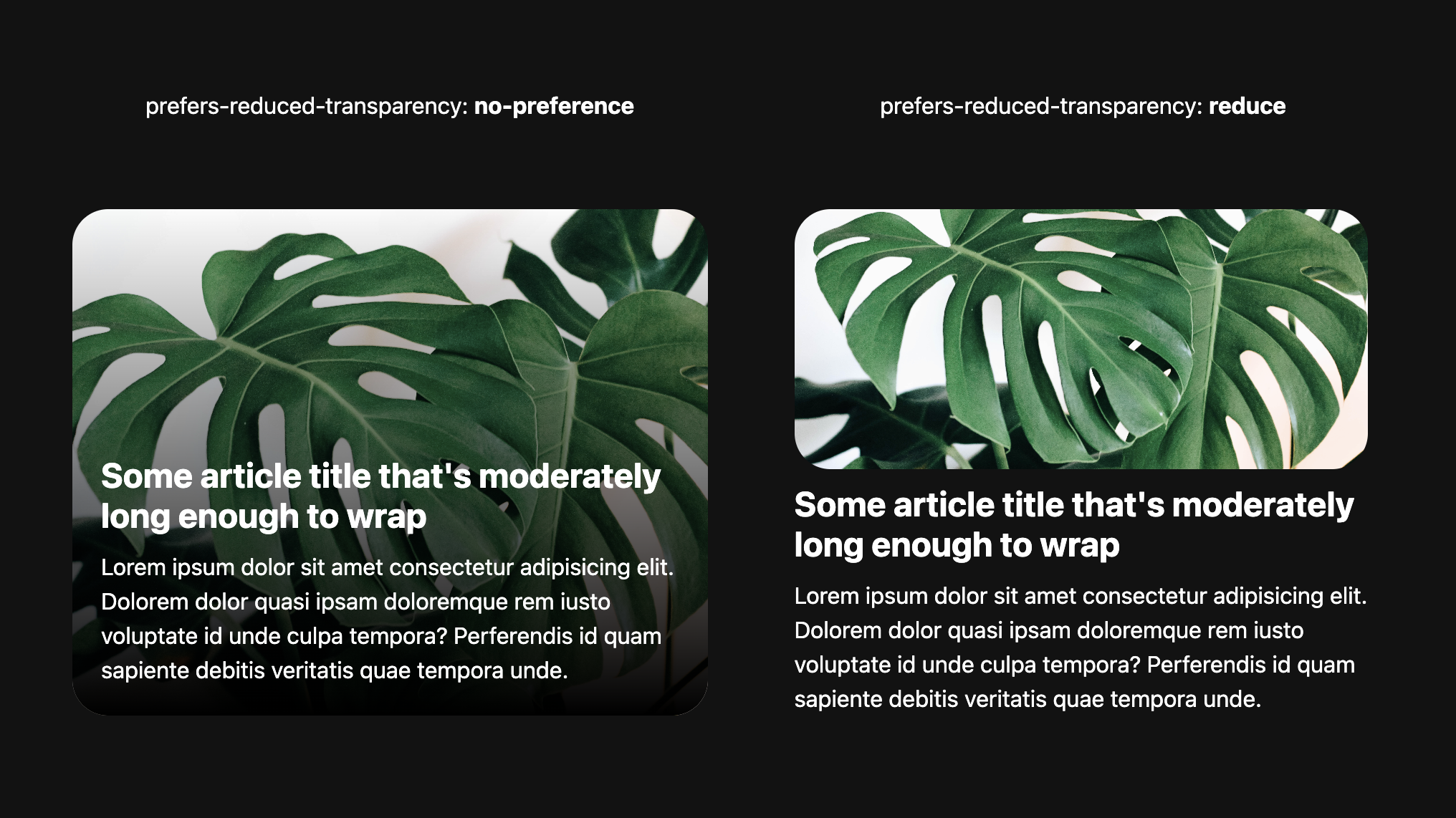
I wrote about CSS prefers-reduced-transparency on developer.chrome.com 🤓
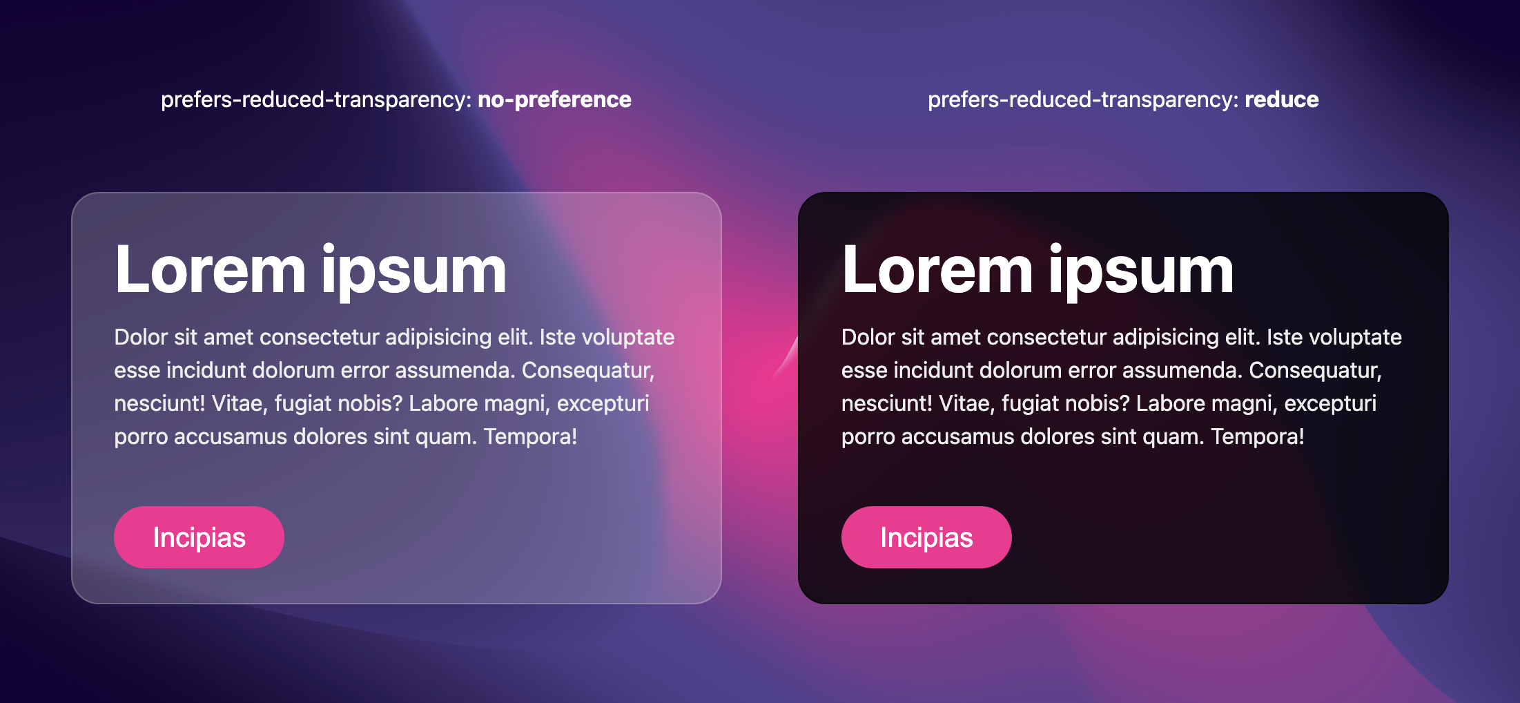
a comparison is shown between a transparent blurry white card design with white text next to a reduced transparency equivalent that is dark and nearly opaquea comparison is shown between a photo of a monstera with a black gradient overlay that has text inside and the same picture above the text, no overlay, no transparency, and very equivalent look

Join the conversation on

13 likes
8 reposts
  • E.L. Guerrero
  • Tamas
  • katherine
  • ???? Rotten Apple Annie :prami:
  • GENKI
  • Tibor Pino
  • Sophia Vasylyshyn
  • The Internet's own Kiddos

@samreciter it can be thought of similar to prefers high contrast, where users with low vision can't discern the text due to the low contrast or business behind the text. it can get worse too, some users get headaches from the struggle.

but don't ask me, ask Windows, iOS and macOS why they support it ????

Adam ArgyleAdam Argyle

@argyleink i don't even get the thing at all? why? what is the problem with transparency?

samrecitersamreciter

Crawl the CSS Webring?

previous sitenext site
a random site