RSS FeedTwitterMastodonShare IconHeart IconGithub IconArrow IconClock IconGUI Challenges IconHome IconNote IconBlog IconCSS IconJS IconHTML IconMedia IconGit IconSpeaking Icon
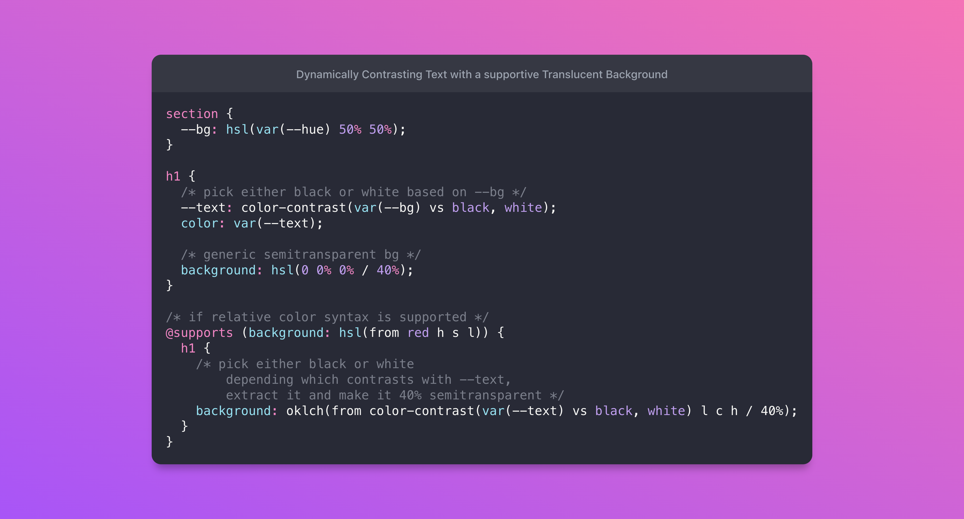
Screenshot of the final code snippet from this blog post.
A series of images of an avatar doing a bunch of skateboard tricks.

A color-contrast() strategy for complimentary translucent backgrounds

5 min read
css

The goal I had in mind was to have maximized text contrast against any color. This meant the text color should contrast well, but also I wanted a supportive translucent background to help bump that contrast even further, for situations where it may have otherwise had low contrast.

To do this:

  1. I find a good contrasting text color with color-contrast().
  2. Then I find a contrasting color for that text color with color-contrast().
  3. Use that text contrast color as a supportive translucent background with relative color syntax oklch(from black l c h / 40%)

tldr;

  1. If the text color is white, it's supportive background should be translucent black.
  2. If the text color is black, it's supportive background should be translucent white.

It's so much easier to see, but you can try it here:

See how I've automated the text color and a supportive background on that text? I don't have to care about the color I'm overlaying now, the browser handles all of it dynamically!

The essentials of the effect #

I use 2 future CSS features that aren't well supported yet (but are very fun to play with):

  1. color-contrast() - spec
  2. "Relative color syntax" - spec

Safari Tech Preview is the only browser with support for relative color syntax at the time of writing this post. Chrome Canary has color-contrast() support but won't have the dynamic supportive background (see generic bg in CSS below).

First, the container background needs to be in a custom property so we can share it with other functions:

section {
  --bg: hsl(var(--hue) 50% 50%);
}

Then, the h1 need to put it's contrasting text color into a custom property so we can share it too:

h1 {
  /* pick either black or white based on --bg */
  --text: color-contrast(var(--bg) vs black, white);
  color: var(--text);
  
  /* generic semitransparent bg */
  background: hsl(0 0% 0% / 40%);
}

For the cherry on top, if the browser understands relative color syntax, then create a new semi-transparent color from the contrasting color of --text.

/* if relative color syntax is supported */
@supports (background: hsl(from red h s l)) {
  h1 {
    /* pick either black or white 
       depending which contrasts with --text,
       extract it and make it 40% semitransparent */
    background: oklch(from color-contrast(var(--text) vs black,white) l c h / 40%);
  }
}

All of it together:

@layer demo {
  section {
    --bg: hsl(var(--hue) 50% 50%);
  }
  
  h1 {
    --text: color-contrast(var(--bg) vs black, white);
    color: var(--text);
    background: hsl(0 0% 0% / 40%);
  }
  
  @supports (background: hsl(from red h s l)) {
    h1 {
      background: oklch(from color-contrast(var(--text) vs black,white) l c h / 40%);
    }
  }
}

Conclusion #

There you have it, dynamically contrasting text with a supportive translucent background. I think that's pretty rad stuff.

Here's the Codepen embedded, so in the future it'll just work 🤓
Mentions #

Join the conversation on

388 likes
75 reposts
  • hiro:processinger
  • H. EL-WATANY
  • sarai-ap03
  • Віталій Бобров 🇺🇦💗🛡️⚔️
  • tigerh
  • Alexis Mora Angulo
  • Cristiano Rastelli
  • Jason Lawton :wordpress:
  • Ст. 122 УК РБ
  • T. Afif @ CSS Challenges
  • CSS by T. Afif :verified:
  • Šimon DSK
  • Audrey Le Mercier
  • Una 🇺🇦
  • John Sim
  • Sergio Gallardo. Especialista en Marketing Digital
  • Josef Ježek
  • Scott Tolinski - Syntax.fm - LevelUpTuts
  • Katy Castillo
  • Rodrigo Castro
  • Support striking workers
  • GENKI
  • techie quickhatch ⚛ 🐾 (Айті Росомаха)
  • Maxime Rossignol
  • Mike-麥-Mai/index.html
  • siriwatknp
  • Chanfi Attoumani
  • CNine
  • John Miller
  • Coinbroccoli
  • K Anne
  • Mike Shtilerman
  • Sujal Shah ⚡
  • Aykhan Huseyn
  • Ali Syahidin
  • Rishi
  • Евгений Резниченко
  • Vi Pro
  • Lingxi Li
  • Оля
  • KuronNazaki
  • ❖ Adrian
  • geoffrey.crofte@mastodon.design 🐧
  • Umma
  • L!on 💙💛
  • Ulf Hansen
  • Aarav Sareen
  • Arnoldyall
  • Roman Czerkies
  • Lorien
  • its_Classyd
  • Sang Nguyen
  • Carlos Caballero
  • PawaOx4th
  • D7460N
  • Jesse Holden
  • Jon Graft
  • jota
  • Melvin Rimachi
  • Fresh Frontend Links
  • Jesus Rodriguez
  • Nicolas Giethlen
  • fg
  • x
  • Thomas Kowalski
  • Michelle Barker
  • Elly Loel ✨🌱
  • David G. Smith
  • Ricard Torres
  • Sine 🏳️‍🌈
  • Virtual Boy :bec_wink:
  • kaiserkiwi :kiwibird:
  • Tyler Sticka
  • Shannon Moeller
  • Callie 🏳️‍⚧️

@argyleink that's so unfortunate that it's still blocked. especially since it's not something that can be easily emulated at build time (css vars being computed at runtime and whatnot) 😔

MayankMayank

@argyleink last i remember, this feature was blocked by discussions around WCAG contrast algorithm not being perfect. is that still the case?

my take is that the algorithm could be changed to match what WCAG 3.0 recommends (years from now) and that it shouldn't block this feature today.

MayankMayank

@hi_mayank yes, blocked by WCAG algo chat. WCAG 3.0 is years out yep.

I have my own spec proposal for this function, find it here! https://observablehq.com/@argyleink/contrast-color

my take is the browser should allow manually setting it but make it's own "best judgement" in the interim. aka, mine allows the auto keyword where the algo goes, where in the spec right now it's required.

my take is also that by default it should use the user's contrast pref from the MQ.

i have many many thoughts on this..!

CSS contrast-color() Proposal Explorer
Adam ArgyleAdam Argyle

@argyleink I loved OO1 and OO2. Finally got started on OOW and I love it for multiple reasons.

jerryjerry

@argyleink also holy hell ColorJS is so cool

MayankMayank

@hi_mayank so is ObservableHQ, i like coding my docs. it's all honest, there's the prose and code in harmony, proved and interactive. <3

Adam ArgyleAdam Argyle

@argyleink slightly off topic: Is that gif in your website a custom character from 'OlliOlli World'?

jerryjerry

@jerryD yep! i'm a big fan of their games and especially the new one. glad you noticed!

Adam ArgyleAdam Argyle

@argyleink Great post, as always! 👏 In browsers only supporting color-contrast() but not the relative color syntax, you could compose the background in the same way, they do it in Tailwind: https://adamwathan.me/composing-the-uncomposable-with-css-variables/#:~:text=Using%20CSS%20variables%20for%20partial%20values

Composing the Uncomposable with CSS Variables – Adam Wathan
Christian "Schepp" SchaeferChristian "Schepp" Schaefer

@jerryD i get so much zen vibes from those games. and OOW is just top notch work. I love the UI and the music, just as much as I love trickin out a whole level.

Adam ArgyleAdam Argyle

ViggoZ:

本周刊记录有趣好玩的独立产品设计开发相关内容,每周发布,往期内容同样精彩,感兴趣的伙伴可以点击订阅我的周刊。为保证每期都能收到,建议邮件订阅。欢迎通过 Twitter 私信推荐或投稿。

💻 产品推荐

1. method.ac

这个网站非常适合没有做过 UI 设计的新手来玩一下,如果你想学 UI 设计,可以玩一下,最基础的贝塞尔曲线的用法,布尔运算,颜色,字体,形状。这些都是最通用的设计基础能力,所有的界面设计软件都是这样做的。非常好的一个小游戏。

2. MuscleWiki

这个网站内容做的不错,可以选择你想要锻炼的部位,然后看可以如何训练,视频指导非常清晰。

3. Numbeo – Cost of Living

这个网站是世界上最大的生活成本数据库。 一个众包全球生活质量数据数据库:住房指标、感知犯罪率、医疗保健质量、交通质量和其他统计数据。另外 city-data 这个网站可以看到美国的一些具体数据,人口分布等等。搬家移民换城市很有用的参考。

4. Losethevery

这个网站非常有意思,可以用来提高自己的英文写作水平,从不使用 “Very” 开始,可以看到很多“Very xxxxxx” 的高级替代词。不得不说 It’s a very good website.

5. eggspensive

之前推荐过一个网站,可以显示美国各地的披萨价格,这个孪生网站,是用来看美国各个地方鸡蛋的价格😂跟踪美国每个沃尔玛的鸡蛋价格。不得不说硅谷西海岸的鸡蛋是真贵。

6. 发票盒子

发票盒子可以帮你自动完成发票的收集、分类、整理工作,自动排重,填报销单,输出 Excel 清单,PDF 拼合 A4 打印,简直是职场报销同学的救星。从发现票据管理的痛点、调研、开发、到测试、上线、运营,发票盒子的团队合作非常默契和成熟,他们立足长沙,专注职场效率工具,实行远程办公,产品也多次获奖,他们是我想象中「小而美」的完美诠释。更多可以看这篇文章《对话开发者第 25 期:一个“开发给女朋友用的 App”的故事》

👨🏻‍💻 开源项目

1. AppFlowy.io

开源的 Notion 替代方案 ,界面做的这么精致的开源项目不多了,注重隐私和开源软件的朋友可以试试看。

2. wttr.in

这个开源项目很有意思,用控制台看天气预报😂,输入 “curl wttr.in/xxx“就可以。也可以在官网体验,直接在网址后面跟上你城市的名字就可以。开发者福音⛅ The right way to check the weather.

3. Pomotroid

很好看的番茄时钟。Vue 写的番茄计时器,支持自定义时间、回合数、提示音、桌面通知等功能。支持 Mac ,Windows ,Linux 。

4. 第三方的 ChatGPT 桌面应用

这是个开源项目,支持 Mac, Windows and Linux ,比较好用的是这个客户端可以像 Telegram 机器人指令一样工作,帮助你快速填充自定模型,来让 ChatGPT 按照你想要的方式去工作。可以方便从 awesome-chatgpt-prompts 来寻找有趣的功能来导入到应用。也可以使用 Sync Prompts ,来一键同步所有。

5. No SVG, no image, CSS-only fluid slider with input[type=range]

很炫酷的一个选择模块,拖动的颜色变化和动画很舒服

6. Chinese-CLIP

这是个中文的图片特征提取,最近在玩的 AI 绘画经常用到这个功能,另外除了 Stable Diffusion WebUI 能快速提取图片的描述之外,也可以用这两个来提取图片的特征描述:pharma/CLIP-Interrogatorfffiloni/CLIP-Interrogator-2 。我还是用 SD 的比较多,部署在本地快很多。

7. English-level-up-tipsfor-Chinese

这是一个英语学习的指南,有作者主观的看法和一定的科学依据,为大家提供一份详尽的英语进阶指南。

8. SpleeterGUI – Music source separation desktop app

Windows 端人声提取的软件,不需要复杂的设置,视频或音频拖入即可分离人声与伴奏。

9. theme-toggles

一个开源的项目,有很多主题切换图标的动画,很好看都。

💌 随便看看

1. 2023 及以后的响应式设计指南

2. 如何避免创造没人想要的产品

这篇文章的主旨是如何避免创建没有市场需求的产品。要做到这一点,作者建议了以下两个主要步骤:1. 深入了解你的目标客户群体,包括他们的需求、喜好和痛点。2. 确定产品的市场需求,例如,通过验证你的假设、构建原型或提供免费试用版等方式来测试你的产品概念。

3. A color-contrast() strategy for complimentary translucent backgrounds

这个文章讲了自动化适配不同颜色背景下,透明按钮的背景和文本颜色适配方案,用到了 CSS 还没有做的很好的功能,浏览器会动态处理所有这些。很不错。我之前试过为了做这种效果 ,要去符合 WCAG 的可视化标准要做很多取舍,现在有现成方案可以自动解决,很不错。

4. 8 个小程序开源项目助你快速搭建小程序

几个小程序开源项目, 用来轻松搭建自己的小程序应用,有小程序 UI 组件, 可视化库, 完整项目等。

更多内容可以订阅我的周刊:竹白订阅官网RSS 订阅Telegram 频道Twitter

另外,往期推荐的产品基本没有时效性,感兴趣的伙伴可以去看看我整理的往期产品数据库,可以筛选 /分类 /标签 /搜索我推荐过的所有软件,更多介绍请看 会员计划

from V2EX-最新主题 https://ift.tt/MRHdI3D
福利APP推荐:https://niucnet.notion.site
广告投放:https://t.me/cnxalex
牛C网:https://j1o.net
牛C网导航:https://niuc2.com
福利APP合集:https://j1o.net/share/1678.html
V2EX-独立产品灵感周刊 DecoHack #049 - 开发者如何学习 UI 设计 - 第12张  | 牛C网(NiuL.Net)

最后编辑:作者:分享菌 这个作者貌似有点懒,什么都没有留下。 站内专栏 站点

We gotta talk about CSS! That’s my favorite thing! It’s always on the table for a good Chris’ Corner edition, but sometimes focusing on it entirely is best.

Klint Finley called it “The modern web’s underrated powerhouse” for GitHub’s publication The ReadME Project back in February, and I’m inclined to agree. Although the days of CSS being considered underrated are waning. I get the sense that plenty of people find it complicated or generally just don’t like it, but those same people still respect its power. There is also one big undeniable fact: every website uses it. All of ’em. And it controls nearly every aspect of how a website looks, which, ya know, if you care at all about how successfully your website does what it sets out to do, matters a whole heck of a lot.

Anyway, rather than listen to me prattle on about how good CSS is, let’s look at some interesting ideas pulled off in CSS, new things coming to CSS, dealing with browser support, and future ideas.

It used to be that if you used CSS to set the width and height of an image and the aspect ratio that those two numbers formed didn’t match the aspect ratio of the image, it would squish the image awkwardly. Almost certainly not the effect you want. But now we’ve got the object-fit property in CSS, and specifically the cover and contain values, which prevent the squishing. With cover, the image might crop, so you’re sending more image data than you needed to, perhaps, but you’ll be achieving the design you’re after.

With that as a foundation, let me let Henry Desroches take over in Using Focal Points, Aspect Ratio & Object-Fit To Crop Images Correctly. In conjunction with object-fit there is object-position which allows you to set an XY coordinate from where the image scales.

Try clicking different positions on the source image and see how the sized images change which part of the image they show. This is just good to know. If you’re ultimately cropping images, you don’t have to settle for the defaults.

You’d think “position this element over by this other element” would be easy peasy for CSS, but you’d be wrong. There has been no mechanism for that up until now. The new thing is called anchor positioning, and Jhey Tompkins has the scoop in Tether elements to each other with CSS anchor positioning.

The big obvious use case to all this for me is basically: tooltips powered by footnotes. Essentially I want bits of UI (a phrase, link, or [?] button) that can be hovered or otherwise interacted with to reveal a bit more information. But that information is elsewhere in the DOM. Wherever I want in the DOM that makes sense for my project. Finally, I’ll be able to do that (once is supported across all browsers or if I use the polyfill).

I had a little play with this myself, thanks to Jhey’s guidance in this post.

I didn’t get into all the scrolling stuff you have to think about or the @try style positioning, but I do think all that is very cool. Edge detection stuff is another thing that we’d have to lean on JavaScript to do normally, but never love having to do so.

As good as CSS has been lately with new features working across browsers, it’s still a thing we have to think about. Fortunately, CSS saw this coming long ago and has @supports rules that can help us conditionally apply CSS in supporting (or not) situations.

Stephanie Eckles has the most up-to-date information on all this in Testing Feature Support for Modern CSS.

An example I can think of is the kick-ass :has() selector. As I write, :has() isn’t supported in Firefox yet. So if we wanted to know that in CSS before we use it, we could do:

@supports selector(:has(a)) {
  /* styles when :has() is supported */
}

It is useful to think about what your plan is for detection, though. Like does it matter if Firefox doesn’t support :has() for what you are trying to do? Are you prepared to do it some other way if it’s not? As an example, I was talking to Eric Meyer the other day, and somehow table row/column highlighting came up, and he made a demo with :has().

Now you’d have to decide: how important is that effect? As written, in Firefox, just the cell you hover over highlights, so you could decide that’s fine, and then you don’t need any feature detection at all; you just let it fail. Alternatively, you could decide to use a @supports query in CSS and highlight the entire row if :has() isn’t supported, which is a similar effect (if not quite as cool).

Another decision you could make is to do the test in JavaScript and use a JavaScript-powered fallback if necessary. Good news, Stephanie has a JavaScript testing tool just for this. It uses a number of different techniques to report if a feature is supported or not. Ultimately you could use it for our :has() test like:

Ya know, just while we’re talking about feature detection in CSS, a typography-specific feature tester crossed my desk the other day, font-tech and font-format:

@supports font-tech(palettes) {
  .palette {
    display: block;
  }
}

@supports font-format(woff2) {
  div {
    display: block;
  }
}

Just interesting to me; I’ve never seen those specific functions before.

Wait, wait, I gotta do one more about feature detection. There are some things that you cannot detect in CSS, and is kind of a pain in the butt to detect in JavaScript also. Ahmad Shadeed made this point in Do we need CSS flex-wrap detection? The point has been made again and again that we need certain state detections like a :stuck selector for position: sticky; elements, and it sounds likely we’ll get that. But “is wrapped or not” is another form of state, I’d say. Ahmad’s use case was like… if a line in a flexbox layout wraps, it’s saying: “there isn’t room for these on one line”. But where that is is totally arbitrary based on content and element size. But if we knew exactly when that break was, we could, for example, use that exact moment to break a line of navigation into a hamburger rather than guessing at some magic number size. Strong point, I think.

I have an unnatural affinity for the “yellow fade technique”. It’s this idea that works with the :target selector in CSS and on-page anchor links. Imagine a table of contents where you click a link, and it jumps the page down (or scrolls, I suppose if you use scroll-behavior: smooth). How do you know exactly where the page is trying to take you to and draw your attention toward? The element is probably at the top of the page, but it might not be if the page is too short. The yellow fade technique just makes it way more clear. When that jump happens, that element becomes the :target, and you apply a background-color animation to it (light yellow!) that draws attention to it. It’s just nice, I think. There are some classic examples on CodePen, naturally.

The idea can also be applied to an element being added to the DOM, drawing attention to the fact that it just appeared. That’s what Bramus Van Damme does in The Yellow Fade Technique with Modern CSS using @starting-style.

Erm… @starting-style, what’s that? It’s basically built for the yellow fade technique. 😍.

div {
  transition: background-color 0.5s;
  background-color: transparent;

  @starting-style {
    background-color: yellow;
  }
}

With that, you don’t need a once-running @keyframes which ends up being more verbose and harder to understand. This way the transition essentially runs once on

s being added to the DOM. So I guess it’s not as perfect for the table of contents use-case, but it’s still pretty cool. Now I’m thinking about other DOM-entrance animations, like list items that slide in, or modals that fade in.

Sometimes we get new CSS stuff, and it’s just great right on the surface. Oh, the oklch() color function? Neat, it can do vibrant P3 colors. Neat, it has perceptually uniform lightness. Neat, the gradient interpolation is arguably nicer for some color pairings.

But then, over time, it turns out it’s how the new CSS feature is combined and interacts with other features that makes that feature shine even more. Aww, that was sweet, wasn’t it? We’re all better with a little help from our friends.

That’s what I was thinking about reading Adam Argyle’s A color-contrast() strategy for complimentary translucent backgrounds. If you haven’t seen color-contrast() yet, it’s a function that will pick the most visually contrasting color from a list of colors against a given color. That given color is probably a --custom-property meaning it can change and thus you don’t know ahead of time what the most contrasting color is. That’s awesome! But Adam takes it a little bit further. He wants to kick up the contrast even more by putting a slightly transparent black or white color behind the text.

html {
  --bg: hsl(var(--hue) 50% 50%);
}
  
h1 {
  --text: color-contrast(var(--bg) vs black, white);
  color: var(--text);
  background: hsl(0 0% 0% / 40%);
}
  
@supports (background: hsl(from red h s l)) {
  h1 {
    background: oklch(from color-contrast(var(--text) vs black,white) l c h / 40%);
  }
}

So cool. So individually, color-contrast() is neat, OKLCH is neat, @supports is neat, and the relative color syntax is neat, but combined, they really shine.

The post Chris’ Corner: More Like CSBest appeared first on CodePen Blog.

RSSFeeds CloudRSSFeeds Cloud

Member of a CSS Webring

Try a site in the ring!
PreviousRandomNext