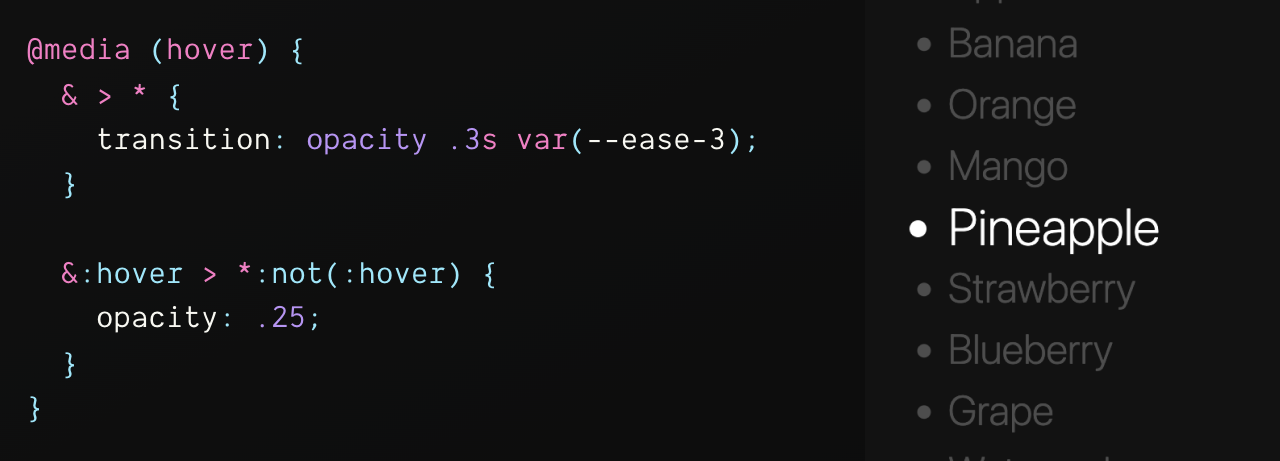
I don't see this technique enough: focus by demotion. Very often we create focus by promotion: hover to create a glow, focus rings, or even just making text bold.
I've found, that creating focus by pushing back, blurring or obfuscating the items not being shown interest, can significantly reduce visual and cognitive overload.
The Effect #
In CSS, we can accomplish a variant of this focus technique by watching for hovers in a container that trigger an effect on all children except the one currently being hovered:
@media (hover) {
  & > * {
    transition: opacity 0.3s var(--ease-3);
  }

  &:hover > *:not(:hover) {
    opacity: 0.25;
  }
}
Try it in my notebook
The above example fades out everything in the list on hover, but not the one your mouse is over. Try it in this codepen:
That alone is nice IMO. We can take it a bit further tho, if you like 😏
There's also a variant by Temani Afif that uses :has(); it is a more
consistent experience.
Try it in my notebook.
Effect + Transforms #
Add a bit of a scale effect, further "pushing back" the un-hovered items, and create a more punchy variant of the focus effect:
ul {
  @media (hover) and (prefers-reduced-motion: no-preference) {
    & > li {
      transform-origin: left center;
      transition: transform 1s var(--ease-spring-3), opacity 0.3s var(--ease-3);
    }

    &:hover > li:not(:hover) {
      opacity: 0.25;
      transform: scale(0.8);
    }
  }
}
Take it a bit further you say?
Effect + Math & :has() #
I made this demo that fans a list into an arc on hover, what if:
- the hovered item stayed put
- further items arc more
- further items fade more
We can do that!
:has() can track the hovered target, then using custom properties like
sibling-index() we can derive the distance from the hovered target and use
that delta to change opacity and rotation:
ul {
  --arc: 5deg;

  @media (hover) and (prefers-reduced-motion: no-preference) {
    &:has(li:nth-child(1):hover) {--target: 1}
    &:has(li:nth-child(2):hover) {--target: 2}
    &:has(li:nth-child(3):hover) {--target: 3}
    &:has(li:nth-child(4):hover) {--target: 4}
    &:has(li:nth-child(5):hover) {--target: 5}
    &:has(li:nth-child(6):hover) {--target: 6}
    &:has(li:nth-child(7):hover) {--target: 7}
    &:has(li:nth-child(8):hover) {--target: 8}
    &:has(li:nth-child(9):hover) {--target: 9}

    & > li {
      transform-origin: -200% 50%;
      transition: transform 2s var(--ease-spring-5), opacity 0.3s var(--ease-3);
    }

    &:hover > li:not(:hover) {
      --distance-from-target: abs(var(--sibling-index) - var(--target));
      --distance-multiplier: var(--distance-from-target) * 15%; /* change 15% */
      --gradual-fadeout: calc(100% - var(--distance-multiplier));
      opacity: var(--gradual-fadeout);

      --angle: calc((var(--sibling-index) - var(--target)) * var(--arc));
      transform: rotateZ(var(--angle));
    }
  }
}
See it here in this video:
Or go try it on Codepen:
Nice video by Kevin Powell:
Are you using focus by demotion anywhere? Send a link!


