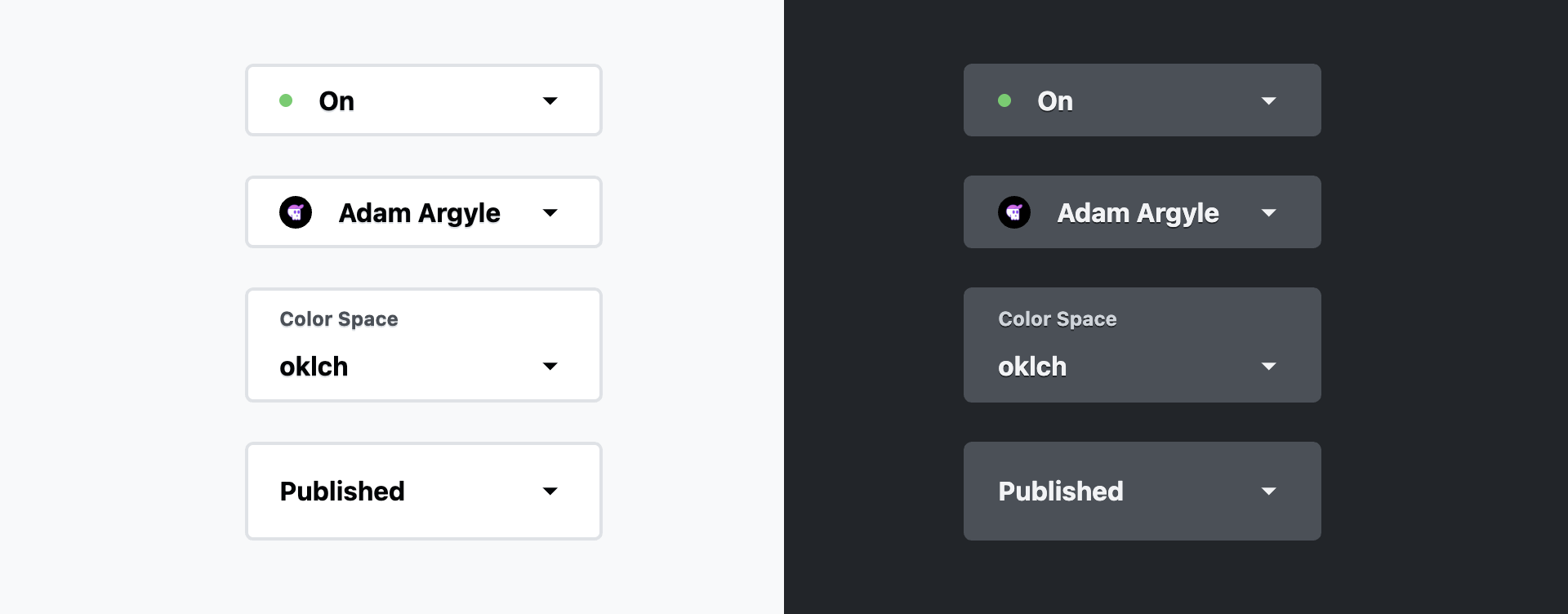
Sharing this here because it's an important starting place for working with "customizable selects."
The Boilerplate #
The first step is to give the select and it's picker appearance: base-select, which signals that you intend to build up a select from a set of base styles.
Then enable transitions on the ::picker popover.
Lastly, hook into the :open pseudo class and provide the enter and exit stage animations.
select {
  &, &::picker(select) {
    appearance: base-select;
  }

  &::picker(select) {
    transition:
      display allow-discrete 1s,
      opacity 1s,
      overlay 1s allow-discrete
    ;
  }

  &:not(:open)::picker(select) {
    opacity: 0;
  }

  &:open::picker(select) {
    opacity: 1;

    @starting-style {
      opacity: 0;
    }
  }
}
Where & How to try it #
Try it on Codepen:
- With Canary
- Enable web experiments
What can I do with this? #
Glad you asked!
Here's the Codepen for the demo video at the beginning of this post:

