RSS FeedTwitterMastodonBlueskyShare IconHeart IconGithub IconArrow IconClock IconGUI Challenges IconHome IconNote IconBlog IconCSS IconJS IconHTML IconShows IconGit IconSpeaking IconTools Icon
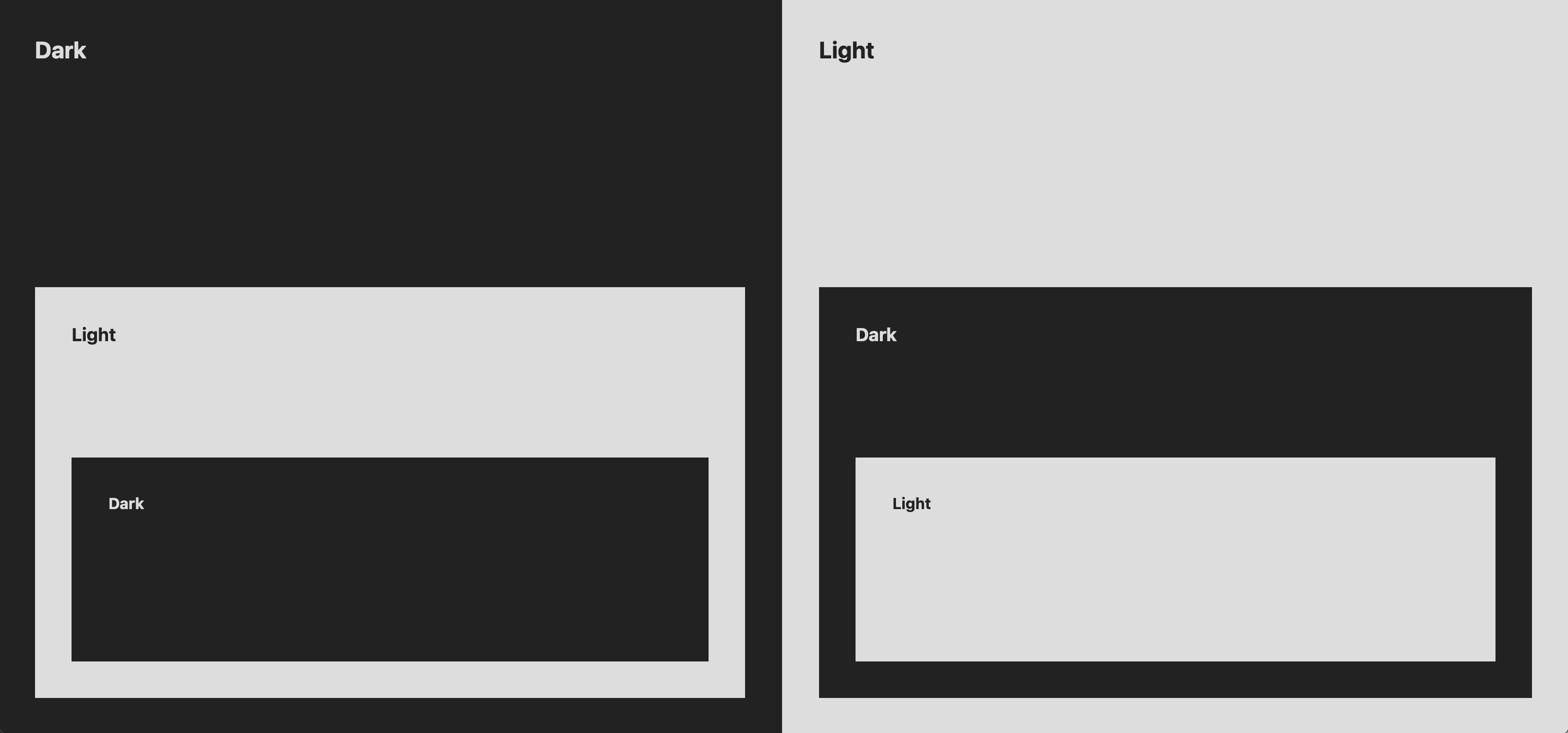
Screenshot of 2 columns each with alternating light and dark nested elements
My google avatar.

Page and Component Adaptive Light/Dark

5 min read
css

Sometimes having a light and dark version of the site isn't enough. Sometimes you need light and dark elements, sections or components. Additionally, sometimes you want more than just light and dark.

These nested light and dark scenarios can be tricky.

This post covers 3 strategies: one that can be used today and two that can be used in the future.

Today #

Color-scheme and light-dark() #

With color-scheme and light-dark(), the strategy is minimal and effective. One, possibly big, limit is that this is only for color values. But the HTML is clean and tidy.

HTML

<section class="dark">
  <h1>Dark</h1>
  
  <section class="light">
    <h1>Light</h1>
    
    <section class="dark">
      <h1>Dark</h1>
    </section>
  </section>
</section>

CSS

.dark  { color-scheme: dark }
.light { color-scheme: light }

section {
  background: light-dark(#ddd, #222);
  color: light-dark(#222, #ddd);
}

Can I Use?

Maybe color is all you need to adapt your components and pages. If so, take this code and run!

Future #

@scope #

Miriam Suzanne showed us that a primary use case for @scope is for scoping light and dark contexts.

They break it down with lots of detail in the @scope Explainer.

I've adapted the demo from this post to use @scope. The HTML can match the light-dark() version, but the CSS changes:

@scope (.dark) {
  :scope {
    color-scheme: dark;
    background: #222;
    color: #ddd;
    border: 5px dashed cyan;
  }
}

@scope (.light) {
  :scope {
    color-scheme: light;
    background: #ddd;
    color: #222;
    border: 5px solid hotpink;
  }
}

Can I Use?

We don't get to query or do anything "just in time", but we are able to change colors and any styles we want within a light or dark context.

Style Queries #

But if you want to adapt more than just color in these nested scenarios, then Style Queries and custom properties holding the color-scheme value can be used.

The HTML does need adjusted though because a style query can only query a parent, so each new context needs wrapped in an element with the .dark or .light class.

<div class="dark">
  <section>
    <h1>Dark</h1>
    <div class="light">
      <section>
        <h1>Light</h1>
        <div class="dark">
          <section>
            <h1>Dark</h1>
          </section>
        </div>
      </section>
    </div>
  </section>
</div>
.dark, .light {
  color-scheme: var(--color-scheme);
}

.dark  { --color-scheme: dark }
.light { --color-scheme: light }

section {
  background: light-dark(#ddd, #222);
  color: light-dark(#222, #ddd);
  
  @container style(--color-scheme: light) {
    border: 10px solid pink;
  }
  
  @container style(--color-scheme: dark) {
    border: 5px dashed cyan;
  }
}

Can I Use?

While the HTML is decently less approachable and manageable, it does have some nice benefits.

What strategy are you using?
Mentions #

Join the conversation on

32 likes
16 reposts
  • Sara Joy :happy_pepper:
  • Apple Annie :prami:
  • Toby Evans
  • Jan ⚓️
  • Matthias Ott
  • graste
  • Roma Komarov
  • Kai Klostermann
  • Francis Rubio :verified:
  • bizzl / fourteen bit
  • Sylvain Soliman ☕️
  • Ryan Mulligan
  • Fynn Becker
  • Martin Matovu
  • GENKI
  • Brett Peary

@chriskirknielsen @argyleink Style queries might be so powerful that you might be able to create a IE6 rendering simulator for modern engines.

Because thats of course the first useful thing that comes to my mind.

Vesa PiittinenVesa Piittinen

@argyleink oh, one less draft for me to finish, haha.

Edit: oh wait, nevermind, still need to finish it, just with less content :D

Roma KomarovRoma Komarov

@argyleink 👏 Great post!

Matthias OttMatthias Ott

Querying the Color Scheme

Published on: Categories: Style Queries 2, color-scheme, CSS Variables 5, CSS 45 Current music:The Album Leaf — Dust CollectsCurrent drink:Lemongrass, Ginger & Black Pepper tea Table of Contents

Introduction

Media queries are nice: they allow us to query different features, like the prefers-color-scheme one, which allows us to get the user preference and switch some styles between light and dark themes.

For many things, we don’t even need the media queries themselves: there is this great CSS property color-scheme. If we set it on the root like this:

:root {
    color-scheme: light dark;
}

Many things in our page will automatically adapt to the user’s color-scheme:

If you would like to learn more, I can recommend reading these articles that I previously shared in my bookmarks posts:

  • Built-in UI elements: scrollbars, inputs, buttons.
  • Some system colors: for example, Canvas and CanvasText.
  • The built-in light-dark() function, which accepts two colors and returns the first one when the theme is light, and the second one otherwise.

Adapting to the User Preference

By providing both possible schemes: “light dark” to the color-scheme, we tell the browser that it is ok to adapt to one of those themes that matches the user preference. The example below should adapt to the color-scheme you’re using in your browser:

I should adapt. Current scheme: lightdark.

.example1 {
    color-scheme: light dark;

    & p {
        padding: 1em;
        background: Canvas;
        color: CanvasText;
        border: 2px solid light-dark(hotpink, pink);
    }

    @media (prefers-color-scheme: light) {
        .dark-only {
            display: none;
        }
    }
    @media (prefers-color-scheme: dark) {
        .light-only {
            display: none;
        }
    }
}

We can see how everything — the light-dark(), the Canvas & CanvasText and the media queries — adapts to the current scheme.

Enforcing a color-scheme

But what if we will set only one value?

I should be always light. Current scheme: lightdark.

I should be always dark. Current scheme: lightdark.

.example2--light {
    &,
    & *  {
        color-scheme: light;
    }
}

.example2--dark {
    &,
    & *  {
        color-scheme: dark;
    }
}

.example2 {
    & p {
        padding: 1em;
        background: Canvas;
        color: CanvasText;
        border: 2px solid light-dark(hotpink, pink);
    }

    @media (prefers-color-scheme: light) {
        .dark-only {
            display: none;
        }
    }
    @media (prefers-color-scheme: dark) {
        .light-only {
            display: none;
        }
    }
}

Two notes about browser compatibility here:

  • Firefox has a bug where it does not apply the color-scheme correctly for consecutive elements, so we have to specify it not just on the wrapper, but also for everything nested inside. Note that this workaround makes it so we can’t nest our themes. But, in general, it would work if not for the Firefox.
  • Safari supports light-dark() only starting from 17.5, so the border won’t be visible in the current stable version.

While system colors and light-dark() applied according to our color-scheme, we can’t change the media query from our CSS. It just tells us what is the user preference.

The light-dark() itself is very useful, but can only be used for things that expect an actual CSS <color> type. But what if we’d want to adapt other, non-color things?

We can work around this by using something different as the source of truth, like CSS scopes or style queries. I recommend reading the recent Page and Component Adaptive Light/Dark post by Adam Argyle about these.

But what if we’d want to use the color-scheme as the source of truth?

Single Source of Truth

With the style queries and registered custom properties, we could! Here is how:

I should be always light. Current scheme: lightdark.

I should be always dark. Current scheme: lightdark.

.example3--light {
    color-scheme: light;
}

.example3--dark {
    color-scheme: dark;
}

@property --captured-color {
    syntax: "<color>";
    inherits: true;
    initial-value: white;
}

.example3 {
    --captured-color: light-dark(white, black);

    & p {
        padding: 1em;
        background: Canvas;
        color: CanvasText;
        border: 2px solid light-dark(hotpink, pink);
    }

    @container style(--captured-color: white) {
        .dark-only {
            display: none;
        }
    }
    @container style(--captured-color: black) {
        .light-only {
            display: none;
        }
    }
}

Note that style queries are only available in Chrome and Safari Technology Preview currently, do not rely on them in production.

I am also not using the fix for the Firefox, as style queries do not work there anyway right now.

Here, instead of using media queries, we register a --captured-color custom property, then assign two different values to it using the light-dark() function. Because the property is registered, the function is properly applied, resulting in the corresponding color changing based on the color-scheme.

Then, instead of relying on the prefers-color-scheme, we use a container style query to query this registered custom property, which allows us setting any properties for anything inside the element that defines the color-scheme!

When I first tested this, only Safari Technology Preview was handling this case correctly! I had to open a bug for Chromium about it, and it was fixed rather quickly.

Downsides

The main downside of this method (outside the browser support) is the fact that the style queries apply to the elements inside the element with the color-scheme, but the color-scheme changes the styles on the element itself. Unless we’ll get some way to conditionally apply styles on the element itself, we will need to make sure we never style anything on the element with the color-scheme.

And, of course, it is not as intuitive with the container style queries targeting some variable with some abstract values.

Not the User Preference

In the most recent Web-Standards podcast (in Russian), Vadim Makeev mentioned a good point: there is a big difference between the user preference and a color-scheme property. Occasionally, it might be alluring to use the color-scheme as a switch for the components’ theme, but we need to consider that even when we do so, we could still want to listen to the prefers-color-scheme to understand which theme the user prefers, and make adjustments to both the light and dark themes we’re applying via color-scheme.

For example, if the user prefers the dark color-scheme, and we’re overriding it to light on some inner component, we could want to not just invert the colors there, but also make them not as bright, as in not to make it stand out too much. We might even want to adjust the overall theme based on it if we have the built-in color scheme switch: dim the light one when the user prefers the dark color scheme, and make the dark more contrast if the user has it as light, as otherwise UI elements could be overshined by the bright browser chrome.

The Future

I did not find a dedicated issue about this yet, but in one of the other issues about color-scheme many people did express their desire to have a dedicated style query for this. I imagine it will work very similarly, and potentially have the same downside of not matching with the color-scheme, unless there will be some specific handling implemented that will prevent any circular dependency issues.

The abovementioned issue itself is about the problem where a <meta name=color-scheme> in HTML does not reflect on the prefers-color-scheme @media. In my opinion, this is the way it should work: I think the user preferences should stay that way, and it is not correct to change it based on the current color scheme, regardless of where it is defined — in HTML or CSS.

This technique (or a potential style query) will solve the issue described in the issue well enough: just apply it on the html or body element and use it instead of the @media itself.

Conclusion

Registered custom properties are powerful in their ability to capture some value on the element itself, rather than passing it down to be applied later. I got the idea to apply it to the light-dark() function when playing with the tan(atan2()) technique as a part of my experiments for the Fit-to-Width Text: A New Technique article, and after playing with the style queries for my Self-Modifying Variables: the inherit() Workaround article.

I published a separate post about the concept of capturing values: Captured Custom Properties.

As always, I am fascinated by what we can achieve by combining different CSS features: in this case we rely on three of them together. I hope this post will encourage you to experiment with all the new things in CSS as well, and will give you ideas about how we could use them in other unusual ways.

Roma KomarovRoma Komarov

Crawl the CSS Webring?

previous sitenext site
a random site