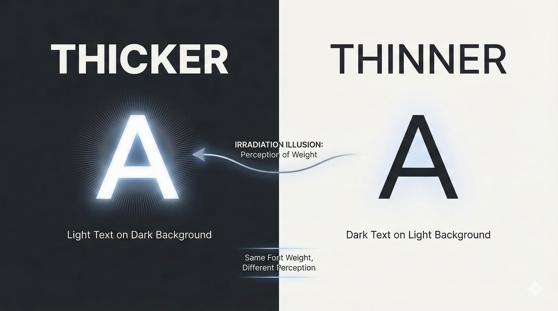
Ever noticed how white text on a black background looks thicker than black text on a white background, even though the weights are the same?
This post teaches you how to account for this and adjust perceived font weight for dark mode without layout shift, with variable fonts and the GRAD axis.
g…RAD! 👈😎👈
Feel out the problem space #
Test your eyes and feel the problem space with the following demo
(def open it up larger):
To test:
Flip between light and dark. Look closely at font weights in the "un-adjusted" and "adjusted" example content.
The goal:
The visual weight to not perceptively change when switching between light and dark. This means, when in dark mode, using a negative value for GRAD to reduce the perceived thickness.
Some play:
In dark mode, use the slider to adjust the GRAD axis to see how it changes the perceived weight of the font in the adjusted example. Feel free to fine tune the slider to find the perfect balance for your eyes, flipping back and forth, adjust the slider until you see no weight change when flipping themes.
I think it's easier to notice the difference in the paragraph text than the heading text, but you find which is easier to notice for yourself.
It's subtle:
Don't expect this to jump out at you, but you'll struggle to unsee once you see.
Irradiation illusion #
Humans perceive white on black vs black on white differently. We learned it from the world, the way shadows and light have given us biases and expectations. Our squishy human eye has been through some things you know?

Read more about irradiation illusion.
This impacts typography in dark mode, as the perceived weight of a font changes in dark mode, without intention from the CSS authors. The light text appears thicker than the dark text counterpart, even though the font weight is the same.
CSS can account for this illusion 🤓
GRAD in variable fonts to the rescue #
Before variable fonts, font weight was the only way to adjust the perceived weight of a font, but this changes the glyph size. This can cause accidental layout shift, aka a janky experience.
GRAD stands for "grade", and it's a variable font axis that allows us to adjust the perceived weight of a font without changing the glyph size.
Fixing bold link hovers #
Here, you'll recognize this classic issue. Hover the links in the below demo to see a small preview of the type of layout shift that can occur.
With variable fonts, we can use the GRAD axis to adjust the perceived weight of a font without changing the glyph size.
This allows us to adjust the perceived weight of a font without causing layout shift. That's what the "fixed" example is using.
One step further #
So far we've only adjusted the perceived weight of a font in dark mode with a negative value for GRAD, and for links being hovered that use a positive value for GRAD, but we can go even further:
This allows us to adjust the perceived weight of a font based on the users contrast preferences.
If the user prefers more contrast, without layout shift, we can use a positive value for GRAD to increase the perceived thickness. In dark mode, we can use a negative value for GRAD to reduce the perceived thickness while still maintaining their preference.
body {
  --GRAD: 0;
  font-variation-settings: "GRAD" var(--GRAD);
}

@media (prefers-contrast: more) { body { --GRAD: 700 } }
@media (prefers-contrast: less) { body { --GRAD: -50 } }

@media (prefers-color-scheme: dark)                              { body { --GRAD: -50 } }
@media (prefers-color-scheme: dark) and (prefers-contrast: more) { body { --GRAD: 150 } }
@media (prefers-color-scheme: dark) and (prefers-contrast: less) { body { --GRAD: -150 } }
Users will never ask for something like this. They'll just be able to easily read the content in your design in a way that feels natural.
Time to check if your favorite font has a GRAD axis.
Also, this is just the beginning, a foot in the door. It’s worth learning more about the relationship between grade and weight, and fine tune instances to produce the results your users and you will want.

